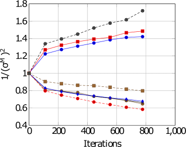
## Line Chart: Convergence of Variance Estimators
### Overview
The image is a line chart that depicts the convergence of variance estimators over a number of iterations. Several lines, each representing a different estimator, show how the inverse of the variance estimate changes with increasing iterations. The chart includes multiple data series, some increasing and some decreasing, indicating the behavior of different estimation methods.
### Components/Axes
* **X-axis (Horizontal):** "Iterations", ranging from 0 to 1,000. Axis markers are present at 0, 200, 400, 600, 800, and 1,000.
* **Y-axis (Vertical):** "1/(σM)^2", ranging from 0.4 to 1.8. Axis markers are present at 0.4, 0.6, 0.8, 1.0, 1.2, 1.4, 1.6, and 1.8.
* **Legend:** There is no explicit legend, but the different lines are distinguished by color and marker type.
### Detailed Analysis
**Data Series and Trends:**
1. **Black dashed line with circle markers:** This line starts at approximately 1.0 and increases steadily, reaching approximately 1.7 at 800 iterations.
2. **Red solid line with square markers:** This line starts at approximately 1.0 and increases, reaching approximately 1.5 at 800 iterations.
3. **Blue solid line with circle markers:** This line starts at approximately 1.0 and increases, reaching approximately 1.4 at 800 iterations.
4. **Brown solid line with square markers:** This line starts at approximately 1.0 and decreases, reaching approximately 0.8 at 800 iterations.
5. **Red dashed line with circle markers:** This line starts at approximately 1.0 and decreases, reaching approximately 0.6 at 800 iterations.
6. **Blue solid line with diamond markers:** This line starts at approximately 1.0 and decreases, reaching approximately 0.7 at 800 iterations.
7. **Black solid line:** This line starts at approximately 1.0 and decreases, reaching approximately 0.65 at 800 iterations.
### Key Observations
* Some estimators (black dashed, red solid, blue solid) show an increasing trend in the inverse of the variance, while others (brown solid, red dashed, blue solid, black solid) show a decreasing trend.
* All lines start at approximately 1.0, indicating an initial normalized state.
* The black dashed line exhibits the most significant increase in the inverse of the variance.
* The red dashed line exhibits the most significant decrease in the inverse of the variance.
* The convergence rate varies among the different estimators.
### Interpretation
The chart illustrates the convergence behavior of different variance estimators as the number of iterations increases. The increasing lines suggest that the corresponding estimators are underestimating the variance, leading to an increase in the inverse of the variance. Conversely, the decreasing lines suggest that the corresponding estimators are overestimating the variance, leading to a decrease in the inverse of the variance. The convergence rate and final values indicate the relative performance and stability of each estimator. The initial value of 1.0 for all lines likely represents a normalized or initial estimate, allowing for a direct comparison of how each estimator evolves over iterations.