## Line Chart: Performance Metric vs. Iterations
### Overview
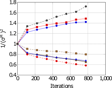
The image is a line chart plotting a performance metric, labeled as `1/(σ^H)^2`, against the number of `Iterations`. It displays six distinct data series, each represented by a unique combination of line style, color, and marker shape. The chart appears to compare the convergence or behavior of different algorithms, models, or parameter settings over a training or optimization process.
### Components/Axes
* **X-Axis (Horizontal):**
* **Label:** `Iterations`
* **Scale:** Linear, ranging from 0 to 1,000.
* **Major Tick Marks:** 0, 200, 400, 600, 800, 1000.
* **Y-Axis (Vertical):**
* **Label:** `1/(σ^H)^2` (The inverse square of a parameter denoted as sigma superscript H).
* **Scale:** Linear, ranging from 0.4 to 1.8.
* **Major Tick Marks:** 0.4, 0.6, 0.8, 1.0, 1.2, 1.4, 1.6, 1.8.
* **Legend:** Located in the top-left quadrant of the plot area. It contains six entries, each with a line sample and a marker:
1. Black dashed line with filled circle markers.
2. Red solid line with filled square markers.
3. Blue solid line with filled circle markers.
4. Brown (or dark gold) dashed line with filled square markers.
5. Blue solid line with filled diamond markers.
6. Red dashed line with filled circle markers.
### Detailed Analysis
The chart tracks the value of `1/(σ^H)^2` over 800 iterations for six different series. All series originate from a common starting point at Iteration 0, where the value is 1.0.
**Trend Verification & Data Points (Approximate):**
1. **Black Dashed Line (Circle Markers):**
* **Trend:** Steep, consistent upward slope. It is the highest-valued series for all iterations > 0.
* **Data Points:** (0, 1.0), (100, ~1.33), (200, ~1.40), (300, ~1.47), (400, ~1.53), (500, ~1.59), (600, ~1.65), (700, ~1.71), (800, ~1.73).
2. **Red Solid Line (Square Markers):**
* **Trend:** Moderate upward slope, consistently below the black dashed line but above the blue solid line (circle markers).
* **Data Points:** (0, 1.0), (100, ~1.27), (200, ~1.32), (300, ~1.36), (400, ~1.40), (500, ~1.43), (600, ~1.46), (700, ~1.48), (800, ~1.49).
3. **Blue Solid Line (Circle Markers):**
* **Trend:** Moderate upward slope, very close to but consistently just below the red solid line.
* **Data Points:** (0, 1.0), (100, ~1.25), (200, ~1.29), (300, ~1.33), (400, ~1.36), (500, ~1.39), (600, ~1.41), (700, ~1.43), (800, ~1.44).
4. **Brown Dashed Line (Square Markers):**
* **Trend:** Gentle downward slope. It is the highest-valued among the decreasing series.
* **Data Points:** (0, 1.0), (100, ~0.90), (200, ~0.88), (300, ~0.86), (400, ~0.85), (500, ~0.84), (600, ~0.83), (700, ~0.82), (800, ~0.81).
5. **Blue Solid Line (Diamond Markers):**
* **Trend:** Moderate downward slope, consistently below the brown dashed line.
* **Data Points:** (0, 1.0), (100, ~0.80), (200, ~0.77), (300, ~0.75), (400, ~0.73), (500, ~0.71), (600, ~0.70), (700, ~0.69), (800, ~0.68).
6. **Red Dashed Line (Circle Markers):**
* **Trend:** Steep downward slope. It is the lowest-valued series for all iterations > 0.
* **Data Points:** (0, 1.0), (100, ~0.79), (200, ~0.73), (300, ~0.69), (400, ~0.66), (500, ~0.64), (600, ~0.62), (700, ~0.60), (800, ~0.59).
### Key Observations
1. **Bifurcation:** All series start together but immediately split into two distinct groups: three series that increase (Black, Red-solid, Blue-solid-circle) and three that decrease (Brown, Blue-solid-diamond, Red-dashed).
2. **Performance Hierarchy:** Within the increasing group, the black dashed line shows the strongest improvement. Within the decreasing group, the red dashed line shows the strongest decline.
3. **Parallelism:** The two solid lines (Red-square and Blue-circle) follow nearly parallel upward trajectories. Similarly, the two blue lines (solid-circle increasing and solid-diamond decreasing) show symmetric but opposite trends from the starting point.
4. **Convergence/Divergence:** The gap between the best-performing (black dashed) and worst-performing (red dashed) series widens significantly over iterations, from 0 at iteration 0 to approximately 1.14 at iteration 800.
### Interpretation
The metric `1/(σ^H)^2` is likely a measure of model precision, confidence, or inverse variance, where a **higher value is better**. The chart demonstrates that different methods or configurations (represented by the six lines) have fundamentally different effects on this metric over time.
* **The three increasing lines** represent methods that successfully improve the model's precision or reduce its uncertainty as training progresses. The black dashed method is the most effective.
* **The three decreasing lines** represent methods that degrade the model's precision or increase its uncertainty. The red dashed method is the most detrimental.
The stark divergence suggests that the choice of method (e.g., optimizer, regularization technique, architectural variant) is critical. The parallel behavior of some lines (e.g., the two solid lines) might indicate they are variants of a similar underlying approach, differing only by a minor parameter. The symmetric split of the blue lines (one increasing, one decreasing) could represent the effect of toggling a single binary flag or hyperparameter. This chart would be essential for diagnosing which experimental conditions lead to desirable model behavior and which lead to failure.