\n
## Line Chart: Continual Train
### Overview
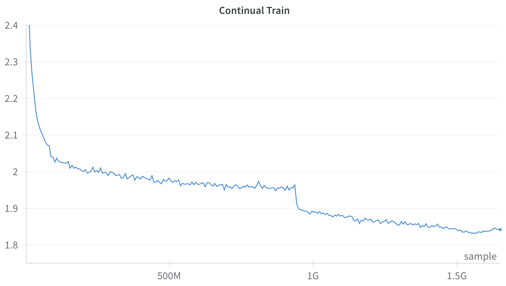
The image displays a line chart titled "Continual Train," plotting a single data series over a large number of samples. The chart shows a generally decreasing trend with distinct phases of rapid decline, gradual descent with noise, and a sharp step-down.
### Components/Axes
* **Title:** "Continual Train" (centered at the top).
* **X-Axis:**
* **Label:** "sample" (positioned at the bottom-right corner).
* **Scale:** Linear scale with major tick marks labeled at "500M" (500 million), "1G" (1 billion), and "1.5G" (1.5 billion). The axis extends from approximately 0 to just beyond 1.5G samples.
* **Y-Axis:**
* **Label:** None present.
* **Scale:** Linear scale with major tick marks labeled at 1.8, 1.9, 2, 2.1, 2.2, 2.3, and 2.4. The axis spans from 1.8 to 2.4.
* **Data Series:** A single, continuous blue line.
* **Legend:** None present.
### Detailed Analysis
The blue line exhibits the following approximate behavior:
1. **Initial Steep Decline (0 to ~100M samples):** The line begins at the top-left corner, at a value of approximately 2.4. It drops very steeply, reaching a value of ~2.05 by the 100M sample mark.
2. **Gradual Descent with Noise (~100M to ~950M samples):** Following the initial drop, the line continues a slower, noisy descent. It fluctuates between approximately 2.05 and 1.95, trending gently downward. The noise appears as small, frequent up-and-down spikes.
3. **Sharp Step-Down (~950M to ~1G samples):** Just before the 1G sample mark, the line experiences a sharp, near-vertical drop from approximately 1.96 to about 1.90.
4. **Final Gradual Descent (~1G to ~1.6G samples):** After the step-down, the line resumes a gradual, noisy decline. It trends from ~1.90 down to a final value of approximately 1.84 at the far right of the chart (around 1.6G samples). The noise level appears slightly reduced compared to the second phase.
### Key Observations
* **Overall Trend:** The primary trend is a consistent decrease in the y-axis value as the number of samples (x-axis) increases.
* **Phased Behavior:** The training process shows distinct phases: rapid initial improvement, a long period of noisy refinement, a sudden discrete improvement event, and a final phase of slower refinement.
* **Sharp Discontinuity:** The most notable feature is the sharp, step-like drop just before 1G samples. This is not a gradual trend but a sudden change.
* **Noise Profile:** The line is not smooth; it contains high-frequency noise throughout, which is typical of stochastic processes like training loss curves.
### Interpretation
This chart almost certainly represents a **training loss curve** from a machine learning model undergoing continual training. The y-axis, though unlabeled, is inferred to be a loss metric (e.g., cross-entropy loss), where lower values indicate better model performance.
* **What it demonstrates:** The model is successfully learning, as evidenced by the overall downward trend in loss. The initial steep drop represents rapid early learning. The long, noisy plateau suggests the model is refining its parameters on the data, with the noise reflecting batch-to-batch variation.
* **The Sharp Drop:** The sudden step-down at ~1G samples is highly significant. It likely corresponds to a deliberate intervention in the training process, such as:
* A scheduled decrease in the learning rate.
* The introduction of a new, more relevant dataset.
* A change in model architecture or optimization algorithm.
* **Notable Anomaly:** The absence of a y-axis title is a minor documentation flaw. The lack of a legend is acceptable for a single-series chart but would be problematic if multiple runs were plotted.
* **Conclusion:** The data suggests a successful, large-scale training run (over 1.5 billion samples) where the model's performance improved substantially. The key event for investigation is the intervention at 1G samples, which provided a clear, discrete boost to performance. The continued decline after this point indicates the model had not yet fully converged by the end of the plotted data.