## Bar Chart: Pass Rate vs. Mid-training Tokens
### Overview
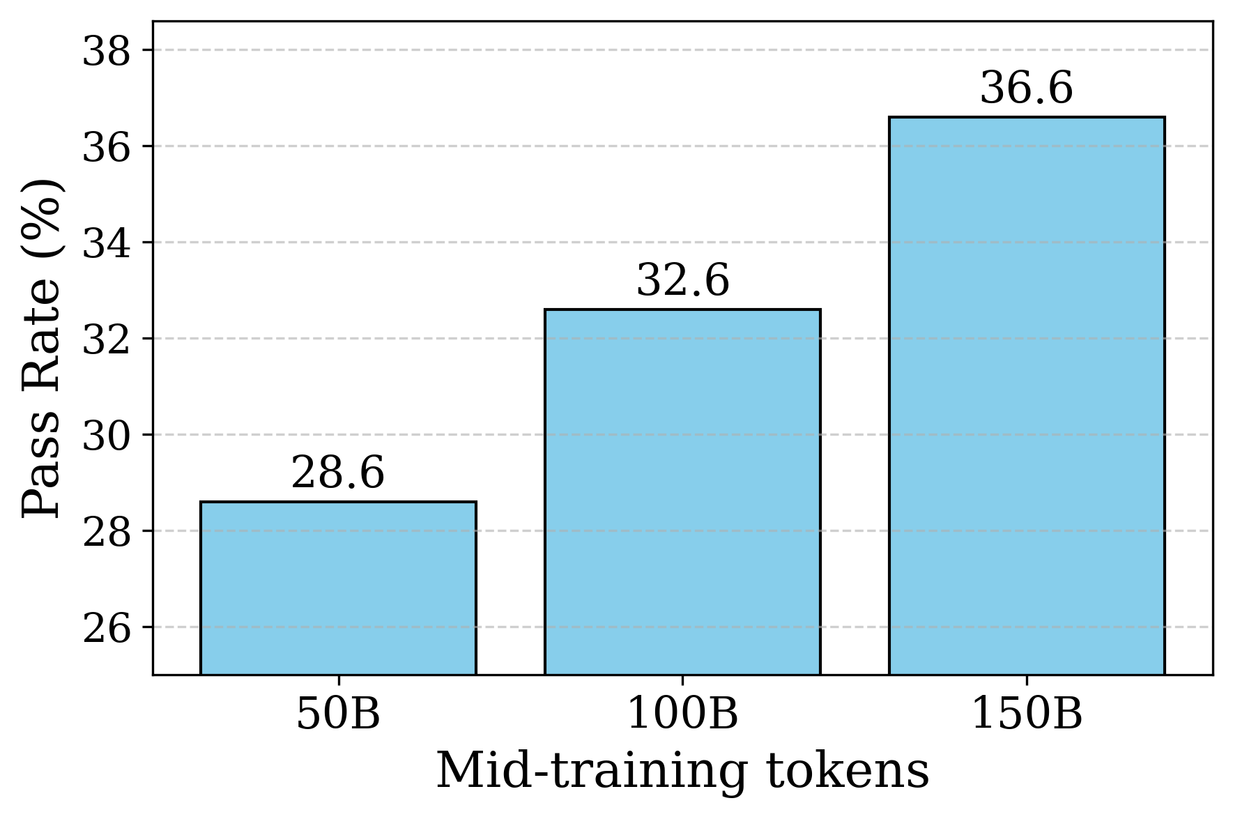
This image is a bar chart illustrating the relationship between the volume of "Mid-training tokens" and a resulting performance metric labeled as "Pass Rate (%)". The chart displays three distinct data points, showing a clear, positive correlation between the number of tokens and the pass rate. The language used in the chart is entirely English.
### Components/Axes
**Component Isolation & Spatial Grounding:**
* **Y-axis (Left side, vertical):**
* **Title:** "Pass Rate (%)" (oriented vertically, reading bottom to top).
* **Scale:** The axis is truncated, starting just below 26 and ending at 38.
* **Markers:** Tick marks are placed at intervals of 2: 26, 28, 30, 32, 34, 36, and 38.
* **Gridlines:** Light grey, dashed horizontal lines extend from each y-axis tick mark across the background of the chart area to aid in visual alignment.
* **X-axis (Bottom, horizontal):**
* **Title:** "Mid-training tokens" (centered below the category labels).
* **Categories:** Three discrete labels positioned from left to right: "50B", "100B", and "150B". ("B" standardly denotes Billions).
* **Data Series (Center):**
* Three vertical bars corresponding to the x-axis categories.
* **Styling:** All bars are a uniform light blue color with solid black outlines. There is no separate legend because there is only one data series.
* **Data Labels:** Exact numerical values are printed in black text directly above the top edge of each corresponding bar.
### Detailed Analysis
**Trend Verification:**
Visually, the bars step upward from left to right. The visual increase in height from the first bar to the second appears identical to the increase from the second bar to the third, suggesting a linear trend within this specific data window.
**Data Extraction:**
* **Left Bar:**
* Category (X): 50B
* Value (Y): 28.6
* **Center Bar:**
* Category (X): 100B
* Value (Y): 32.6
* **Right Bar:**
* Category (X): 150B
* Value (Y): 36.6
### Key Observations
* **Perfect Linearity:** The data exhibits perfectly linear growth within the displayed range. The pass rate increases by exactly 4.0% for every 50B tokens added (28.6 + 4.0 = 32.6; 32.6 + 4.0 = 36.6).
* **Axis Truncation:** The Y-axis does not start at zero (it starts near 25). This visual technique significantly exaggerates the perceived rate of growth. Visually, the 150B bar appears roughly three times taller than the 50B bar, whereas the actual mathematical increase is approximately 28% (from 28.6 to 36.6).
### Interpretation
* **What the data suggests:** The chart demonstrates that continuing to train a model (likely a Large Language Model, given the terminology "tokens" and "B" for billions) with additional "mid-training" data yields consistent, predictable improvements in its ability to pass a specific benchmark (the "Pass Rate").
* **Why it matters:** In machine learning, understanding scaling laws is critical for resource allocation. This chart argues that investing compute to process an additional 50 billion tokens yields a reliable 4% bump in this specific performance metric.
* **Investigative/Peircean Reading:** The *perfectly* linear nature of this data (+4.0% exactly per step) is highly unusual in empirical deep learning results. Typically, model performance follows a logarithmic scaling law, where returns diminish as more data is added. The perfect linearity here suggests one of a few possibilities:
1. This is a highly specific, narrow slice of a larger, curved scaling graph where the curve appears locally linear.
2. The data might be smoothed, averaged, or extrapolated rather than representing raw, single-run empirical variance.
3. The specific "mid-training" phase represented here is in a highly stable, unsaturated learning regime.
* Furthermore, the author's choice to truncate the Y-axis indicates an intent to emphasize the *impact* of the mid-training tokens, making the gains look as dramatic as possible to the viewer.