## Heatmap: Unlabeled Grid Visualization
### Overview
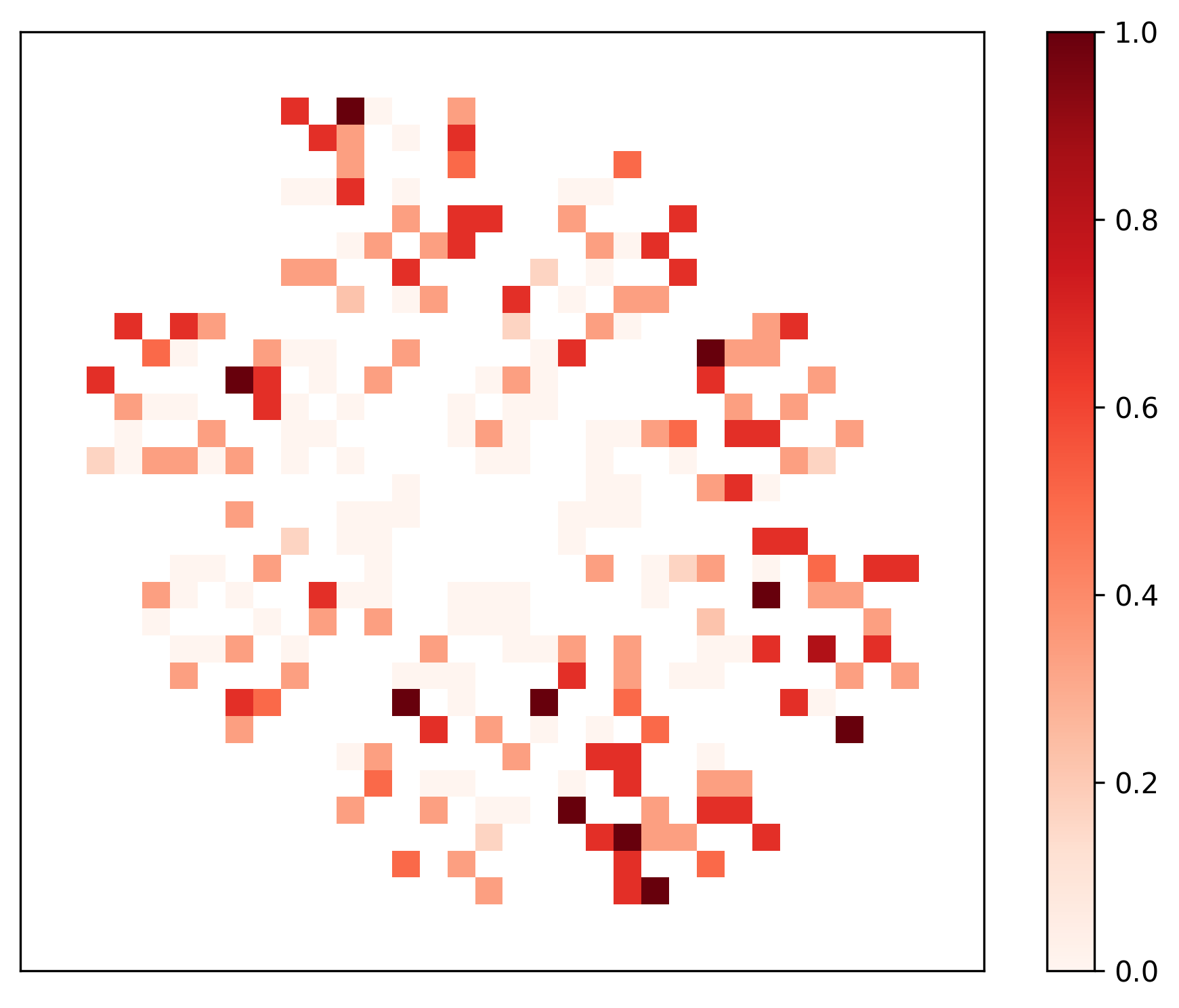
The image displays a 2D heatmap visualization. It consists of a square grid of colored cells (pixels) arranged in a seemingly random or sparse pattern against a white background. A vertical color scale bar is positioned to the right of the main grid. There are no visible axis labels, titles, or a legend identifying the categories represented by the grid's rows and columns.
### Components/Axes
1. **Main Grid Area:** A square region containing a sparse distribution of colored squares. The grid appears to be approximately 30x30 cells, though the exact dimensions are not labeled. The cells are either colored or white (empty/background).
2. **Color Scale Bar:** Located on the right side of the image, running vertically.
* **Scale Range:** 0.0 (bottom) to 1.0 (top).
* **Tick Marks & Labels:** The scale has labeled tick marks at intervals of 0.2: `0.0`, `0.2`, `0.4`, `0.6`, `0.8`, `1.0`.
* **Color Gradient:** The bar shows a continuous gradient from a very light pink/white at 0.0, through shades of orange and red, to a dark burgundy/red at 1.0.
3. **Missing Elements:** The image contains **no** axis titles, row/column labels, chart title, or a separate legend box. The color bar serves as the sole legend for interpreting cell values.
### Detailed Analysis
* **Data Representation:** Each colored cell in the grid represents a numerical value between 0.0 and 1.0, as defined by the color scale. The color of the cell maps directly to a value on the gradient.
* **Spatial Distribution & Value Clusters:**
* **High-Value Clusters (Dark Red, ~0.8-1.0):** Several isolated dark red cells are scattered throughout the grid. Notable clusters or individual high-value points appear in the:
* Top-left quadrant (e.g., a dark cell near the top edge).
* Center-left area.
* Bottom-right quadrant (a small cluster of dark cells).
* Bottom-center area.
* **Medium-Value Clusters (Orange-Red, ~0.4-0.7):** These are more numerous and form loose, irregular groupings. They are often adjacent to or surrounding the high-value dark red cells. A significant concentration exists in the upper half of the grid.
* **Low-Value Cells (Light Pink, ~0.1-0.3):** These are dispersed widely, often filling spaces between medium-value clusters. They are less common than medium-value cells.
* **Empty/Zero Cells (White):** A large portion of the grid is white, indicating either a value of 0.0, missing data, or a value below the visualization threshold. The pattern is sparse, not a dense matrix.
* **Color-Value Cross-Reference:** The darkest burgundy cells (e.g., in the bottom-right cluster) correspond to the top of the scale (~1.0). The lightest pink cells correspond to values just above 0.0. The orange cells fall in the middle of the gradient (~0.5).
### Key Observations
1. **Sparsity:** The data is highly sparse. Most grid cells are empty (white), with colored cells forming an irregular, non-contiguous pattern.
2. **Lack of Structure:** There is no immediately apparent geometric structure (like a diagonal, blocks, or waves) to the distribution of colored cells. It appears random or based on an underlying, unlabeled dataset.
3. **Value Range Utilization:** The full range of the color scale (0.0 to 1.0) is utilized, from the lightest pinks to the darkest reds.
4. **No Labels:** The complete absence of axis or category labels makes it impossible to determine what the rows, columns, or individual cells represent without external context.
### Interpretation
This heatmap visualizes a sparse, two-dimensional dataset where most coordinates have a null or zero value. The colored cells indicate the presence and magnitude of a measured variable at specific (x, y) coordinates.
* **What it Demonstrates:** The visualization highlights "hot spots" (dark red cells) of high intensity or probability scattered across the measured space. The surrounding medium and low-value cells suggest a gradient or diffusion of the measured property around these hotspots, or simply independent, lower-magnitude events.
* **Relationships:** The clustering of similarly colored cells (e.g., dark red cells near other red/orange cells) suggests possible spatial correlation or autocorrelation in the underlying data—where high values are more likely to be found near other high values.
* **Anomalies & Patterns:** The primary anomaly is the sparsity itself. The pattern does not suggest a simple linear relationship or a uniform distribution. Without labels, it could represent anything from a correlation matrix with many zero correlations, to a spatial map of event occurrences (e.g., sensor activations, genetic markers, or document term frequencies), to a visualization of weights in a neural network layer.
* **Peircean Investigative Reading:** The sign (the heatmap) is an **icon** of the underlying data structure, representing its spatial layout directly. It is also an **index**, as the color intensity points to the magnitude of the value at each location. The viewer must use abductive reasoning to infer the context: the sparsity and random-like distribution might indicate a complex, non-linear system or a high-dimensional dataset projected into 2D. The lack of labels is a critical indexical gap, pointing to the necessity of external information (a caption, accompanying text, or dataset description) to complete the interpretation.