# Technical Data Extraction: Principal Component Analysis (PCA) of Experts
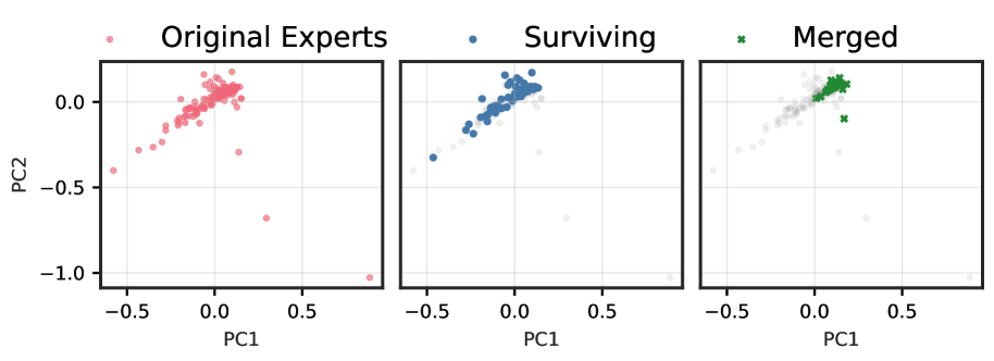
This image consists of three side-by-side scatter plots visualizing the distribution and transformation of "Experts" in a 2D principal component space (PC1 vs. PC2).
## 1. General Chart Metadata
* **X-Axis Label:** PC1 (Principal Component 1)
* **Y-Axis Label:** PC2 (Principal Component 2)
* **X-Axis Scale:** Ranges from approximately -0.6 to +0.9. Major ticks at -0.5, 0.0, and 0.5.
* **Y-Axis Scale:** Ranges from approximately -1.1 to +0.2. Major ticks at -1.0, -0.5, and 0.0.
* **Grid:** Light gray grid lines are present on all three plots.
---
## 2. Individual Plot Analysis
### Plot 1: Original Experts
* **Legend Label:** Original Experts (indicated by a light red circle icon).
* **Data Representation:** All data points are shown as semi-transparent red circles.
* **Distribution:**
* The majority of points are clustered in a dense diagonal formation extending from roughly (-0.2, -0.1) to (0.1, 0.1).
* A tail of sparse points extends toward the bottom-left (negative PC1, negative PC2), reaching approximately (-0.6, -0.4).
* There are three distinct outliers in the bottom-right quadrant:
* One near (0.15, -0.3)
* One near (0.3, -0.7)
* One near (0.9, -1.0)
### Plot 2: Surviving
* **Legend Label:** Surviving (indicated by a blue circle icon).
* **Data Representation:**
* **Active Points:** Solid blue circles.
* **Background Points:** The "Original Experts" from the first plot are shown as faint, light-gray circles for context.
* **Distribution:**
* The "Surviving" experts are primarily concentrated in the upper-right portion of the main cluster, centered around (0.0, 0.1).
* The sparse tail in the negative PC1/PC2 region and the extreme outliers in the bottom-right quadrant are largely excluded (rendered in gray), indicating they did not "survive."
### Plot 3: Merged
* **Legend Label:** Merged (indicated by a green 'x' icon).
* **Data Representation:**
* **Active Points:** Green 'x' markers.
* **Background Points:** The "Original Experts" are shown as faint, light-gray circles.
* **Distribution:**
* The "Merged" points are highly localized in the top-right corner of the main cluster, specifically around the coordinates (0.1, 0.1).
* One green 'x' outlier is visible at approximately (0.18, -0.1).
* This plot shows the highest level of pruning/consolidation, as the green markers occupy a much smaller area of the PC space compared to the "Surviving" or "Original" sets.
---
## 3. Summary of Trends
* **Data Reduction:** Moving from left to right, the number of active points decreases.
* **Spatial Filtering:** The process (Surviving -> Merged) appears to filter out experts located in the lower-left tail and the extreme bottom-right outliers.
* **Convergence:** The "Merged" experts represent a tight consensus group located at the positive extreme of the main density cluster on both the PC1 and PC2 axes.