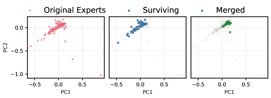
## Principal Component Analysis (PCA) of Expert Data
### Overview
The image displays a Principal Component Analysis (PCA) plot, which is a dimensionality reduction technique used to visualize high-dimensional data in a lower-dimensional space. The plot is divided into three sections, each representing a different group of experts: Original Experts, Surviving Experts, and Merged Experts. The x-axis represents the first principal component (PC1), and the y-axis represents the second principal component (PC2). Each data point is color-coded to indicate the group it belongs to.
### Components/Axes
- **X-Axis (PC1)**: Represents the first principal component, which captures the most variance in the data.
- **Y-Axis (PC2)**: Represents the second principal component, which captures the second most variance in the data.
- **Legend**: Color-coded to indicate the group of experts (Original Experts, Surviving Experts, Merged Experts).
- **Data Points**: Each point represents an expert, and its position on the plot indicates its principal component scores.
### Detailed Analysis or ### Content Details
- **Original Experts**: The data points for Original Experts are scattered across the plot, with a mix of positive and negative values for both PC1 and PC2. The majority of these points are in the upper left quadrant, suggesting that Original Experts tend to have higher values for both principal components.
- **Surviving Experts**: The data points for Surviving Experts are more clustered towards the upper right quadrant, indicating that they tend to have higher values for PC1 and PC2 compared to Original Experts.
- **Merged Experts**: The data points for Merged Experts are spread out across the plot, with a mix of positive and negative values for both principal components. The majority of these points are in the lower right quadrant, suggesting that Merged Experts tend to have lower values for both principal components compared to Original Experts.
### Key Observations
- **Clusters**: There are distinct clusters of data points for each group, indicating that the experts can be grouped based on their principal component scores.
- **Outliers**: There are no significant outliers in the plot, suggesting that the data points are relatively close to the mean.
- **Trends**: The plot shows that the Merged Experts tend to have lower values for both principal components compared to Original Experts, while the Surviving Experts tend to have higher values for both principal components.
### Interpretation
The PCA plot suggests that the experts can be grouped based on their principal component scores. The Original Experts tend to have higher values for both principal components, indicating that they may have more diverse or complex data. The Surviving Experts tend to have higher values for PC1 and PC2, suggesting that they may have more consistent or predictable data. The Merged Experts tend to have lower values for both principal components, indicating that they may have less diverse or complex data. The plot also suggests that the experts can be grouped based on their principal component scores, which can be useful for further analysis and interpretation of the data.