## 3D Charts and Heatmap: Model Performance Analysis
### Overview
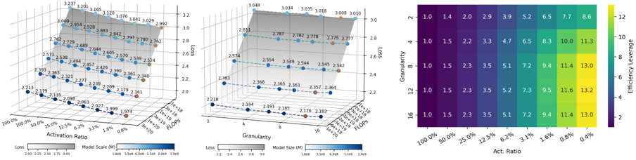
The image contains three visualizations analyzing model performance: two 3D charts and a heatmap. The charts explore relationships between model parameters (activation ratio, model scale, granularity, FLOPs) and performance metrics (loss, efficiency leverage). The heatmap quantifies efficiency leverage across activation ratios and granularity levels.
### Components/Axes
#### Left 3D Chart
- **Axes**:
- **X-axis**: Activation Ratio (0.0% to 100.0%)
- **Y-axis**: Model Scale (M) (1e+18 to 3e+19)
- **Z-axis**: Loss (1.974 to 3.237)
- **Legend**:
- Color gradient for Model Scale (M): Light blue (1e+18) to dark blue (3e+19)
- Shaded area indicates loss range (2.213–3.237)
- **Data Points**:
- Blue dots with numerical labels (e.g., 2.213, 2.277, 3.237)
#### Right 3D Chart
- **Axes**:
- **X-axis**: Granularity (1 to 16)
- **Y-axis**: FLOPs (1e+18 to 3e+19)
- **Z-axis**: Loss (2.118 to 3.008)
- **Legend**:
- Color gradient for Model Size (M): Light blue (1e+18) to dark blue (3e+19)
- Shaded area indicates loss range (2.118–3.008)
- **Data Points**:
- Blue dots with numerical labels (e.g., 2.118, 2.218, 3.008)
#### Heatmap
- **Axes**:
- **X-axis**: Activation Ratio (100.0% to 0.4%)
- **Y-axis**: Granularity (2 to 16)
- **Color Scale**:
- Purple (low) to yellow (high) for Efficiency Leverage (2 to 13.3)
- **Cell Values**:
- Numerical values (e.g., 1.0, 1.4, 2.0, 2.9, 3.3, 4.7, 6.5, 7.7, 8.6)
### Detailed Analysis
#### Left 3D Chart
- **Trend**:
- Loss decreases slightly as Activation Ratio increases (e.g., 3.237 at 0.0% → 2.213 at 100.0%).
- Model Scale (M) correlates with loss: Higher scales (e.g., 3e+19) show higher loss (3.237) compared to lower scales (1e+18, 2.213).
- **Key Data Points**:
- (0.0%, 1e+18, 2.213)
- (100.0%, 3e+19, 3.237)
#### Right 3D Chart
- **Trend**:
- Loss decreases with higher Granularity (e.g., 3.008 at Granularity 1 → 2.118 at Granularity 16).
- FLOPs correlate with loss: Higher FLOPs (e.g., 3e+19) show higher loss (3.008) compared to lower FLOPs (1e+18, 2.118).
- **Key Data Points**:
- (1, 1e+18, 2.118)
- (16, 3e+19, 3.008)
#### Heatmap
- **Trend**:
- Efficiency Leverage increases with both Activation Ratio and Granularity.
- Highest values (13.3) occur at 0.4% Activation Ratio and Granularity 16.
- **Key Data Points**:
- (100.0%, 2): 1.0
- (0.4%, 16): 13.3
### Key Observations
1. **Inverse Relationship**: Lower Activation Ratios and Granularity correlate with higher loss in both 3D charts.
2. **Efficiency Leverage**: The heatmap shows a strong positive correlation between Activation Ratio and Granularity for efficiency leverage.
3. **Model Scale/FLOPs Impact**: Larger models (higher M/FLOPs) exhibit higher loss, suggesting diminishing returns with scale.
### Interpretation
The data suggests that model efficiency (measured by loss and efficiency leverage) is highly sensitive to Activation Ratio and Granularity. While larger models (higher M/FLOPs) achieve lower loss, they also show reduced efficiency leverage. The heatmap indicates that optimizing Activation Ratio and Granularity could significantly improve efficiency without relying solely on model scale. The shaded areas in the 3D charts highlight variability, implying that model performance is not strictly deterministic but influenced by additional factors (e.g., architecture, training data). The inverse relationship between Activation Ratio and loss in the left chart contrasts with the heatmap’s positive trend, suggesting a trade-off between parameter efficiency and computational cost.