\n
## Charts: Model Size vs. Compute & Steps
### Overview
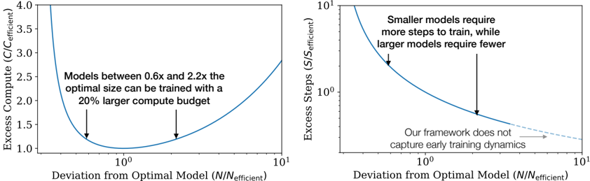
The image presents two charts illustrating the relationship between model size and computational resources. The left chart shows the excess compute required as a function of deviation from the optimal model size, while the right chart shows the excess steps required for training as a function of the same deviation. Both charts use a logarithmic scale on the x-axis.
### Components/Axes
**Left Chart:**
* **X-axis:** Deviation from Optimal Model (N/N<sub>efficient</sub>). Scale is logarithmic, ranging from approximately 0.1 to 10.
* **Y-axis:** Excess Compute (C/C<sub>efficient</sub>). Scale is linear, ranging from approximately 1.0 to 4.0.
* **Curve:** A single blue curve representing the relationship between deviation and excess compute.
* **Annotations:** Two downward-pointing arrows indicating minima on the curve. Text annotation: "Models between 0.6x and 2.2x the optimal size can be trained with a 20% larger compute budget."
**Right Chart:**
* **X-axis:** Deviation from Optimal Model (N/N<sub>efficient</sub>). Scale is logarithmic, ranging from approximately 0.1 to 10.
* **Y-axis:** Excess Steps (S/S<sub>efficient</sub>). Scale is logarithmic, ranging from approximately 10<sup>1</sup> to 10<sup>3</sup>.
* **Curve:** A single blue curve representing the relationship between deviation and excess steps.
* **Annotations:** Two downward-pointing arrows indicating a steep decline in steps required. Text annotation: "Smaller models require more steps to train, while larger models require fewer." Text annotation: "Our framework does not capture early training dynamics" with an arrow pointing to the right side of the curve.
### Detailed Analysis or Content Details
**Left Chart:**
The blue curve exhibits a U-shaped trend. It starts at approximately 1.6 at a deviation of 0.1, decreases to a minimum of approximately 1.1 at a deviation of around 1, and then increases again to approximately 3.8 at a deviation of 10. The two minima are located around deviations of 0.6 and 2.2.
**Right Chart:**
The blue curve shows a steep downward slope initially, then flattens out. It starts at approximately 100 at a deviation of 0.1, rapidly decreases to approximately 10 at a deviation of 1, and then continues to decrease to approximately 2 at a deviation of 10. The curve appears to level off after a deviation of approximately 3.
### Key Observations
* Both charts demonstrate a trade-off between model size and computational resources.
* The left chart shows that deviating from the optimal model size increases compute requirements, but within a certain range (0.6x to 2.2x), the increase is manageable (20%).
* The right chart shows that smaller models require significantly more training steps than larger models.
* The right chart's annotation suggests limitations in the framework's ability to model early training dynamics.
### Interpretation
The data suggests that there is an optimal model size that balances computational efficiency and training time. Deviating from this optimal size incurs costs in either compute or training steps. The left chart indicates a tolerance for model size variation, while the right chart highlights the substantial cost of using smaller models in terms of training time. The logarithmic scales on the x-axes emphasize the non-linear relationship between model size and resources. The annotation on the right chart suggests that the observed trend may not hold for the very early stages of training, indicating a potential area for further investigation or model refinement. The two charts together provide a holistic view of the resource implications of model size selection.