## Line Chart: Warmup Performance of Model Configurations
### Overview
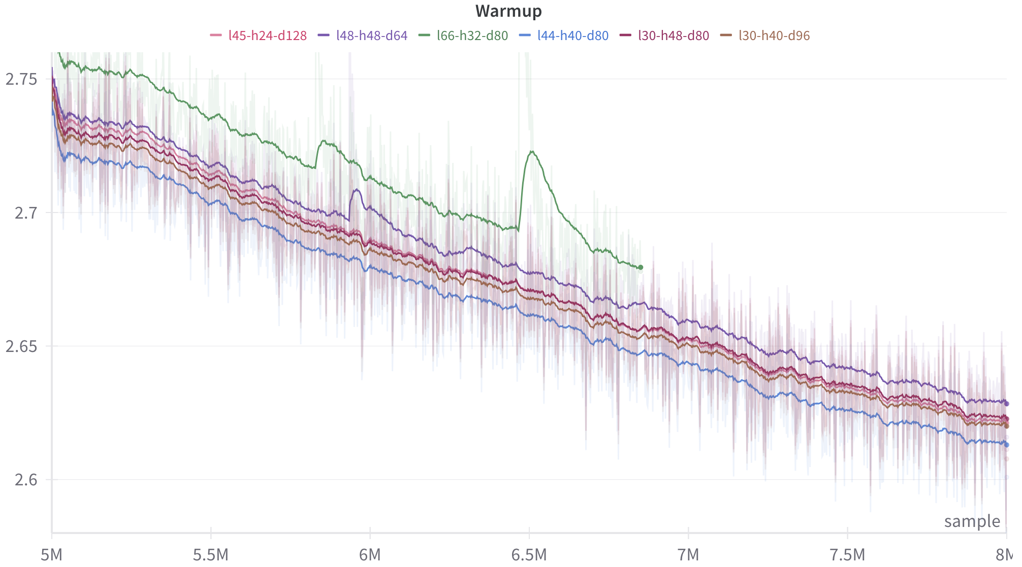
The image displays a line chart titled "Warmup," plotting the performance (likely a loss metric) of six different model configurations over a training period measured in samples. The chart shows a general downward trend for all configurations, indicating improvement (reduction in loss) as training progresses. Each line is accompanied by a shaded region, likely representing variance or confidence intervals.
### Components/Axes
* **Title:** "Warmup" (centered at the top).
* **Legend:** Positioned at the top, below the title. It contains six entries, each with a colored line segment and a label:
* Pink line: `l45-h24-d128`
* Purple line: `l48-h48-d64`
* Green line: `l66-h32-d80`
* Blue line: `l44-h40-d80`
* Dark Red line: `l30-h48-d80`
* Brown line: `l30-h40-d96`
* **X-Axis:** Labeled "sample" (bottom right). The axis has major tick marks at 5M, 5.5M, 6M, 6.5M, 7M, 7.5M, and 8M (where "M" denotes million).
* **Y-Axis:** Unlabeled, but displays numerical values. Major tick marks are at 2.6, 2.65, 2.7, and 2.75. The scale is linear.
### Detailed Analysis
The chart tracks six distinct data series, each corresponding to a model configuration denoted by a label (e.g., `l45-h24-d128`). The labels likely encode architectural parameters (e.g., layers, heads, dimensions).
**Trend Verification & Data Points (Approximate):**
All series exhibit a general downward slope from left (5M samples) to right (8M samples), indicating decreasing loss over time. The lines are noisy, with frequent small fluctuations.
1. **Green Line (`l66-h32-d80`):**
* **Trend:** Starts as the highest line, decreases, but exhibits a significant, sharp upward spike (anomaly) centered around 6.5M samples before resuming its decline.
* **Approximate Values:** Starts near 2.75 at 5M. After the spike, it ends near 2.68 at 8M. It remains the highest line for most of the chart's duration.
2. **Blue Line (`l44-h40-d80`):**
* **Trend:** Consistently the lowest line throughout the plotted range, showing a steady decline.
* **Approximate Values:** Starts near 2.72 at 5M. Ends near 2.61 at 8M.
3. **Purple Line (`l48-h48-d64`):**
* **Trend:** Generally the second-highest line, following a similar path to the green line but without the major spike.
* **Approximate Values:** Starts near 2.74 at 5M. Ends near 2.63 at 8M.
4. **Pink Line (`l45-h24-d128`), Dark Red Line (`l30-h48-d80`), Brown Line (`l30-h40-d96`):**
* **Trend:** These three lines are tightly clustered in the middle of the pack, following very similar downward trajectories. They are often intertwined.
* **Approximate Values:** All start between 2.73 and 2.74 at 5M. They end in a tight cluster between approximately 2.62 and 2.63 at 8M.
**Spatial Grounding:** The legend is centered horizontally at the top. The green line's anomalous spike is a prominent feature in the center of the chart. The blue line occupies the bottom edge of the data cluster. The shaded variance regions are most expansive for the green line, especially around its spike.
### Key Observations
1. **Performance Hierarchy:** A clear, persistent hierarchy exists: `l66-h32-d80` (green) > `l48-h48-d64` (purple) > {`l45-h24-d128`, `l30-h48-d80`, `l30-h40-d96`} (cluster) > `l44-h40-d80` (blue). Lower y-values indicate better performance (lower loss).
2. **Anomaly:** The `l66-h32-d80` (green) configuration experiences a major, temporary performance degradation (loss spike) around 6.5M samples.
3. **Convergence:** By 8M samples, the performance gap between the middle three configurations and the best (green) has narrowed, but the blue configuration maintains a distinct advantage.
4. **Variance:** The shaded regions suggest that the `l66-h32-d80` (green) configuration also exhibits higher variance or instability, particularly around the anomaly.
### Interpretation
This chart visualizes the "warmup" phase of training for different neural network architectures. The y-axis almost certainly represents a loss function (e.g., cross-entropy), where lower is better. The x-axis tracks the number of training samples processed.
The data suggests that architectural choices (encoded in the labels) significantly impact both the final performance and the stability of training. The `l44-h40-d80` (blue) configuration appears to be the most efficient and stable learner within this sample range. The `l66-h32-d80` (green) configuration, while ultimately performing well, suffers from a notable instability event, which could be due to factors like learning rate sensitivity, gradient issues, or data batch characteristics.
The tight clustering of the pink, dark red, and brown lines indicates that their respective architectural differences lead to very similar training dynamics and outcomes in this warmup phase. The chart is crucial for diagnosing training behavior, comparing model variants, and identifying potential instabilities that need to be addressed (e.g., via learning rate scheduling or architectural tweaks). The absence of a y-axis label is a minor omission for a technical document; it should be explicitly stated (e.g., "Validation Loss").