TECHNICAL ASSET FINGERPRINT
b44ab2f8dd8042562dc0d486
Click to view fullscreen
Press ESC or click to close
FOUND IN PAPERS
EXPERT: gemini-2.5-flash-free VERSION 1
RUNTIME: google-free/gemini-2.5-flash
INTEL_VERIFIED
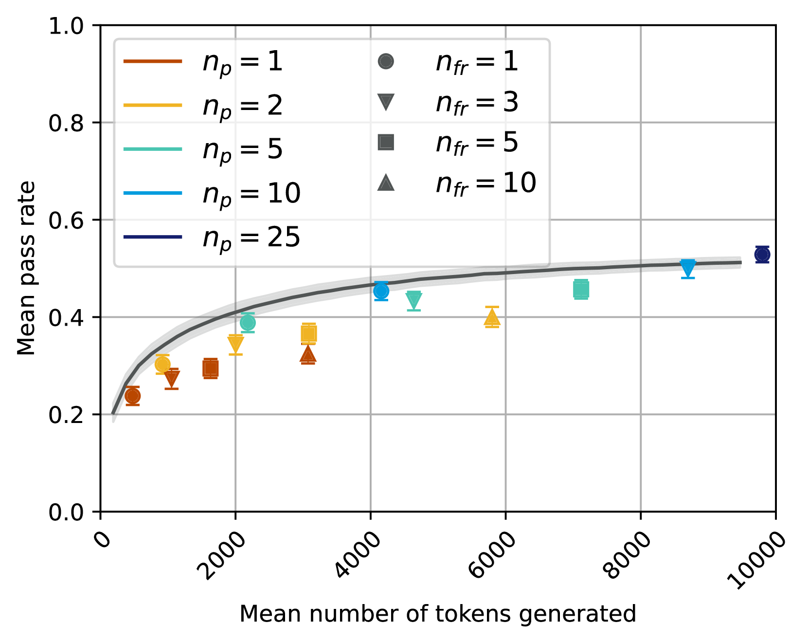
## Chart Type: Scatter Plot with Fitted Curve
### Overview
This image displays a scatter plot illustrating the relationship between "Mean number of tokens generated" on the x-axis and "Mean pass rate" on the y-axis. The data points are categorized by two parameters: `n_p` (represented by color) and `n_fr` (represented by marker shape). A dark grey fitted curve with a lighter grey confidence interval is overlaid on the data, showing the general trend.
### Components/Axes
**X-axis:**
* **Title:** "Mean number of tokens generated"
* **Range:** From 0 to 10000
* **Major Ticks:** 0, 2000, 4000, 6000, 8000, 10000
**Y-axis:**
* **Title:** "Mean pass rate"
* **Range:** From 0.0 to 1.0
* **Major Ticks:** 0.0, 0.2, 0.4, 0.6, 0.8, 1.0
**Legend (positioned in the top-center of the plot area):**
The legend is split into two columns. The left column defines `n_p` values by line color, and the right column defines `n_fr` values by marker shape.
* **n_p** (Line Colors):
* `n_p = 1`: Brown line
* `n_p = 2`: Goldenrod/Yellow-orange line
* `n_p = 5`: Teal/Light blue-green line
* `n_p = 10`: Blue line
* `n_p = 25`: Dark blue/Navy line
* **n_fr** (Marker Shapes):
* `n_fr = 1`: Dark grey circle
* `n_fr = 3`: Dark grey inverted triangle
* `n_fr = 5`: Dark grey square
* `n_fr = 10`: Dark grey triangle
**Fitted Curve:**
* A solid dark grey line represents the central trend.
* A lighter grey shaded area surrounds the dark grey line, indicating the confidence interval or uncertainty of the fit. The curve starts near (0, 0.2) and increases, then flattens out, reaching approximately (9500, 0.52).
### Detailed Analysis
The plot shows individual data points, each representing a specific combination of `n_p` and `n_fr` values, plotted against the mean number of tokens generated and the mean pass rate.
**Overall Trend of Fitted Curve:**
The dark grey fitted curve shows a clear positive correlation: as the "Mean number of tokens generated" increases, the "Mean pass rate" generally increases. This increase is initially steep and then gradually flattens out, suggesting a diminishing return on pass rate for very high numbers of tokens generated. The curve starts around a pass rate of 0.2 and approaches a plateau around 0.5 to 0.52. The confidence interval is relatively narrow, indicating a consistent trend.
**Data Points by `n_p` and `n_fr`:**
* **`n_p = 1` (Brown colored points):**
* `n_fr = 1` (Circle): Approximately (1000 tokens, 0.24 pass rate)
* `n_fr = 3` (Inverted Triangle): Approximately (1500 tokens, 0.28 pass rate)
* `n_fr = 5` (Square): Approximately (2000 tokens, 0.30 pass rate)
* `n_fr = 10` (Triangle): Approximately (3000 tokens, 0.32 pass rate)
* *Trend:* For `n_p = 1`, increasing `n_fr` generally corresponds to a higher number of tokens generated and a slightly higher pass rate.
* **`n_p = 2` (Goldenrod/Yellow-orange colored points):**
* `n_fr = 1` (Circle): Approximately (1200 tokens, 0.29 pass rate)
* `n_fr = 3` (Inverted Triangle): Approximately (2000 tokens, 0.35 pass rate)
* `n_fr = 5` (Square): Approximately (3000 tokens, 0.37 pass rate)
* `n_fr = 10` (Triangle): Approximately (5800 tokens, 0.40 pass rate)
* *Trend:* Similar to `n_p = 1`, increasing `n_fr` generally leads to more tokens and a higher pass rate. These points are generally above the `n_p = 1` points for similar token counts.
* **`n_p = 5` (Teal/Light blue-green colored points):**
* `n_fr = 1` (Circle): Approximately (1500 tokens, 0.35 pass rate)
* `n_fr = 3` (Inverted Triangle): Approximately (4500 tokens, 0.43 pass rate)
* `n_fr = 5` (Square): Approximately (7000 tokens, 0.46 pass rate)
* `n_fr = 10` (Triangle): Approximately (4000 tokens, 0.38 pass rate)
* *Trend:* These points show a general increase in pass rate with tokens. The `n_fr = 10` point is an outlier in terms of token count compared to the `n_fr = 3` and `n_fr = 5` points for this `n_p` value, having fewer tokens but a slightly lower pass rate than `n_fr = 3`.
* **`n_p = 10` (Blue colored points):**
* `n_fr = 1` (Circle): Approximately (4200 tokens, 0.46 pass rate)
* `n_fr = 3` (Inverted Triangle): Approximately (8800 tokens, 0.50 pass rate)
* `n_fr = 5` (Square): Approximately (4800 tokens, 0.45 pass rate)
* `n_fr = 10` (Triangle): Approximately (7500 tokens, 0.49 pass rate)
* *Trend:* These points generally follow the fitted curve, showing higher pass rates at higher token counts. The `n_fr = 5` point has a slightly lower pass rate than `n_fr = 1` despite more tokens.
* **`n_p = 25` (Dark blue/Navy colored points):**
* `n_fr = 1` (Circle): Approximately (9500 tokens, 0.52 pass rate)
* *Note:* Only one data point is plotted for `n_p = 25`. This point is the highest in both tokens generated and pass rate among all plotted points, and it sits at the upper end of the fitted curve's plateau.
### Key Observations
* **General Improvement:** There's a clear positive correlation between the mean number of tokens generated and the mean pass rate, up to a certain point where the pass rate plateaus.
* **Impact of `n_p`:** Higher values of `n_p` (represented by colors from brown to dark blue) generally correspond to higher mean pass rates for a given range of tokens generated, or require more tokens to achieve similar pass rates. The `n_p = 25` point achieves the highest pass rate observed.
* **Impact of `n_fr`:** For a fixed `n_p`, increasing `n_fr` (represented by marker shapes from circle to triangle) generally leads to an increase in the mean number of tokens generated and often a corresponding increase in the mean pass rate.
* **Diminishing Returns:** The fitted curve indicates that beyond approximately 8000 tokens generated, the increase in mean pass rate becomes marginal, suggesting a point of diminishing returns.
* **Data Density:** The data points are more densely clustered at lower token counts (below 4000) and become sparser at higher token counts.
### Interpretation
The chart suggests that both `n_p` and `n_fr` parameters influence the performance, measured by "Mean pass rate," and the computational cost, measured by "Mean number of tokens generated."
Increasing `n_p` appears to be a primary driver for achieving higher pass rates, as evidenced by the `n_p = 25` point reaching the highest pass rate. However, this often comes at the cost of generating more tokens.
Similarly, increasing `n_fr` generally pushes the system towards generating more tokens and, consequently, achieving higher pass rates. This implies that `n_fr` might be related to the thoroughness or breadth of the generation process, leading to more tokens and better outcomes.
The flattening of the fitted curve is a critical insight. It indicates that there is an upper limit to the "Mean pass rate" that can be achieved, regardless of how many more tokens are generated. This suggests that optimizing for pass rate beyond a certain token generation threshold might be inefficient, as the gains become negligible. Researchers or practitioners might use this information to find an optimal balance between computational cost (tokens generated) and performance (pass rate) by selecting appropriate `n_p` and `n_fr` values that fall within the steep part of the curve before the plateau. For instance, achieving a pass rate of ~0.45-0.46 might be possible with around 4000-5000 tokens (e.g., `n_p = 10, n_fr = 1` or `n_p = 5, n_fr = 3`), while pushing to ~0.50-0.52 requires significantly more tokens (e.g., `n_p = 10, n_fr = 3` or `n_p = 25, n_fr = 1`).
DECODING INTELLIGENCE...