## Combined Line Charts: Epsilon Opt vs. Alpha/L and Overlaps vs. Alpha/L
### Overview
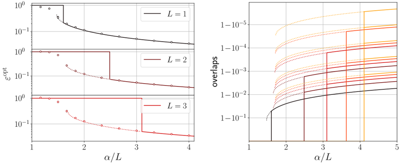
The image presents two line charts side-by-side. The left chart displays epsilon optimal (εopt) as a function of alpha/L (α/L) for three different values of L (1, 2, and 3). The right chart shows overlaps as a function of alpha/L (α/L). Both charts use a logarithmic scale for the y-axis.
### Components/Axes
**Left Chart:**
* **Title:** Implicitly, "Epsilon Opt vs. Alpha/L"
* **Y-axis:** εopt (epsilon optimal), logarithmic scale. Axis markers at 10^-1 and 10^0.
* **X-axis:** α/L (alpha/L), linear scale. Axis markers at 1, 2, 3, and 4.
* **Legend:** Located in the top-right corner of the left chart.
* L = 1 (Black line)
* L = 2 (Brown line)
* L = 3 (Red line)
**Right Chart:**
* **Title:** Implicitly, "Overlaps vs. Alpha/L"
* **Y-axis:** overlaps, logarithmic scale. Axis markers at 1e-1, 1e-2, 1e-3, 1e-4, and 1e-5.
* **X-axis:** α/L (alpha/L), linear scale. Axis markers at 1, 2, 3, 4, and 5.
* **Legend:** Implicit, colors correspond to different parameter values, but no explicit legend is provided. Colors range from black to yellow.
### Detailed Analysis
**Left Chart:**
* **L = 1 (Black):** The black line starts at approximately 1.0 for α/L = 1. It remains constant until approximately α/L = 1.5, then decreases sharply, following a curve with superimposed circles.
* **L = 2 (Brown):** The brown line starts at approximately 1.0 for α/L = 1. It remains constant until approximately α/L = 2.5, then drops to approximately 0.07 and remains constant. A dotted brown line with circles follows a curve that decreases from α/L = 1 to α/L = 4.
* **L = 3 (Red):** The red line starts at approximately 1.0 for α/L = 1. It remains constant until approximately α/L = 3, then drops to approximately 0.05 and remains constant. A dotted red line with circles follows a curve that decreases from α/L = 1 to α/L = 4.
**Right Chart:**
* **Black Line:** The black line starts at approximately 0 for α/L = 1. It remains at 0 until approximately α/L = 1.5, then increases sharply to approximately 0.01 at α/L = 2, and continues to increase gradually.
* **Other Lines (Brown to Yellow):** There are multiple lines, some solid and some dotted, ranging in color from brown to yellow. These lines generally increase with α/L. The solid lines exhibit step-like increases, while the dotted lines increase more smoothly. The dotted lines are above the solid lines of similar color.
### Key Observations
* In the left chart, as L increases, the point at which εopt drops shifts to the right (higher α/L values).
* In the right chart, the overlaps generally increase with α/L. The dotted lines consistently show higher overlap values than the solid lines of similar color.
### Interpretation
The left chart likely represents the performance of an optimization algorithm, where εopt represents the error or loss. The parameter L seems to influence the threshold at which the error starts to decrease as α/L increases. The right chart shows how overlaps between different solutions or states change with α/L. The step-like increases in the solid lines might indicate phase transitions or critical points. The dotted lines could represent a different type of overlap or a different regime of the system. The data suggests that increasing α/L generally leads to higher overlaps, and the parameter L in the left chart affects the optimal operating point.