## Line Graph: Loss Scaling Curves Comparison
### Overview
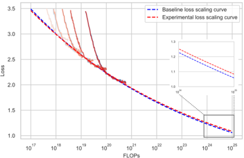
The image presents a line graph comparing two loss scaling curves: a "Baseline loss scaling curve" (dashed blue line) and an "Experimental loss scaling curve" (dashed red line). The graph illustrates how loss decreases as computational resources (measured in FLOPs) increase. An inset graph provides a zoomed-in view of the lower FLOPs range (10¹⁸–10²⁰).
---
### Components/Axes
- **X-axis (FLOPs)**: Logarithmic scale from 10¹⁷ to 10²⁵.
- **Y-axis (Loss)**: Linear scale from 1.0 to 3.5.
- **Legend**: Located in the top-right corner, with:
- Dashed blue line labeled "Baseline loss scaling curve."
- Dashed red line labeled "Experimental loss scaling curve."
- **Inset Graph**: Positioned in the bottom-right corner, with:
- X-axis: 10¹⁸ to 10²⁰ (logarithmic).
- Y-axis: 1.0 to 1.3 (linear).
- Dashed lines mirroring the main graph's curves.
---
### Detailed Analysis
1. **Main Graph Trends**:
- Both curves exhibit a **negative slope**, indicating loss decreases as FLOPs increase.
- The **Experimental curve (red)** starts slightly above the Baseline (blue) at lower FLOPs (10¹⁷–10²⁰) but **crosses below** the Baseline curve around 10²² FLOPs.
- At the highest FLOPs (10²⁴–10²⁵), the Experimental curve achieves a loss of ~1.0, while the Baseline remains ~1.2.
2. **Inset Graph**:
- Focuses on the range 10¹⁸–10²⁰ FLOPs.
- The Experimental curve (red) begins at ~1.25 loss at 10¹⁸ FLOPs and declines to ~1.1 at 10²⁰ FLOPs.
- The Baseline curve (blue) starts at ~1.2 and declines to ~1.1 over the same range.
3. **Data Points**:
- **Crossover Point**: Experimental curve overtakes Baseline at ~10²² FLOPs (main graph).
- **Inset Data**: Experimental curve consistently outperforms Baseline in the 10¹⁸–10²⁰ FLOPs range.
---
### Key Observations
- The Experimental curve demonstrates **superior scalability** at higher FLOPs, achieving lower loss than the Baseline.
- The Baseline curve shows diminishing returns at higher FLOPs, with loss plateauing near 1.2.
- The inset highlights that the Experimental curve’s advantage becomes significant only at very high FLOPs (10²²+).
---
### Interpretation
The data suggests that the Experimental method is **more computationally efficient** than the Baseline for large-scale computations. While both approaches converge at lower FLOPs, the Experimental curve’s steeper decline implies better optimization for high-resource scenarios. This could inform decisions in resource-constrained environments, where prioritizing the Experimental method may yield better performance despite higher initial costs. The crossover point (~10²² FLOPs) marks a critical threshold where the Experimental approach becomes advantageous.