## Scatter Plot: A-mem vs. Base
### Overview
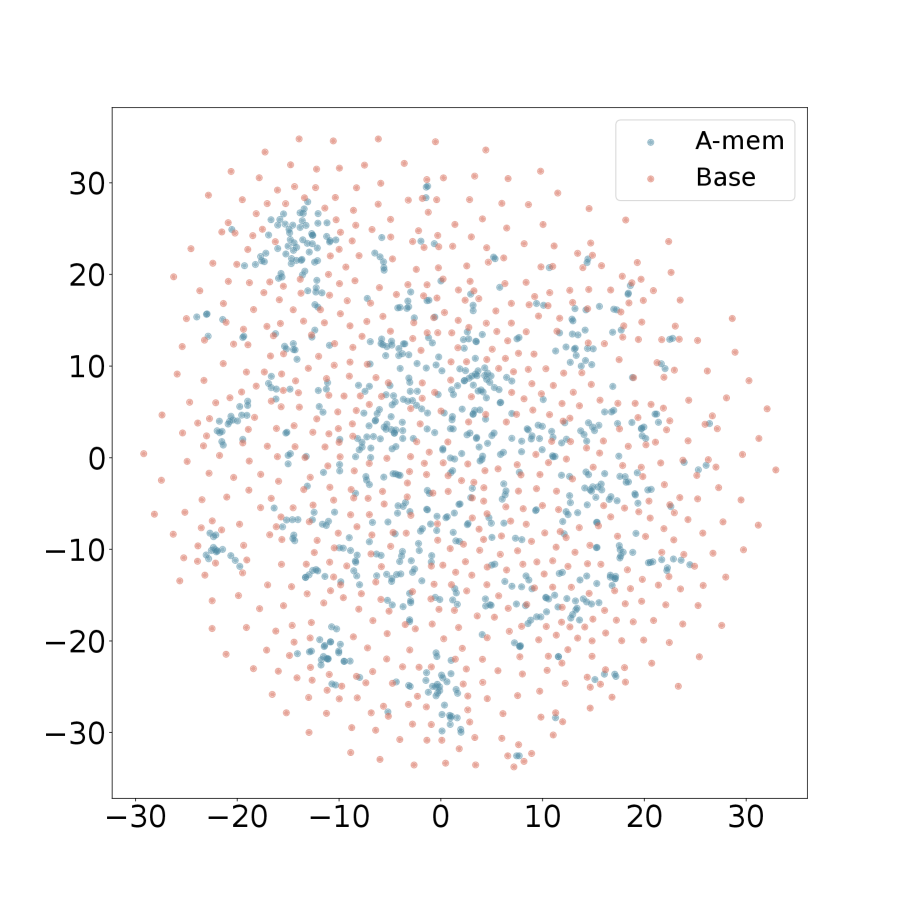
The image is a scatter plot displaying the distribution of two datasets, labeled "A-mem" and "Base". The plot shows the data points scattered across a two-dimensional space, with the x and y axes ranging from approximately -30 to 30. The "A-mem" data points are colored light blue, while the "Base" data points are colored light red.
### Components/Axes
* **X-axis:** Ranges from -30 to 30, with tick marks at -30, -20, -10, 0, 10, 20, and 30.
* **Y-axis:** Ranges from -30 to 30, with tick marks at -30, -20, -10, 0, 10, 20, and 30.
* **Legend:** Located in the top-right corner.
* "A-mem": Represented by light blue data points.
* "Base": Represented by light red data points.
### Detailed Analysis
* **A-mem (Light Blue):** The light blue data points appear to be clustered in certain regions of the plot, forming denser groups.
* **Base (Light Red):** The light red data points are more evenly distributed across the plot, with a slightly higher density in the central region.
### Key Observations
* The "A-mem" data points show a tendency to cluster, suggesting some underlying structure or relationship within that dataset.
* The "Base" data points are more dispersed, indicating a more uniform distribution across the space.
* There is some overlap between the two datasets, but the clustering of "A-mem" allows for visual differentiation.
### Interpretation
The scatter plot visualizes the distribution of two datasets, "A-mem" and "Base," in a two-dimensional space. The clustering observed in the "A-mem" dataset suggests that its data points share some common characteristics or relationships that are not as apparent in the "Base" dataset. The more uniform distribution of "Base" data points could indicate a lack of strong correlations or a more random distribution. The plot allows for a visual comparison of the two datasets and highlights the differences in their spatial distribution.