## Horizontal Bar Chart: R1-Llama | AIME24
### Overview
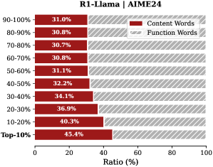
The image displays a horizontal bar chart titled "R1-Llama | AIME24". It compares the percentage ratio of "Content Words" versus "Function Words" across different percentile-based categories, likely representing performance or data distribution tiers. The chart uses two distinct visual styles for the bars to differentiate the two word types.
### Components/Axes
* **Chart Title:** "R1-Llama | AIME24" (Top-center).
* **Y-Axis (Vertical):** Lists percentile-based categories. From top to bottom:
* 90-100%
* 80-90%
* 70-80%
* 60-70%
* 50-60%
* 40-50%
* 30-40%
* 20-30%
* 10-20%
* Top-10%
* **X-Axis (Horizontal):** Labeled "Ratio (%)". The scale runs from 0 to 100 with major tick marks at 0, 20, 40, 60, 80, and 100.
* **Legend:** Positioned in the top-right corner of the chart area.
* A solid red rectangle is labeled "Content Words".
* A red rectangle with diagonal white hatching is labeled "Function Words".
* **Data Bars:** For each y-axis category, there are two horizontal bars:
* A solid red bar representing the "Content Words" ratio.
* A hatched red bar representing the "Function Words" ratio.
* Each bar has its exact percentage value printed inside or at its end.
### Detailed Analysis
The chart presents the following data points for each category (Content Words, Function Words):
* **90-100%:** Content Words: 31.0%, Function Words: 30.8%
* **80-90%:** Content Words: 30.8%, Function Words: 30.7%
* **70-80%:** Content Words: 30.7%, Function Words: 30.8%
* **60-70%:** Content Words: 30.8%, Function Words: 31.1%
* **50-60%:** Content Words: 31.1%, Function Words: 32.2%
* **40-50%:** Content Words: 32.2%, Function Words: 34.1%
* **30-40%:** Content Words: 34.1%, Function Words: 36.9%
* **20-30%:** Content Words: 36.9%, Function Words: 40.3%
* **10-20%:** Content Words: 40.3%, Function Words: 45.4%
* **Top-10%:** Content Words: 45.4%, Function Words: 40.3%
**Visual Trend:** For both word types, the ratio generally increases as the percentile category decreases (moving down the y-axis), peaking in the "10-20%" or "Top-10%" range. The "Content Words" ratio is consistently higher than the "Function Words" ratio in the top four categories (90-100% down to 60-70%). The relationship inverts in the middle categories (50-60% to 10-20%), where "Function Words" have a higher ratio. The trend inverts again for the final "Top-10%" category, where "Content Words" regain a significantly higher ratio.
### Key Observations
1. **Inversion Point:** The relative dominance of Content vs. Function words flips twice. Content words lead in the highest and lowest percentile brackets, while Function words lead in the middle brackets.
2. **Peak Values:** The highest ratio for "Content Words" is 45.4% in the "Top-10%" category. The highest ratio for "Function Words" is 45.4% in the "10-20%" category.
3. **Smallest Difference:** The ratios are nearly identical in the "80-90%" and "70-80%" categories, with differences of only 0.1%.
4. **Largest Difference:** The most significant gap is in the "Top-10%" category, where "Content Words" exceed "Function Words" by 5.1 percentage points.
5. **Data Structure:** The categories appear to be ordered from highest percentile range (90-100%) at the top to a specific "Top-10%" group at the bottom, which may be a distinct aggregate.
### Interpretation
This chart likely analyzes the composition of text data processed or generated by the "R1-Llama" model on the "AIME24" dataset or benchmark. The "Ratio (%)" probably represents the proportion of total words that are either content words (nouns, verbs, adjectives carrying semantic meaning) or function words (articles, prepositions, conjunctions providing grammatical structure) within different performance tiers.
The data suggests a non-linear relationship between word type prevalence and the percentile metric (which could be accuracy, difficulty, or another score). The inversion pattern is notable:
* In the **highest-performing tiers (90-100% to 60-70%)**, content words are slightly more prevalent. This could indicate that high-performance outputs or inputs are characterized by a richer semantic core.
* In the **middle tiers (50-60% to 10-20%)**, function words become more dominant. This might reflect more complex grammatical structures or perhaps more verbose, less semantically dense text in these ranges.
* The **"Top-10%" category** shows a strong resurgence of content words. If this category represents the absolute best performance, it strongly implies that top-tier results are achieved through highly focused, semantically rich language, minimizing structural filler.
The chart reveals that the balance between meaning-carrying and structure-providing words is a key differentiator across performance levels in this specific context. The "Top-10%" result is particularly striking, suggesting a qualitative shift in language composition at the very highest level.