## Stacked Bar Chart: Comparison of Approaches
### Overview
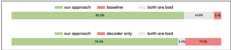
The image presents a stacked bar chart comparing the performance of "our approach" against two different baselines: "baseline" and "decoder only". The chart shows the percentage breakdown of outcomes, categorized as "our approach", "baseline" or "decoder only", and "both are bad". There are two stacked bars, one for each baseline comparison.
### Components/Axes
* **Chart Type:** Stacked Bar Chart
* **Categories:** Two comparisons are shown as two stacked bars.
* **Legend (Top):**
* Green: "our approach"
* Red: "baseline"
* Gray (with dots): "both are bad"
* **Legend (Bottom):**
* Green: "our approach"
* Red: "decoder only"
* Gray (with dots): "both are bad"
* **Values:** Percentages are displayed within each segment of the stacked bars.
### Detailed Analysis
**Top Bar (Comparison with "baseline"):**
* **"our approach" (Green):** 82.0%
* **"both are bad" (Gray):** 14.9%
* **"baseline" (Red):** 3.1%
**Bottom Bar (Comparison with "decoder only"):**
* **"our approach" (Green):** 79.4%
* **"both are bad" (Gray):** 3.4%
* **"decoder only" (Red):** 17.2%
### Key Observations
* "Our approach" consistently accounts for the largest percentage in both comparisons (82.0% and 79.4%).
* The "decoder only" baseline results in a significantly higher percentage (17.2%) compared to the "baseline" (3.1%).
* The "both are bad" category is relatively small in both comparisons (14.9% and 3.4%).
### Interpretation
The data suggests that "our approach" outperforms both the "baseline" and "decoder only" methods. The significant difference between the "baseline" and "decoder only" percentages indicates that the "decoder only" method is less effective than the "baseline" method. The relatively low percentages for "both are bad" suggest that "our approach" is generally successful, even when compared to the other methods. The stacked bar chart effectively visualizes the relative performance of "our approach" against the two baselines, highlighting its superiority.