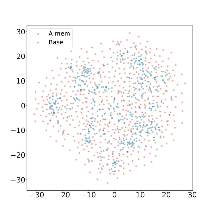
## Scatter Plot: A-mem vs. Base
### Overview
The image is a scatter plot comparing two datasets, labeled "A-mem" and "Base." The plot displays the distribution of data points for each dataset across a two-dimensional space. The x and y axes range from approximately -30 to 30.
### Components/Axes
* **X-axis:** Ranges from -30 to 30, with tick marks at -30, -20, -10, 0, 10, 20, and 30.
* **Y-axis:** Ranges from -30 to 30, with tick marks at -30, -20, -10, 0, 10, 20, and 30.
* **Legend:** Located in the top-left corner.
* "A-mem": Represented by light blue data points.
* "Base": Represented by light red data points.
### Detailed Analysis
* **A-mem (Light Blue):** The light blue data points appear to be clustered in several regions. There are clusters around (-10, 15), (10, -10), (-10, -10), and (10, 15).
* **Base (Light Red):** The light red data points are more evenly distributed across the space, with a higher density towards the edges of the plot.
### Key Observations
* The "A-mem" dataset shows distinct clustering, suggesting some underlying structure or grouping within the data.
* The "Base" dataset appears more uniformly distributed, indicating a lack of strong clustering.
* There is some overlap between the two datasets, particularly in the central region of the plot.
### Interpretation
The scatter plot visualizes the distribution of two datasets, "A-mem" and "Base," in a two-dimensional space. The clustering observed in the "A-mem" dataset suggests that its data points share some common characteristics or relationships, while the more uniform distribution of the "Base" dataset indicates a lack of such structure. The plot allows for a visual comparison of the two datasets and highlights their differences in distribution patterns. The clustering of "A-mem" could indicate that this data is more structured or has more dependencies than the "Base" data.