## Line Chart: Accuracy vs. Sample Size (k)
### Overview
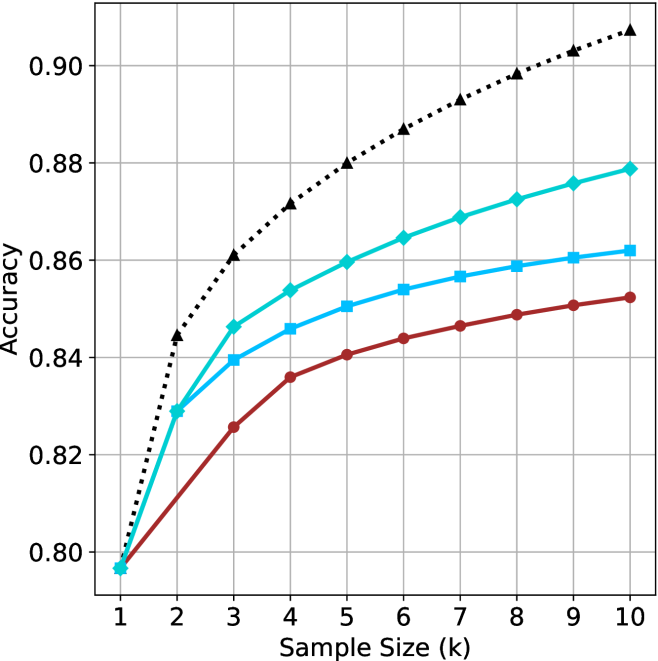
This image is a line chart illustrating the relationship between "Sample Size (k)" and "Accuracy" across four distinct data series. All four series originate from a single point at the minimum sample size (k=1) and diverge as the sample size increases to 10. The chart demonstrates a positive correlation between sample size and accuracy, characterized by a curve of diminishing returns.
**Note:** There is no legend provided in the image to identify what each specific line represents (e.g., different models, algorithms, or datasets). The lines are identified below by their visual characteristics (color and marker shape).
### Components/Axes
* **X-Axis:** Labeled "Sample Size (k)". The scale is linear, ranging from 1 to 10 in integer increments.
* **Y-Axis:** Labeled "Accuracy". The scale ranges from 0.80 to 0.90, with grid lines provided at intervals of 0.02 (0.80, 0.82, 0.84, 0.86, 0.88, 0.90).
* **Data Series (4 total):**
1. **Black Dotted Line:** Marked with triangles.
2. **Teal Solid Line:** Marked with diamonds.
3. **Light Blue Solid Line:** Marked with squares.
4. **Dark Red Solid Line:** Marked with circles.
### Detailed Analysis
All four data series exhibit an upward trend, with the steepest rate of increase occurring between k=1 and k=3. Beyond k=4, the rate of improvement slows significantly for all series.
**Data Point Estimates (Approximate):**
| Sample Size (k) | Black (Dotted/Tri) | Teal (Solid/Dia) | Light Blue (Solid/Sq) | Dark Red (Solid/Cir) |
| :--- | :--- | :--- | :--- | :--- |
| **1** | ~0.797 | ~0.797 | ~0.797 | ~0.797 |
| **2** | ~0.844 | ~0.829 | ~0.829 | ~0.812 |
| **3** | ~0.861 | ~0.846 | ~0.840 | ~0.826 |
| **4** | ~0.872 | ~0.854 | ~0.846 | ~0.836 |
| **5** | ~0.880 | ~0.860 | ~0.851 | ~0.841 |
| **6** | ~0.887 | ~0.865 | ~0.854 | ~0.844 |
| **7** | ~0.893 | ~0.869 | ~0.857 | ~0.847 |
| **8** | ~0.898 | ~0.873 | ~0.859 | ~0.849 |
| **9** | ~0.903 | ~0.876 | ~0.861 | ~0.851 |
| **10** | ~0.908 | ~0.879 | ~0.862 | ~0.853 |
### Key Observations
* **Convergence:** All four series start at the exact same accuracy value (~0.797) at k=1.
* **Performance Hierarchy:** The Black Dotted line is the top-performing series across the entire range (k > 1). The Teal line is the second-best, followed by the Light Blue line, with the Dark Red line performing the worst.
* **Divergence:** The gap between the top-performing series (Black) and the others increases significantly as the sample size grows. At k=10, the Black line is at ~0.908, while the Dark Red line is at ~0.853, a difference of approximately 0.055.
* **Clustering:** The three solid-line series (Teal, Light Blue, Dark Red) are clustered closer to each other than they are to the Black Dotted line, suggesting the Black Dotted configuration may be fundamentally different or optimized compared to the others.
### Interpretation
This chart is characteristic of performance evaluation in machine learning, likely representing the accuracy of a model (or ensemble) as the number of samples (k) increases.
* **Diminishing Returns:** The "elbow" shape of the curves indicates that increasing the sample size provides the most significant accuracy gains at lower values (k=1 to k=3). After k=5, the marginal utility of adding more samples decreases, suggesting that the computational cost of increasing k further might outweigh the minimal accuracy gains.
* **Baseline Performance:** The convergence at k=1 suggests that with a single sample, all four configurations are effectively performing the same task or using the same baseline logic, resulting in identical accuracy.
* **Model Superiority:** The Black Dotted line represents a configuration that scales much better with increased sample size than the other three. If this were a k-Nearest Neighbors algorithm, the Black line might represent a more robust distance metric or a different weighting scheme. The Dark Red line, being the lowest, suggests the least effective configuration for scaling with sample size.