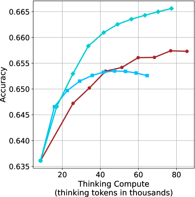
## Line Chart: Accuracy vs. Thinking Compute
### Overview
The image is a line chart comparing the accuracy of different models as a function of "Thinking Compute" (measured in thousands of tokens). There are three data series represented by lines of different colors (cyan, blue, and brown), each showing how accuracy changes with increasing compute.
### Components/Axes
* **X-axis:** "Thinking Compute (thinking tokens in thousands)". The axis ranges from approximately 0 to 80 in increments of 20.
* **Y-axis:** "Accuracy". The axis ranges from 0.635 to 0.665 in increments of 0.005.
* **Data Series:**
* Cyan line with diamond markers.
* Blue line with square markers.
* Brown line with circle markers.
* **Gridlines:** Present in both horizontal and vertical directions.
### Detailed Analysis
* **Cyan Line (Diamond Markers):** This line shows a generally upward trend, indicating increasing accuracy with increasing thinking compute.
* At x=10, y ≈ 0.636
* At x=20, y ≈ 0.647
* At x=30, y ≈ 0.653
* At x=40, y ≈ 0.661
* At x=50, y ≈ 0.663
* At x=60, y ≈ 0.664
* At x=70, y ≈ 0.665
* At x=80, y ≈ 0.666
* **Blue Line (Square Markers):** This line initially increases, peaks around x=40, and then decreases slightly.
* At x=10, y ≈ 0.636
* At x=20, y ≈ 0.652
* At x=30, y ≈ 0.653
* At x=40, y ≈ 0.654
* At x=50, y ≈ 0.653
* At x=60, y ≈ 0.652
* **Brown Line (Circle Markers):** This line shows an upward trend, plateauing after x=60.
* At x=10, y ≈ 0.636
* At x=20, y ≈ 0.647
* At x=30, y ≈ 0.650
* At x=40, y ≈ 0.653
* At x=50, y ≈ 0.656
* At x=60, y ≈ 0.656
* At x=70, y ≈ 0.657
* At x=80, y ≈ 0.657
### Key Observations
* The cyan line consistently outperforms the other two in terms of accuracy across the range of thinking compute.
* The blue line reaches a peak accuracy and then declines, suggesting a point of diminishing returns or potential overfitting.
* The brown line shows a steady increase in accuracy, but plateaus at higher compute values.
### Interpretation
The chart suggests that increasing "Thinking Compute" generally improves model accuracy, but the extent of improvement varies depending on the model (represented by the different colored lines). The cyan model benefits most from increased compute, while the blue model shows a point where further compute does not lead to better accuracy, and may even decrease it. The brown model shows diminishing returns at higher compute levels. This information is valuable for determining the optimal allocation of computational resources for each model to achieve the best performance.