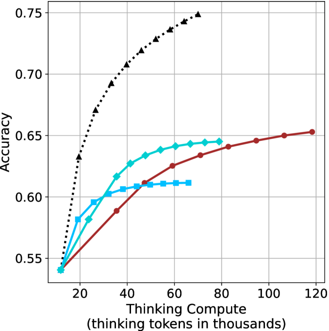
## Chart: Accuracy vs. Thinking Compute
### Overview
The image is a line chart comparing the accuracy of different models as a function of "Thinking Compute," measured in thousands of thinking tokens. There are three distinct data series represented by different colored lines with different markers. The chart shows how accuracy improves with increased computational resources for each model.
### Components/Axes
* **X-axis:** Thinking Compute (thinking tokens in thousands). The axis ranges from approximately 10 to 120, with major tick marks at intervals of 20.
* **Y-axis:** Accuracy. The axis ranges from 0.55 to 0.75, with major tick marks at intervals of 0.05.
* **Data Series:**
* **Black dotted line with triangle markers:** This line shows the highest accuracy and increases rapidly at first, then plateaus.
* **Teal line with diamond markers:** This line shows intermediate accuracy and increases steadily before plateauing.
* **Brown line with circle markers:** This line shows the lowest accuracy and increases steadily before plateauing.
* **Light Blue line with square markers:** This line shows intermediate accuracy and increases steadily before plateauing at a lower level than the teal line.
### Detailed Analysis
* **Black dotted line (triangle markers):**
* Trend: Rapid initial increase, then plateaus.
* Data Points:
* (15, 0.55)
* (25, 0.63)
* (35, 0.68)
* (50, 0.72)
* (65, 0.74)
* (70, 0.75)
* **Teal line (diamond markers):**
* Trend: Steady increase, then plateaus.
* Data Points:
* (15, 0.54)
* (25, 0.58)
* (35, 0.61)
* (45, 0.63)
* (60, 0.64)
* **Brown line (circle markers):**
* Trend: Steady increase, then plateaus.
* Data Points:
* (20, 0.55)
* (40, 0.59)
* (60, 0.62)
* (80, 0.64)
* (100, 0.65)
* (120, 0.65)
* **Light Blue line (square markers):**
* Trend: Steady increase, then plateaus.
* Data Points:
* (15, 0.54)
* (30, 0.60)
* (45, 0.61)
* (60, 0.61)
### Key Observations
* The black dotted line (triangle markers) achieves the highest accuracy with the least amount of thinking compute.
* The brown line (circle markers) requires the most thinking compute to reach its maximum accuracy.
* All lines show diminishing returns as thinking compute increases, indicating a plateau in accuracy.
* The light blue line (square markers) plateaus at a lower accuracy level compared to the teal line (diamond markers) and the brown line (circle markers).
### Interpretation
The chart illustrates the trade-off between computational resources (thinking tokens) and model accuracy. The black dotted line (triangle markers) represents a more efficient model, achieving higher accuracy with fewer resources. The other lines represent models that require more computational power to achieve comparable or lower accuracy. The plateauing effect suggests that there is a limit to how much accuracy can be gained by simply increasing computational resources, and that other factors, such as model architecture or training data, may play a more significant role beyond a certain point. The light blue line (square markers) may represent a model with inherent limitations, as it plateaus at a lower accuracy level despite increasing computational resources.