## Line Chart: Accuracy vs. Thinking Compute
### Overview
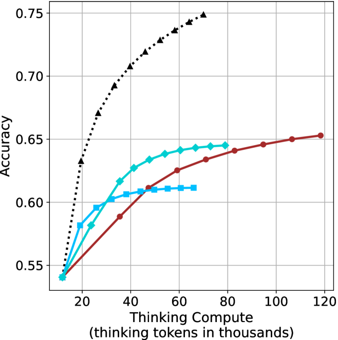
This image is a line chart illustrating the relationship between "Thinking Compute" (measured in thousands of thinking tokens) and "Accuracy" for four distinct data series. The chart demonstrates diminishing returns on accuracy as the amount of compute increases, with each series representing a different performance profile.
### Components/Axes
* **Y-Axis (Vertical):** Labeled "Accuracy". The scale ranges from 0.55 to 0.75, with major grid lines at 0.05 intervals.
* **X-Axis (Horizontal):** Labeled "Thinking Compute (thinking tokens in thousands)". The scale ranges from 20 to 120, with major grid lines at 20-unit intervals.
* **Data Series (Legend-less):** There is no explicit legend. The series are distinguished by color and marker shape:
* **Black Dotted Line:** Triangle markers.
* **Cyan Solid Line:** Diamond markers.
* **Blue Solid Line:** Square markers.
* **Red/Brown Solid Line:** Circle markers.
### Detailed Analysis
All four data series originate from a common starting point at approximately **(12k, 0.54)**.
#### 1. Black Dotted Line (Triangles)
* **Trend:** This series exhibits the steepest upward slope, indicating the highest efficiency in gaining accuracy per unit of compute.
* **Data Points (Approximate):**
* Starts at ~12k tokens (0.54 accuracy).
* Rises sharply to ~20k (0.63), ~27k (0.67), ~35k (0.69), ~40k (0.71), ~45k (0.72), ~52k (0.73), ~57k (0.735), ~63k (0.74), and terminates at ~70k (0.75).
#### 2. Cyan Solid Line (Diamonds)
* **Trend:** Shows a strong initial upward slope that begins to curve and flatten significantly after 40k tokens.
* **Data Points (Approximate):**
* Starts at ~12k (0.54).
* Rises to ~20k (0.58), ~25k (0.585), ~28k (0.595), ~35k (0.615), ~40k (0.625), ~45k (0.63), ~50k (0.635), ~55k (0.64), ~60k (0.642), ~65k (0.643), ~72k (0.644), and terminates at ~80k (0.645).
#### 3. Blue Solid Line (Squares)
* **Trend:** Exhibits a moderate initial slope but hits a "ceiling" or saturation point very early, flattening out almost completely after 40k tokens.
* **Data Points (Approximate):**
* Starts at ~12k (0.54).
* Rises to ~20k (0.58), ~25k (0.595), ~30k (0.60), ~35k (0.605), ~40k (0.608), and plateaus between 45k and 65k at approximately 0.61 accuracy.
#### 4. Red/Brown Solid Line (Circles)
* **Trend:** This series has the shallowest slope, indicating the lowest accuracy gain per token, but it continues to scale linearly for the longest duration, reaching the highest compute value on the chart.
* **Data Points (Approximate):**
* Starts at ~12k (0.54).
* Rises steadily to ~35k (0.59), ~47k (0.61), ~60k (0.625), ~72k (0.635), ~85k (0.64), ~95k (0.645), ~105k (0.65), and terminates at ~118k (0.653).
### Key Observations
* **Efficiency Divergence:** The black series is significantly more efficient than the others, achieving 0.75 accuracy with less than 70k tokens, whereas the red series requires nearly 120k tokens to reach only 0.65 accuracy.
* **Saturation Points:** The blue and cyan lines demonstrate clear saturation points where adding more compute yields negligible accuracy improvements.
* **Common Origin:** All models start at the same baseline performance, suggesting they are likely variants of the same base model architecture or different configurations of the same system.
### Interpretation
This chart is a classic representation of **scaling laws in AI reasoning models** (often referred to as "test-time compute" or "thinking tokens").
* **The "Thinking" Trade-off:** The data demonstrates that allowing a model to "think" longer (consume more tokens) generally improves accuracy, but the returns are non-linear and model-dependent.
* **Model Capability:** The black line likely represents a more capable or better-optimized model architecture, as it achieves higher accuracy with significantly less compute.
* **Diminishing Returns:** The flattening of the blue and cyan lines suggests that for those specific configurations, there is a hard limit to how much accuracy can be gained through additional thinking time; beyond a certain point, the model is likely just "spinning its wheels" without gaining deeper insight.
* **Scalability:** The red line represents a model that scales poorly in terms of efficiency but is highly stable, continuing to improve slowly even at very high compute levels, suggesting it may have a different training objective or architectural constraint compared to the black line.