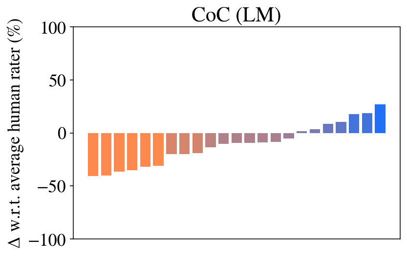
## Bar Chart: CoC (LM) Performance Relative to Human Raters
### Overview
The image displays a bar chart titled "CoC (LM)". It visualizes the percentage difference (Δ) in performance of various items (likely different models, methods, or conditions) with respect to an average human rater's score. The data is presented as a series of 16 vertical bars arranged from left to right, showing a clear progression from negative to positive values. The bars are colored in a gradient from orange (leftmost, most negative) through brownish-purple (middle) to blue (rightmost, most positive).
### Components/Axes
* **Title:** "CoC (LM)" - Positioned at the top center of the chart area.
* **Y-Axis:**
* **Label:** "Δ w.r.t. average human rater (%)". This is written vertically along the left side of the chart.
* **Scale:** Linear scale ranging from -100 to 100.
* **Major Tick Marks:** Located at -100, -50, 0, 50, and 100.
* **X-Axis:** No explicit label or category names are provided for the individual bars. The bars are evenly spaced along the horizontal axis.
* **Data Series:** A single series of 16 bars. There is no separate legend; the color gradient itself serves as a visual indicator of the value's sign and magnitude.
### Detailed Analysis
The chart shows a monotonic increase in the Δ value from the leftmost bar to the rightmost bar. The bars can be grouped into three color categories based on visual inspection:
1. **Orange Group (Bars 1-8, Leftmost):** All bars in this group have negative values, indicating performance below the human rater average.
* Bar 1 (far left): Approximately -40%.
* Bars 2-8: Values gradually increase (become less negative), ranging from approximately -38% to -20%. The trend is a steady upward slope.
2. **Brownish-Purple Group (Bars 9-12):** These bars represent values near zero, transitioning from slightly negative to slightly positive.
* Bar 9: Approximately -15%.
* Bar 10: Approximately -10%.
* Bar 11: Approximately -5%.
* Bar 12: Approximately -2%.
3. **Blue Group (Bars 13-16, Rightmost):** All bars in this group have positive values, indicating performance above the human rater average.
* Bar 13: Approximately +5%.
* Bar 14: Approximately +10%.
* Bar 15: Approximately +18%.
* Bar 16 (far right): Approximately +25%.
**Trend Verification:** The visual trend for the entire data series is a consistent, near-linear upward slope from left to right. The color transition from orange (negative) to blue (positive) perfectly correlates with this numerical trend.
### Key Observations
1. **Clear Performance Gradient:** There is a smooth and continuous improvement in the measured metric across the 16 items, spanning a total range of approximately 65 percentage points (from ~-40% to ~+25%).
2. **Symmetry Around Zero:** The data is not symmetrically distributed around the zero line (human average). More items (12 out of 16) fall below the human average than above it (4 out of 16). The most negative value (~-40%) is larger in magnitude than the most positive value (~+25%).
3. **Color as Value Encoding:** The color gradient is not merely aesthetic; it is a direct visual encoding of the quantitative value, with warm colors (orange) representing underperformance and cool colors (blue) representing overperformance relative to the human baseline.
### Interpretation
This chart, likely from an AI or machine learning evaluation context ("CoC (LM)" may stand for "Chain of Code (Language Model)"), demonstrates a comparative analysis. The "Δ w.r.t. average human rater (%)" metric suggests the data points represent how much better or worse different system configurations are compared to a human performance benchmark.
The key takeaway is that while the majority of the tested configurations (the orange and brownish-purple bars) perform worse than the average human, a select few (the blue bars) achieve superior performance. The smooth gradient implies that the variable being changed across the x-axis (e.g., model size, training data, inference method) has a predictable and continuous effect on the outcome. The fact that the best-performing item exceeds the human baseline by ~25% is a significant result, indicating a potential breakthrough or highly effective method within the tested set. The absence of x-axis labels prevents identifying the specific factors driving this improvement, but the trend itself is the critical finding.