## Bar Chart: ProcessBench Mean F1 (%) Comparison
### Overview
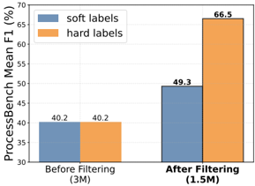
This image displays a grouped bar chart comparing the performance of two labeling strategies—"soft labels" and "hard labels"—across two distinct data processing states: "Before Filtering (3M)" and "After Filtering (1.5M)". The chart illustrates how data filtering affects the ProcessBench Mean F1 score for each labeling method.
### Components/Axes
* **Y-Axis:** Labeled "ProcessBench Mean F1 (%)". The scale ranges from 30 to 70, with increments of 5.
* **X-Axis:** Contains two categorical groups:
* "Before Filtering (3M)"
* "After Filtering (1.5M)"
* **Legend:** Located in the top-left corner of the chart area.
* **Blue rectangle:** Corresponds to "soft labels".
* **Orange rectangle:** Corresponds to "hard labels".
* **Data Markers:** Numerical values are printed directly above each bar to indicate the exact F1 score.
### Detailed Analysis
The chart is divided into two main clusters along the X-axis.
**1. Before Filtering (3M)**
* **Visual Trend:** The two bars are of equal height, indicating parity between the two labeling methods.
* **Soft Labels (Blue):** The bar reaches a value of **40.2**.
* **Hard Labels (Orange):** The bar reaches a value of **40.2**.
**2. After Filtering (1.5M)**
* **Visual Trend:** Both bars show an upward trend compared to the "Before Filtering" state. However, the orange bar (hard labels) shows a significantly steeper increase than the blue bar (soft labels).
* **Soft Labels (Blue):** The bar reaches a value of **49.3**.
* **Hard Labels (Orange):** The bar reaches a value of **66.5**.
### Key Observations
* **Performance Parity:** Before filtering, the labeling method (soft vs. hard) has zero impact on the ProcessBench Mean F1 score.
* **Filtering Efficacy:** Filtering the dataset (reducing it from 3M to 1.5M) results in a performance increase for both labeling methods.
* **Divergence:** After filtering, "hard labels" significantly outperform "soft labels" by a margin of 17.2 percentage points (66.5 vs 49.3).
* **Data Efficiency:** The reduction of the dataset by 50% (from 3M to 1.5M) correlates with a substantial improvement in model performance, suggesting that the filtering process successfully removes noise or low-quality data.
### Interpretation
The data suggests that the filtering process is highly effective at improving the quality of the dataset, as evidenced by the increase in F1 scores across both labeling methods.
The most critical insight is the divergence in performance after filtering. While "soft labels" improve by approximately 9.1 points (40.2 to 49.3), "hard labels" improve by approximately 26.3 points (40.2 to 66.5). This indicates that "hard labels" are significantly more compatible with or sensitive to the benefits of the filtering process. It is possible that the filtering process removes ambiguous or noisy data points that "soft labels" (which typically represent probability distributions) struggle to resolve, whereas "hard labels" (which represent definitive classes) benefit from the cleaner, more distinct data environment created by the filtering.