\n
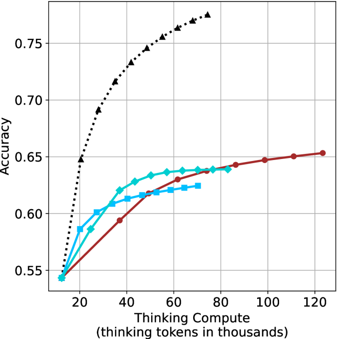
## Line Chart: Accuracy vs. Thinking Compute
### Overview
The image presents a line chart illustrating the relationship between "Thinking Compute" (measured in thousands of tokens) and "Accuracy". The chart displays four distinct data series, each represented by a different colored line, showing how accuracy changes as thinking compute increases. The chart has a grid background for easier readability.
### Components/Axes
* **X-axis:** "Thinking Compute (thinking tokens in thousands)". Scale ranges from approximately 0 to 120, with markers at 20, 40, 60, 80, 100, and 120.
* **Y-axis:** "Accuracy". Scale ranges from approximately 0.55 to 0.76, with markers at 0.55, 0.60, 0.65, 0.70, and 0.75.
* **Data Series:** Four lines, each with a unique color and pattern:
* Black dotted line
* Red solid line
* Cyan dashed line
* Blue dashed-dotted line
### Detailed Analysis
Let's analyze each line individually, noting trends and approximate data points.
* **Black Dotted Line:** This line exhibits the most rapid increase in accuracy with increasing thinking compute. It starts at approximately (20, 0.68) and quickly rises to approximately (60, 0.75), then plateaus, reaching approximately (120, 0.76). The trend is strongly upward and then flattens.
* **Red Solid Line:** This line shows a more gradual increase in accuracy. It begins at approximately (20, 0.55) and steadily climbs to approximately (120, 0.65). The trend is consistently upward, but less steep than the black line.
* **Cyan Dashed Line:** This line starts at approximately (20, 0.56) and increases rapidly to approximately (40, 0.63), then levels off, reaching approximately (120, 0.64). The trend is initially steep, then becomes relatively flat.
* **Blue Dashed-Dotted Line:** This line begins at approximately (20, 0.55) and increases to approximately (60, 0.62), then plateaus, remaining around (120, 0.63). The trend is similar to the cyan line, with an initial rise followed by a plateau.
### Key Observations
* The black dotted line consistently outperforms the other three lines in terms of accuracy across all levels of thinking compute.
* The red solid line shows the most consistent, albeit slow, improvement in accuracy.
* The cyan dashed and blue dashed-dotted lines exhibit diminishing returns in accuracy as thinking compute increases beyond 60,000 tokens.
* All lines start at similar accuracy levels around 0.55-0.68 at 20,000 tokens.
### Interpretation
The chart suggests a positive correlation between thinking compute and accuracy, but with diminishing returns. Increasing the amount of "thinking" (as measured by tokens) initially leads to significant gains in accuracy. However, beyond a certain point (around 60,000-80,000 tokens for the cyan and blue lines, and even earlier for the black line), the improvement in accuracy becomes marginal.
The black line's superior performance indicates that a particular method or model represented by this line is significantly more efficient at leveraging increased thinking compute to achieve higher accuracy. The other lines suggest that there are limitations to the effectiveness of increased compute for those specific methods.
The plateauing of the lines suggests that other factors, beyond simply increasing thinking compute, become more important in determining accuracy once a certain threshold is reached. These factors could include model architecture, training data quality, or optimization algorithms. The chart highlights the importance of finding the optimal balance between compute resources and other factors to maximize performance.