## Line Chart: Accuracy vs. Thinking Compute
### Overview
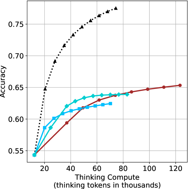
The image is a line chart comparing the accuracy of different models as a function of "Thinking Compute," measured in thousands of thinking tokens. There are four data series plotted, each represented by a different line style and marker. The chart shows how accuracy improves with increased thinking compute for each model.
### Components/Axes
* **X-axis:** "Thinking Compute (thinking tokens in thousands)". The axis ranges from approximately 10 to 120 in increments of 20.
* **Y-axis:** "Accuracy". The axis ranges from 0.55 to 0.75 in increments of 0.05.
* **Data Series:** Four data series are plotted on the chart, each distinguished by color and marker style. The legend is missing, so the exact identity of each series is unknown.
* **Black dotted line with triangle markers:** This line starts at approximately (15, 0.55) and rises sharply, plateauing around 0.77 at higher thinking compute values.
* **Teal line with diamond markers:** This line starts at approximately (15, 0.55) and increases gradually, reaching approximately 0.64 at 80 thinking compute.
* **Blue line with square markers:** This line starts at approximately (15, 0.55) and increases gradually, reaching approximately 0.62 at 70 thinking compute.
* **Brown line with circle markers:** This line starts at approximately (15, 0.55) and increases gradually, reaching approximately 0.65 at 120 thinking compute.
* **Gridlines:** The chart has gridlines for both the x and y axes, aiding in value estimation.
### Detailed Analysis
* **Black dotted line (triangle markers):**
* (15, 0.55)
* (20, 0.65)
* (30, 0.72)
* (40, 0.74)
* (50, 0.75)
* (60, 0.76)
* (70, 0.765)
* (80, 0.77)
* **Teal line (diamond markers):**
* (15, 0.55)
* (20, 0.58)
* (30, 0.60)
* (40, 0.62)
* (50, 0.635)
* (60, 0.64)
* (70, 0.64)
* (80, 0.64)
* **Blue line (square markers):**
* (15, 0.55)
* (20, 0.58)
* (30, 0.60)
* (40, 0.61)
* (50, 0.62)
* (60, 0.62)
* (70, 0.625)
* **Brown line (circle markers):**
* (15, 0.55)
* (40, 0.59)
* (60, 0.62)
* (80, 0.635)
* (100, 0.645)
* (120, 0.65)
### Key Observations
* The black dotted line (triangle markers) shows the most rapid initial increase in accuracy with increasing thinking compute. It also plateaus earlier than the other lines.
* The teal line (diamond markers) and blue line (square markers) show similar performance, with the teal line consistently performing slightly better.
* The brown line (circle markers) shows the slowest initial increase in accuracy but continues to improve even at higher thinking compute values.
* All lines start at approximately the same accuracy level (0.55) at the lowest thinking compute value (15).
### Interpretation
The chart illustrates the relationship between "Thinking Compute" and accuracy for different models. The black dotted line (triangle markers) likely represents a model that benefits greatly from initial increases in compute but reaches a performance ceiling relatively quickly. The other lines represent models that improve more gradually with increased compute, potentially indicating different architectural or training characteristics. Without a legend, it's impossible to definitively identify the models represented by each line. The data suggests that the optimal choice of model depends on the available compute budget and the desired level of accuracy.