## Line Chart: Accuracy vs. Thinking Compute
### Overview
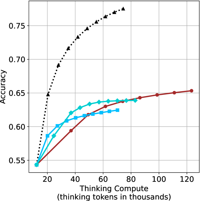
This image is a line chart illustrating the relationship between "Thinking Compute" (measured in thousands of thinking tokens) and model "Accuracy." The chart displays four distinct data series, all originating from a common starting point. The chart demonstrates how increasing the number of thinking tokens allocated to a model impacts its accuracy, with varying performance curves for each series.
### Components/Axes
* **Y-Axis:** Labeled "Accuracy." The scale ranges from 0.55 to 0.75, with major grid lines at 0.05 intervals (0.55, 0.60, 0.65, 0.70, 0.75).
* **X-Axis:** Labeled "Thinking Compute (thinking tokens in thousands)." The scale ranges from 20 to 120, with major grid lines at 20-unit intervals.
* **Legend:** **None provided.** The image lacks a legend to identify the specific models or methods associated with each line color/marker style.
* **Data Series (Visual Identification):**
* **Series A:** Black dotted line with triangle markers.
* **Series B:** Dark red solid line with circle markers.
* **Series C:** Cyan (light blue) solid line with diamond markers.
* **Series D:** Medium blue solid line with square markers.
### Detailed Analysis
All four data series originate from a common point at approximately **(15, 0.54)**.
* **Series A (Black, Dotted, Triangles):**
* **Trend:** Exhibits the steepest upward trajectory.
* **Data Points:** Shows rapid improvement in accuracy as compute increases. It terminates at approximately **(75, 0.775)**, representing the highest accuracy achieved on the chart.
* **Series B (Dark Red, Solid, Circles):**
* **Trend:** Exhibits the most gradual, consistent upward slope.
* **Data Points:** It is the longest series, extending to approximately **(125, 0.655)**. It shows a steady, linear-like growth compared to the others.
* **Series C (Cyan, Solid, Diamonds):**
* **Trend:** Moderate upward slope.
* **Data Points:** Shows a sharp initial increase, then begins to plateau. It terminates at approximately **(85, 0.64)**.
* **Series D (Medium Blue, Solid, Squares):**
* **Trend:** The flattest slope among the colored lines.
* **Data Points:** Shows the least improvement per unit of compute. It terminates at approximately **(75, 0.625)**.
### Key Observations
* **Performance Disparity:** There is a significant performance gap between the Black dotted series and the other three colored series. The Black series achieves significantly higher accuracy with less compute than the others.
* **Diminishing Returns:** All four series exhibit signs of diminishing returns; the slope of each line decreases as the "Thinking Compute" increases, indicating that adding more tokens yields smaller marginal gains in accuracy.
* **Convergence:** All models start at the same baseline accuracy (~0.54) at the lowest compute level (~15k tokens), suggesting they share a common starting point or base model architecture before scaling.
### Interpretation
This chart is a classic representation of "scaling laws" in AI reasoning models. It demonstrates that increasing the "thinking" time (tokens) of a model generally improves accuracy, but the efficiency of that scaling is highly dependent on the model architecture.
* **The "Black" Model:** This series represents a significantly more efficient or capable model architecture. It achieves a much higher accuracy ceiling (0.775) compared to the others, suggesting it utilizes the thinking tokens more effectively.
* **The "Colored" Models:** The Red, Cyan, and Blue lines appear to represent models with lower reasoning capabilities or less efficient scaling. The Red line, while having the lowest slope, continues to scale out to 125k tokens, suggesting it might be a more stable or "slower-burning" model that continues to benefit from compute even at high token counts.
* **Peircean Investigative Note:** The absence of a legend is a critical omission. Without labels, one can infer that the Black line represents a "frontier" model (e.g., a state-of-the-art reasoning model), while the other lines likely represent baseline models, smaller variants, or older iterations used for comparison. The data suggests that simply adding compute (thinking tokens) is not a universal solution; the underlying architecture (the "color" of the line) is the primary determinant of the accuracy ceiling.