\n
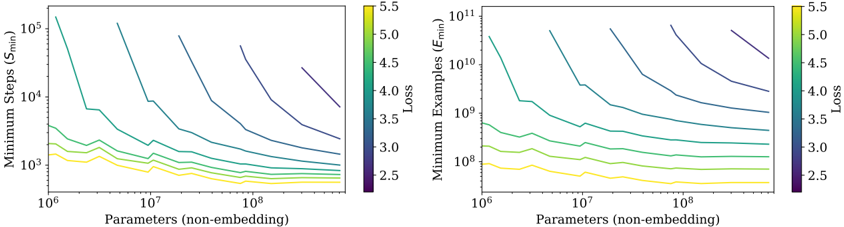
## Chart: Scaling Laws for Minimum Steps and Minimum Examples
### Overview
The image presents two scatter plots illustrating scaling laws. The left plot shows the relationship between the number of parameters (non-embedding) and the minimum steps (S<sub>min</sub>) required, while the right plot shows the relationship between the number of parameters and the minimum examples (E<sub>min</sub>) needed. Both plots use color to represent the loss value.
### Components/Axes
Both charts share the following components:
* **X-axis:** Parameters (non-embedding) - Logarithmic scale from 10<sup>6</sup> to 10<sup>9</sup>.
* **Colorbar:** Loss - Scale from 2.5 to 5.5. The colorbar is positioned on the right side of each chart.
* **Legend:** Implicitly represented by the colorbar.
The left chart has:
* **Y-axis:** Minimum Steps (S<sub>min</sub>) - Logarithmic scale from 10<sup>4</sup> to 10<sup>5</sup>.
The right chart has:
* **Y-axis:** Minimum Examples (E<sub>min</sub>) - Logarithmic scale from 10<sup>10</sup> to 10<sup>11</sup>.
### Detailed Analysis or Content Details
**Left Chart (Minimum Steps vs. Parameters):**
There are approximately 7 data series represented by different colored lines. The lines generally slope downwards, indicating that as the number of parameters increases, the minimum steps required decrease.
* **Dark Blue Line:** Starts at approximately (10<sup>6</sup>, 5.0 x 10<sup>4</sup>) and decreases to approximately (10<sup>9</sup>, 2.5 x 10<sup>4</sup>).
* **Light Blue Line:** Starts at approximately (10<sup>6</sup>, 4.5 x 10<sup>4</sup>) and decreases to approximately (10<sup>9</sup>, 2.0 x 10<sup>4</sup>).
* **Green Line:** Starts at approximately (10<sup>6</sup>, 4.0 x 10<sup>4</sup>) and decreases to approximately (10<sup>9</sup>, 1.5 x 10<sup>4</sup>).
* **Yellow Line:** Starts at approximately (10<sup>6</sup>, 3.5 x 10<sup>4</sup>) and decreases to approximately (10<sup>9</sup>, 1.0 x 10<sup>4</sup>).
* **Light Yellow Line:** Starts at approximately (10<sup>6</sup>, 3.0 x 10<sup>4</sup>) and decreases to approximately (10<sup>9</sup>, 5.0 x 10<sup>3</sup>).
* **Orange Line:** Starts at approximately (10<sup>6</sup>, 3.0 x 10<sup>4</sup>) and decreases to approximately (10<sup>9</sup>, 2.0 x 10<sup>3</sup>).
* **Red Line:** Starts at approximately (10<sup>6</sup>, 3.5 x 10<sup>4</sup>) and decreases to approximately (10<sup>9</sup>, 1.0 x 10<sup>3</sup>).
**Right Chart (Minimum Examples vs. Parameters):**
Similar to the left chart, there are approximately 7 data series represented by different colored lines. These lines also generally slope downwards, indicating that as the number of parameters increases, the minimum examples needed decrease.
* **Dark Blue Line:** Starts at approximately (10<sup>6</sup>, 8.0 x 10<sup>10</sup>) and decreases to approximately (10<sup>9</sup>, 2.0 x 10<sup>10</sup>).
* **Light Blue Line:** Starts at approximately (10<sup>6</sup>, 7.0 x 10<sup>10</sup>) and decreases to approximately (10<sup>9</sup>, 1.5 x 10<sup>10</sup>).
* **Green Line:** Starts at approximately (10<sup>6</sup>, 6.0 x 10<sup>10</sup>) and decreases to approximately (10<sup>9</sup>, 1.0 x 10<sup>10</sup>).
* **Yellow Line:** Starts at approximately (10<sup>6</sup>, 5.0 x 10<sup>10</sup>) and decreases to approximately (10<sup>9</sup>, 5.0 x 10<sup>9</sup>).
* **Light Yellow Line:** Starts at approximately (10<sup>6</sup>, 4.0 x 10<sup>10</sup>) and decreases to approximately (10<sup>9</sup>, 2.0 x 10<sup>9</sup>).
* **Orange Line:** Starts at approximately (10<sup>6</sup>, 3.5 x 10<sup>10</sup>) and decreases to approximately (10<sup>9</sup>, 1.0 x 10<sup>9</sup>).
* **Red Line:** Starts at approximately (10<sup>6</sup>, 4.0 x 10<sup>10</sup>) and decreases to approximately (10<sup>9</sup>, 5.0 x 10<sup>8</sup>).
### Key Observations
* Both charts exhibit a clear negative correlation between the number of parameters and both minimum steps and minimum examples.
* The loss value (indicated by color) generally decreases as the number of parameters increases, suggesting improved performance with larger models.
* The lines representing different data series are relatively close together, indicating a consistent trend across different configurations.
* The red line consistently shows the lowest values for both minimum steps and minimum examples, suggesting it represents the most efficient configuration.
### Interpretation
These charts demonstrate scaling laws in a machine learning context. They suggest that increasing the number of parameters in a model leads to a reduction in both the number of training steps required to achieve a certain level of performance and the amount of training data needed. The color-coding by loss indicates that larger models generally achieve lower loss values, implying better accuracy or generalization ability.
The consistent downward trends across the different data series suggest that these scaling laws are robust and apply to a range of model configurations. The red line's consistently lower values may indicate a particularly effective architecture or training strategy.
These findings are important for understanding the trade-offs between model size, training cost, and performance. They can guide the design and training of machine learning models, helping to optimize resource allocation and achieve desired levels of accuracy. The logarithmic scales on both axes suggest that the relationships are not linear, and that the benefits of increasing model size may diminish at very large scales.