\n
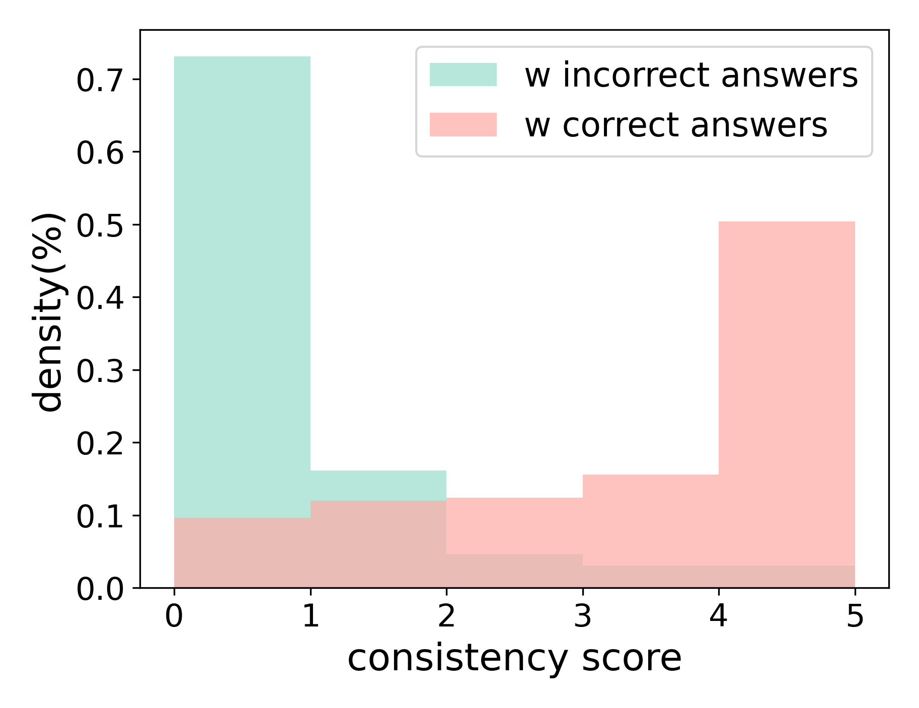
## Histogram: Density of Consistency Score with Correct/Incorrect Answers
### Overview
The image presents a histogram comparing the density distribution of "consistency scores" for two groups: those with "incorrect answers" and those with "correct answers". The x-axis represents the consistency score, and the y-axis represents the density (expressed as a percentage). The chart visually compares how consistency scores are distributed between the two answer groups.
### Components/Axes
* **X-axis Title:** "consistency score"
* **X-axis Range:** 0 to 5
* **Y-axis Title:** "density (%)"
* **Y-axis Range:** 0 to 0.7
* **Legend:** Located in the top-right corner.
* "w incorrect answers" - represented by a light green color.
* "w correct answers" - represented by a light red color.
### Detailed Analysis
The chart displays two histograms stacked on top of each other.
**Incorrect Answers (Light Green):**
The distribution for incorrect answers shows a strong peak around a consistency score of 0, with a density of approximately 0.7. The density decreases rapidly as the consistency score increases. There is a small secondary peak around a consistency score of 2, with a density of approximately 0.15. The density remains relatively low for scores between 2 and 5, fluctuating around 0.05-0.1.
**Correct Answers (Light Red):**
The distribution for correct answers is relatively flat across the range of consistency scores. It starts with a low density around 0.05 at a consistency score of 0. The density increases gradually, reaching a peak around a consistency score of 4-5, with a density of approximately 0.2. There is a slight dip in density around a consistency score of 1, at approximately 0.1.
**Specific Data Points (Approximate):**
| Consistency Score | Incorrect Answers Density (%) | Correct Answers Density (%) |
|---|---|---|
| 0 | 0.7 | 0.05 |
| 1 | 0.1 | 0.1 |
| 2 | 0.15 | 0.1 |
| 3 | 0.1 | 0.15 |
| 4 | 0.05 | 0.2 |
| 5 | 0.05 | 0.2 |
### Key Observations
* The distribution of consistency scores for incorrect answers is heavily skewed towards lower scores (closer to 0).
* The distribution of consistency scores for correct answers is more evenly distributed, with a slight tendency towards higher scores (closer to 5).
* There is a clear difference in the distributions of consistency scores between the two groups.
* The peak at 0 for incorrect answers suggests that a low consistency score is strongly associated with incorrect answers.
### Interpretation
The data suggests a strong correlation between consistency score and answer correctness. Individuals who provide inconsistent responses (low consistency score) are more likely to answer incorrectly. Conversely, individuals who provide consistent responses (high consistency score) are more likely to answer correctly.
The shape of the distributions indicates that inconsistency is a significant factor contributing to incorrect answers. The high density of incorrect answers at a consistency score of 0 suggests that a complete lack of consistency is a strong predictor of incorrectness. The more even distribution of correct answers suggests that consistency, while helpful, is not the sole determinant of correctness. There is a range of consistency scores associated with correct answers, indicating that some individuals can arrive at the correct answer even with moderate levels of inconsistency.
The difference in distributions could be due to several factors, including:
* **Carelessness:** Individuals who answer carelessly may provide inconsistent responses and are more likely to be incorrect.
* **Lack of Understanding:** Individuals who do not fully understand the material may struggle to provide consistent responses.
* **Strategic Guessing:** Individuals who are unsure of the answer may guess randomly, leading to inconsistent responses.
* **Cognitive Biases:** Certain cognitive biases may lead individuals to provide inconsistent responses.