## [Bar Chart]: Distribution of Values
### Overview
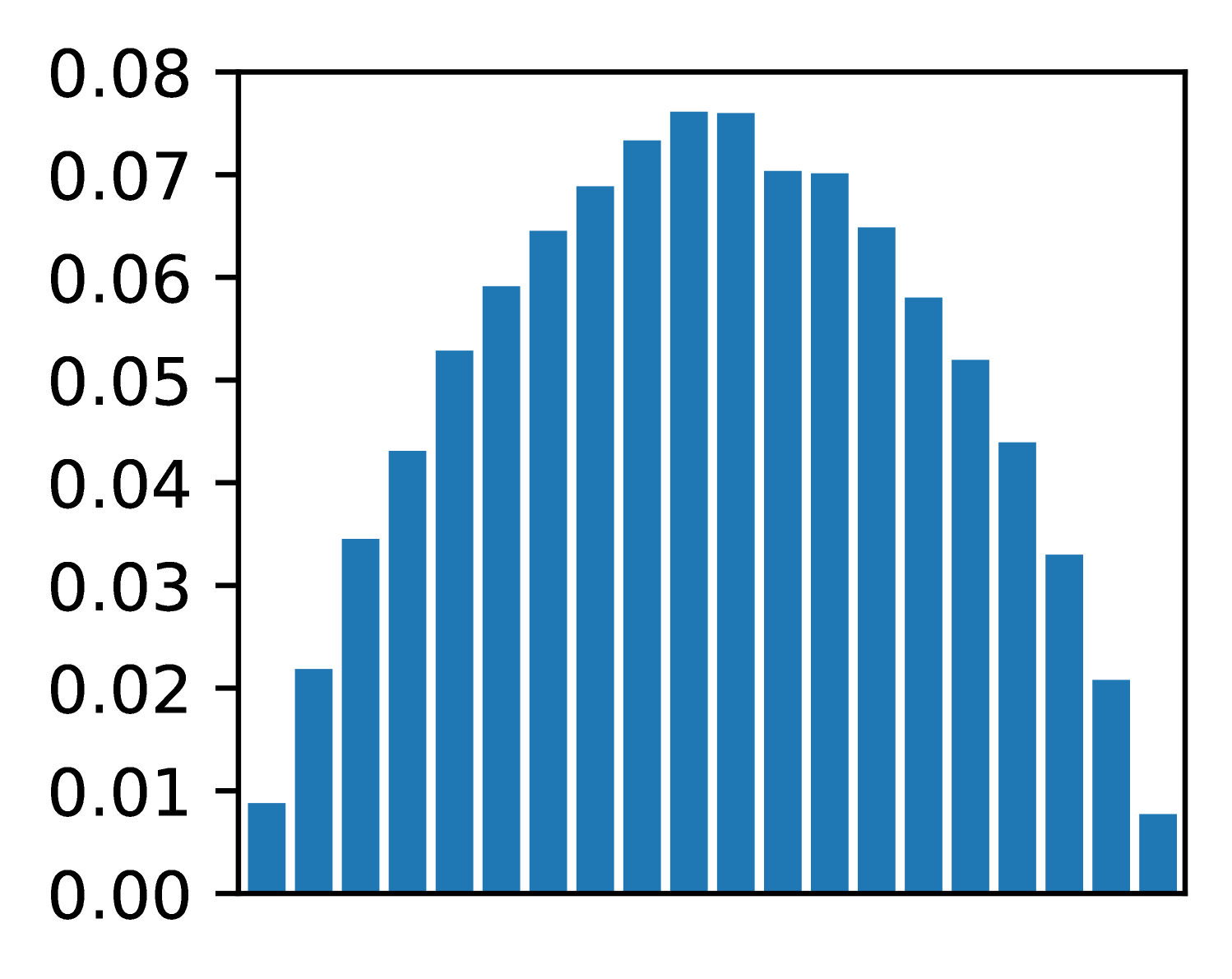
The image displays a vertical bar chart (histogram) showing a symmetric, unimodal distribution of values. The chart consists of 21 blue bars of varying heights arranged along an unlabeled horizontal axis. The vertical axis is labeled with numerical values ranging from 0.00 to 0.08.
### Components/Axes
* **Vertical Axis (Y-axis):**
* **Label:** None explicitly stated.
* **Scale:** Linear scale from 0.00 to 0.08.
* **Tick Marks & Values:** Major tick marks are present at intervals of 0.01, labeled as: `0.00`, `0.01`, `0.02`, `0.03`, `0.04`, `0.05`, `0.06`, `0.07`, `0.08`.
* **Horizontal Axis (X-axis):**
* **Label:** None present.
* **Categories:** 21 distinct, evenly spaced bars. No category labels or numerical markers are provided.
* **Legend:** Not present.
* **Chart Title:** Not present.
* **Bar Color:** Uniform medium blue for all bars.
### Detailed Analysis
The chart displays a clear, symmetric distribution pattern. The bars increase in height from the left, peak in the center, and then decrease symmetrically to the right.
**Trend Verification:** The visual trend is a smooth, bell-shaped curve. Starting from the leftmost bar, heights increase steadily, reach a maximum at the two central bars, and then decrease in a mirror-image fashion.
**Estimated Bar Heights (from left to right, approximate values based on Y-axis):**
1. ~0.009
2. ~0.022
3. ~0.035
4. ~0.043
5. ~0.053
6. ~0.059
7. ~0.065
8. ~0.069
9. ~0.074
10. **~0.076** (Peak, tied)
11. **~0.076** (Peak, tied)
12. ~0.070
13. ~0.070
14. ~0.065
15. ~0.058
16. ~0.052
17. ~0.044
18. ~0.033
19. ~0.021
20. ~0.008
### Key Observations
1. **Symmetry:** The distribution is highly symmetric around the central two bars (bars 10 and 11).
2. **Unimodal Peak:** The distribution has a single peak (mode) represented by the two tallest, equal-height bars in the center.
3. **Range:** The values span from approximately 0.008 at the extremes to a peak of approximately 0.076.
4. **Shape:** The overall shape closely resembles a normal (Gaussian) distribution or a binomial distribution.
5. **Missing Context:** The chart lacks a title, axis labels, and a legend, making it impossible to determine what specific data or categories are being represented.
### Interpretation
This chart visually demonstrates a fundamental statistical pattern where data points are most frequently clustered around a central value, with frequency tapering off symmetrically towards higher and lower values.
* **What it suggests:** The data likely represents a frequency distribution, probability density, or a similar metric where the central tendency is dominant. The perfect symmetry suggests an idealized or theoretical distribution rather than raw, noisy empirical data.
* **Relationship of Elements:** The height of each bar is directly proportional to the value on the Y-axis for its corresponding (but unlabeled) category on the X-axis. The arrangement creates a visual representation of concentration and dispersion.
* **Notable Patterns:** The most significant pattern is the perfect symmetry and the plateau at the peak (two bars of equal maximum height). This is characteristic of many natural and mathematical phenomena. The absence of any skew or outliers reinforces the impression of a controlled or modeled dataset.
* **Underlying Meaning:** Without axis labels, the specific meaning is abstract. However, the form itself is a powerful archetype in data science, representing concepts like the central limit theorem, measurement errors, or the distribution of traits in a population. It communicates balance, predictability, and the prevalence of average values over extremes.