## Line Chart: Exponential Growth Comparison
### Overview
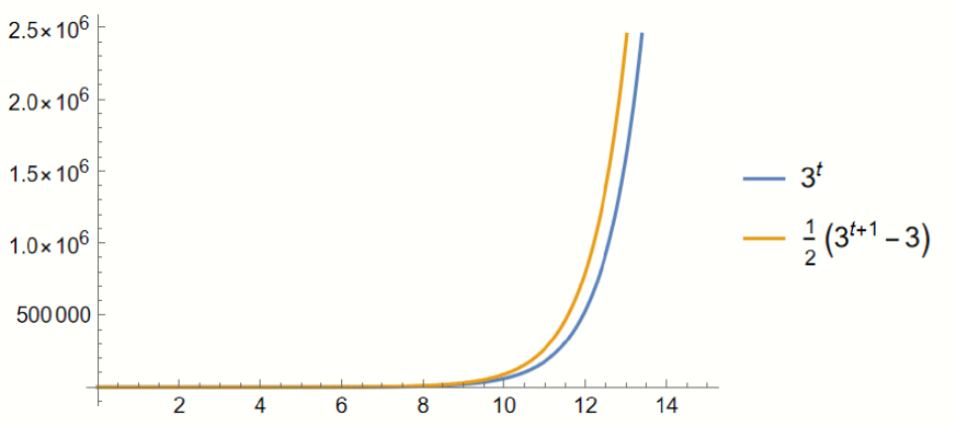
The image displays a mathematical plot comparing two exponential functions over a domain of approximately $t=0$ to $t=14$. The chart illustrates how these two functions grow relative to each other as the input variable $t$ increases.
### Components/Axes
* **X-axis (Horizontal):** Represents the variable $t$. The axis is marked with integers at intervals of 2, ranging from 0 to 15.
* **Y-axis (Vertical):** Represents the output value of the functions. The scale is in scientific notation, with major tick marks at $500,000$, $1.0 \times 10^6$, $1.5 \times 10^6$, $2.0 \times 10^6$, and $2.5 \times 10^6$.
* **Legend:** Positioned to the right of the main chart area.
* **Blue Line:** Represents the function $3^t$.
* **Orange Line:** Represents the function $\frac{1}{2}(3^{t+1} - 3)$.
### Detailed Analysis
**Trend Verification:**
Both data series exhibit classic exponential growth.
* **Blue Line ($3^t$):** Starts near the origin ($t=0, y=1$) and remains nearly flat, hugging the x-axis until approximately $t=8$. Beyond $t=8$, the slope increases sharply, curving upward.
* **Orange Line ($\frac{1}{2}(3^{t+1} - 3)$):** Follows a similar trajectory to the blue line but is consistently positioned above it. It also remains nearly flat until $t=8$, after which it accelerates upward at a steeper rate than the blue line.
**Data Points (Visual Estimation):**
* **At $t=10$:** The blue line is at approximately $6 \times 10^4$ ($59,049$). The orange line is at approximately $9 \times 10^4$ ($88,572$).
* **At $t=12$:** The blue line is at approximately $5.3 \times 10^5$ ($531,441$). The orange line is at approximately $8 \times 10^5$ ($797,160$).
* **At $t=13$:** The blue line is at approximately $1.6 \times 10^6$ ($1,594,323$). The orange line is at approximately $2.4 \times 10^6$ ($2,391,483$).
### Key Observations
* **Consistent Divergence:** The orange line is always above the blue line for all $t > 0$.
* **Widening Gap:** The vertical distance between the two lines increases significantly as $t$ increases, which is expected given the nature of exponential functions with different coefficients.
* **Scale Sensitivity:** The chart effectively hides the growth of the functions for $t < 8$ due to the large scale of the y-axis (reaching $2.5 \times 10^6$).
### Interpretation
The data demonstrates the relationship between two exponential functions. Mathematically, the orange function can be simplified:
$$\frac{1}{2}(3^{t+1} - 3) = \frac{1}{2}(3 \cdot 3^t - 3) = 1.5 \cdot 3^t - 1.5$$
This algebraic simplification explains the visual behavior:
1. **The Multiplier:** The orange function is essentially $1.5$ times the blue function (minus a negligible constant of $1.5$). This explains why the orange line is consistently higher than the blue line.
2. **Growth Rate:** Because both functions share the same base ($3^t$), they grow at the same relative rate, but the orange function maintains a higher magnitude throughout the domain.
3. **Visual Significance:** The chart highlights how quickly exponential functions reach high values, making the initial, slower growth phase appear negligible on a linear scale.