\n
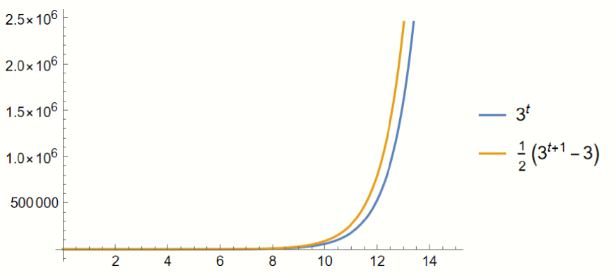
## Mathematical Function Plot: Comparison of Two Exponential Growth Functions
### Overview
The image is a 2D line plot generated by mathematical software (likely Mathematica or similar). It displays two exponential growth functions plotted against a common independent variable, `t`. The plot demonstrates the rapid, accelerating growth characteristic of exponential functions, with one function consistently outpacing the other.
### Components/Axes
* **X-Axis (Horizontal):**
* **Label:** Implicitly represents the variable `t` (as indicated by the function definitions in the legend).
* **Scale:** Linear scale.
* **Range:** Approximately 0 to 14.
* **Major Tick Marks & Labels:** Located at intervals of 2: `2`, `4`, `6`, `8`, `10`, `12`, `14`.
* **Y-Axis (Vertical):**
* **Label:** Implicitly represents the function value, `f(t)`.
* **Scale:** Linear scale.
* **Range:** 0 to 2.5 x 10⁶ (2,500,000).
* **Major Tick Marks & Labels:** Located at intervals of 500,000: `500 000`, `1.0 x 10⁶`, `1.5 x 10⁶`, `2.0 x 10⁶`, `2.5 x 10⁶`.
* **Legend:**
* **Position:** Centered vertically on the right side of the plot area, outside the axes.
* **Content:**
1. **Blue Line:** Labeled with the mathematical expression `3^t`.
2. **Orange Line:** Labeled with the mathematical expression `1/2 (3^(t+1) - 3)`.
* **Plot Area:** Contains two smooth, continuous curves originating near the origin (0,0) and rising sharply to the right.
### Detailed Analysis
* **Data Series 1 (Blue Line - `3^t`):**
* **Trend Verification:** The line exhibits classic exponential growth. It starts with a very shallow slope near t=0, remains close to the x-axis until approximately t=8, and then curves upward with a rapidly increasing slope.
* **Approximate Data Points (Visual Estimation):**
* At t=10: y ≈ 59,000 (5.9 x 10⁴)
* At t=12: y ≈ 531,000 (5.31 x 10⁵)
* At t=13: y ≈ 1,594,000 (1.594 x 10⁶)
* At t=14: y ≈ 4,782,000 (4.782 x 10⁶) - *Note: This point is beyond the top of the plotted y-axis range.*
* **Data Series 2 (Orange Line - `1/2 (3^(t+1) - 3)`):**
* **Trend Verification:** This line also shows exponential growth. It follows a similar shape to the blue line but is consistently positioned above it. The vertical gap between the orange and blue lines widens significantly as `t` increases.
* **Approximate Data Points (Visual Estimation):**
* At t=10: y ≈ 88,000 (8.8 x 10⁴)
* At t=12: y ≈ 796,000 (7.96 x 10⁵)
* At t=13: y ≈ 2,391,000 (2.391 x 10⁶)
* At t=14: y ≈ 7,173,000 (7.173 x 10⁶) - *Note: This point is well beyond the top of the plotted y-axis range.*
* **Relationship Between Series:** For any given `t`, the value of the orange function is greater than the blue function. The ratio between them approaches a constant. Mathematically, `1/2 (3^(t+1) - 3) = (3/2)*3^t - 3/2`. For large `t`, this is approximately `(3/2)*3^t`, meaning the orange line is roughly 1.5 times the height of the blue line. This visual relationship is confirmed in the plot.
### Key Observations
1. **Exponential Growth:** Both functions demonstrate the "hockey stick" curve of exponential growth, where the rate of increase itself increases.
2. **Divergence:** The absolute difference between the two functions grows dramatically with `t`. At t=10, the difference is ~29,000. By t=13, the difference is ~797,000.
3. **Scale:** The y-axis uses scientific notation (`x 10⁶`) to accommodate the very large numbers generated by the functions within a limited plot height.
4. **Clipping:** The plotted lines extend beyond the upper limit of the y-axis (2.5 x 10⁶) shortly after t=13, indicating the functions' values exceed the displayed range.
### Interpretation
This plot is a direct visual comparison of two related exponential functions. The function `1/2 (3^(t+1) - 3)` can be algebraically simplified to `(3/2)*3^t - 3/2`. The graph visually proves that this function is not merely a scaled version of `3^t`; it has a larger base multiplier (1.5 vs 1) and a constant offset (-1.5), which becomes negligible at high `t`.
The key takeaway is the power of exponential growth and how small differences in the function's formula (a multiplier of 1.5 versus 1) lead to enormous differences in output over time. This principle is fundamental in fields like finance (compound interest), biology (population growth), and computer science (algorithmic complexity). The plot serves as a clear, intuitive demonstration that the orange function will always dominate the blue one for positive `t`, and the gap between them will become astronomically large.