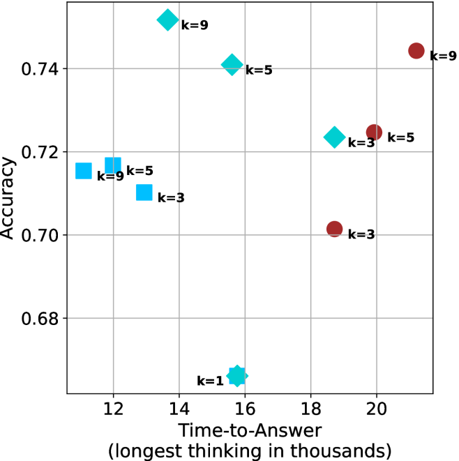
## Scatter Plot: Accuracy vs. Time-to-Answer
### Overview
The image is a scatter plot showing the relationship between "Accuracy" and "Time-to-Answer" (longest thinking in thousands). There are two data series, represented by different shapes and colors: cyan squares and diamonds, and brown circles. Each data point is labeled with a "k" value (k=1, k=3, k=5, k=9).
### Components/Axes
* **X-axis:** "Time-to-Answer (longest thinking in thousands)". The scale ranges from 12 to 20, with gridlines at each integer value.
* **Y-axis:** "Accuracy". The scale ranges from 0.68 to 0.74, with gridlines at intervals of 0.02.
* **Data Series 1:** Cyan squares and diamonds, labeled with k=1, k=3, k=5, k=9.
* **Data Series 2:** Brown circles, labeled with k=3, k=5, k=9.
### Detailed Analysis
**Cyan Squares and Diamonds Data Series:**
* **k=1:** Located at approximately (15.5, 0.66). Shape: Star.
* **k=3:** Located at approximately (14, 0.71). Shape: Square.
* **k=5:** Located at approximately (12.5, 0.72). Shape: Square.
* **k=9:** Located at approximately (12, 0.72). Shape: Square.
* **k=3:** Located at approximately (18, 0.725). Shape: Diamond.
* **k=5:** Located at approximately (17, 0.74). Shape: Diamond.
* **k=9:** Located at approximately (16, 0.75). Shape: Diamond.
**Trend:** The cyan data points show a complex relationship. For k=1, 3, 5, and 9, the time-to-answer decreases as accuracy increases. For k=3, 5, and 9, the time-to-answer increases as accuracy increases.
**Brown Circles Data Series:**
* **k=3:** Located at approximately (18, 0.70).
* **k=5:** Located at approximately (19, 0.725).
* **k=9:** Located at approximately (20, 0.745).
**Trend:** The brown data points show a positive correlation between time-to-answer and accuracy. As time-to-answer increases, accuracy also increases.
### Key Observations
* The cyan data points are clustered in the lower left of the plot, while the brown data points are in the upper right.
* The cyan data points show a more complex relationship between time-to-answer and accuracy than the brown data points.
* The "k" values are associated with each data point, but the plot does not explain what "k" represents.
### Interpretation
The scatter plot visualizes the relationship between the time taken to answer a question and the accuracy of the answer, for different values of "k". The two data series (cyan and brown) exhibit different trends. The brown data series shows a clear positive correlation: more time spent thinking leads to higher accuracy. The cyan data series shows a more complex relationship, possibly indicating diminishing returns or different strategies at play. The meaning of "k" is not defined in the plot, but it appears to be a parameter influencing both time-to-answer and accuracy. The plot suggests that optimizing for "k" could lead to different trade-offs between speed and accuracy.