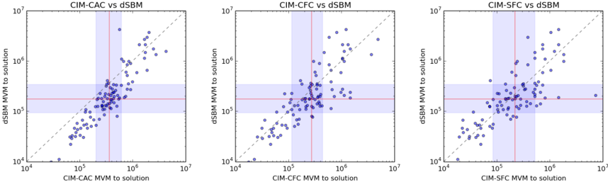
## Scatter Plots: Comparison of CIM-CAC, CIM-CFC, and CIM-SFC vs dSBM
### Overview
The image presents three scatter plots arranged horizontally. Each plot compares a different CIM (presumably a computational method) – CAC, CFC, and SFC – against dSBM (another computational method). The plots visualize the relationship between the "MVM to solution" values for each method. A diagonal dashed gray line represents the ideal scenario where both methods yield the same result. A horizontal red line indicates a threshold or benchmark. Data points are color-coded: black for most points, and blue for a subset of points.
### Components/Axes
Each plot shares the following components:
* **X-axis:** Labeled as "[CIM-X] MVM to solution" where X is CAC, CFC, or SFC. Scale is logarithmic, ranging from 10<sup>4</sup> to 10<sup>7</sup>.
* **Y-axis:** Labeled as "dSBM MVM to solution". Scale is logarithmic, ranging from 10<sup>4</sup> to 10<sup>7</sup>.
* **Title:** Each plot has a title indicating the comparison being made (e.g., "CIM-CAC vs dSBM").
* **Diagonal Line:** A dashed gray line with a slope of 1, representing the line of equality.
* **Horizontal Line:** A solid red horizontal line, positioned at approximately y = 5 x 10<sup>5</sup>.
* **Data Points:** Black and blue dots representing individual data points.
### Detailed Analysis or Content Details
**Plot 1: CIM-CAC vs dSBM**
* **Trend:** The data points generally cluster around the line of equality, but with significant scatter. There's a slight upward trend, indicating a positive correlation. Points above the horizontal red line are more numerous than those below.
* **Data Points:**
* Black Points: Distributed across the plot, with a concentration in the lower-left and upper-right quadrants. Approximate values (reading from the plot, with uncertainty): (10<sup>4</sup>, 10<sup>4</sup>) to (10<sup>7</sup>, 10<sup>7</sup>).
* Blue Points: Concentrated above the horizontal red line, generally between x = 10<sup>5</sup> and x = 10<sup>6</sup>, and y = 10<sup>5</sup> and y = 10<sup>7</sup>. Approximate values: (10<sup>5</sup>, 5 x 10<sup>5</sup>), (2 x 10<sup>5</sup>, 8 x 10<sup>5</sup>), (5 x 10<sup>5</sup>, 2 x 10<sup>6</sup>), (8 x 10<sup>5</sup>, 10<sup>6</sup>).
**Plot 2: CIM-CFC vs dSBM**
* **Trend:** Similar to Plot 1, the data shows a positive correlation with scatter. Points are more tightly clustered around the line of equality than in Plot 1.
* **Data Points:**
* Black Points: Distributed across the plot, with a concentration in the lower-left and upper-right quadrants. Approximate values: (10<sup>4</sup>, 10<sup>4</sup>) to (10<sup>7</sup>, 10<sup>7</sup>).
* Blue Points: Concentrated above the horizontal red line, generally between x = 10<sup>4</sup> and x = 10<sup>6</sup>, and y = 10<sup>5</sup> and y = 10<sup>7</sup>. Approximate values: (10<sup>4</sup>, 2 x 10<sup>5</sup>), (2 x 10<sup>4</sup>, 5 x 10<sup>5</sup>), (5 x 10<sup>5</sup>, 10<sup>6</sup>), (8 x 10<sup>5</sup>, 5 x 10<sup>6</sup>).
**Plot 3: CIM-SFC vs dSBM**
* **Trend:** The data exhibits a strong positive correlation, with points generally falling above and to the right of the line of equality. The scatter is less pronounced than in the other two plots.
* **Data Points:**
* Black Points: Distributed across the plot, with a concentration in the lower-left and upper-right quadrants. Approximate values: (10<sup>4</sup>, 10<sup>4</sup>) to (10<sup>7</sup>, 10<sup>7</sup>).
* Blue Points: Concentrated above the horizontal red line, generally between x = 10<sup>4</sup> and x = 10<sup>6</sup>, and y = 10<sup>5</sup> and y = 10<sup>7</sup>. Approximate values: (10<sup>4</sup>, 5 x 10<sup>5</sup>), (2 x 10<sup>4</sup>, 10<sup>6</sup>), (5 x 10<sup>5</sup>, 2 x 10<sup>6</sup>), (8 x 10<sup>5</sup>, 5 x 10<sup>6</sup>).
### Key Observations
* The blue points consistently represent a subset of data that performs better than the overall trend (i.e., they are above the red line).
* CIM-SFC appears to have the strongest correlation with dSBM, with the data points clustering more closely around the line of equality.
* All three CIM methods show a positive correlation with dSBM, suggesting that as the MVM to solution increases for one method, it also tends to increase for the other.
* The logarithmic scales make it difficult to assess the absolute magnitude of differences, but the relative positioning of points is clear.
### Interpretation
These plots compare the performance of three different CIM methods (CAC, CFC, and SFC) against dSBM, likely in the context of solving a mathematical or computational problem. The "MVM to solution" metric likely represents the computational effort (e.g., number of matrix-vector multiplications) required to reach a solution.
The diagonal line represents the ideal scenario where both methods require the same amount of computational effort. Points above this line indicate that dSBM is more efficient, while points below indicate that the CIM method is more efficient.
The horizontal red line likely represents a performance threshold. Points above this line may be considered acceptable, while points below may indicate poor performance.
The blue points likely represent a specific subset of cases where the CIM method performs particularly well. This could be due to specific problem characteristics or optimization strategies.
The fact that CIM-SFC consistently performs closer to the line of equality suggests that it is the most reliable and efficient method among the three, in terms of matching the performance of dSBM. The other two methods exhibit more variability, indicating that their performance is more sensitive to the specific problem being solved.
The overall trend suggests that there is a trade-off between the computational effort required by the CIM methods and dSBM. In some cases, the CIM methods may be more efficient, while in others, dSBM may be more efficient. The choice of which method to use will depend on the specific problem and the desired level of performance.