## [Chart Type]: Dual-Panel Line Charts with Scatter Points
### Overview
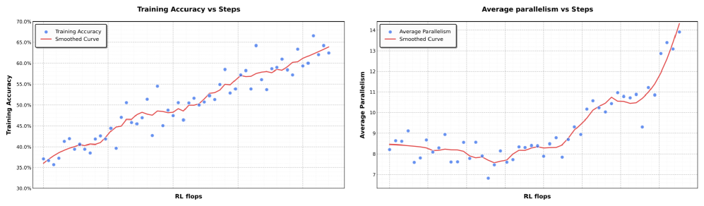
The image displays two side-by-side charts that plot different performance metrics against a common computational cost metric ("RL flops"). Both charts use a scatter plot of individual data points (blue dots) overlaid with a red smoothed trend line. The charts appear to analyze the training progression of a machine learning model, likely in a Reinforcement Learning (RL) context.
### Components/Axes
**Common Elements:**
* **X-Axis (Both Charts):** Label: "RL flops". This axis represents the computational cost or training steps, measured in floating-point operations (flops) for a Reinforcement Learning process. The scale is linear but unlabeled with specific numerical markers.
* **Legend (Both Charts):** Positioned in the top-left corner of each chart's plot area.
* Left Chart: "Training Accuracy" (blue dots), "Smoothed Curve" (red line).
* Right Chart: "Average Parallelism" (blue dots), "Smoothed Curve" (red line).
**Left Chart: "Training Accuracy vs Steps"**
* **Y-Axis:** Label: "Training Accuracy". Scale: Linear, ranging from 30.0% to 70.0% with major gridlines at 5.0% intervals (30.0%, 35.0%, 40.0%, 45.0%, 50.0%, 55.0%, 60.0%, 65.0%, 70.0%).
**Right Chart: "Average parallelism vs Steps"**
* **Y-Axis:** Label: "Average Parallelism". Scale: Linear, ranging from 7 to 14 with major gridlines at integer intervals (7, 8, 9, 10, 11, 12, 13, 14).
### Detailed Analysis
**Left Chart - Training Accuracy:**
* **Trend Verification:** The data series shows a clear, consistent upward trend. The blue dots and the red smoothed curve both slope upward from left to right.
* **Data Points & Values:**
* **Start (Low RL flops):** Training accuracy begins at approximately 35-37%.
* **Mid-Range:** Accuracy crosses the 50% threshold at a mid-point on the x-axis. The data shows moderate scatter around the trend line.
* **End (High RL flops):** The final data points cluster between approximately 62% and 66%. The smoothed curve ends at roughly 63-64%.
* **Distribution:** The scatter of blue dots around the red line is relatively uniform, suggesting consistent variance in accuracy measurements throughout training.
**Right Chart - Average Parallelism:**
* **Trend Verification:** The trend is non-linear. It begins relatively flat, shows a slight dip, then rises gradually before a sharp, accelerating increase at the far right.
* **Data Points & Values:**
* **Start (Low RL flops):** Average parallelism starts around 8.0-8.5.
* **Mid-Range (Dip & Plateau):** There is a noticeable dip where values fall to approximately 7.5-8.0. Following this, the metric recovers and plateaus in the 8.0-9.0 range for a significant portion of the x-axis.
* **End (High RL flops):** A sharp, near-exponential increase occurs. The final data points reach values between 13.0 and 14.0, with the smoothed curve ending at approximately 14.0.
* **Distribution:** The scatter is tighter during the initial flat/dip phase and increases significantly during the final sharp rise, indicating greater variability in parallelism at higher computational scales.
### Key Observations
1. **Positive Correlation:** Both training accuracy and average parallelism show a positive correlation with increased RL flops (training steps/computation).
2. **Divergent Growth Patterns:** While accuracy grows in a roughly linear fashion, parallelism exhibits a "hockey stick" or phase-change growth pattern, with a dramatic acceleration after a long period of modest change.
3. **Initial Parallelism Dip:** The right chart shows a distinct, temporary decrease in average parallelism early in training before it begins its sustained increase.
4. **Increased Variance at Scale:** The scatter (variance) of the "Average Parallelism" data points increases markedly during its final growth phase, unlike the more consistent scatter in the accuracy chart.
### Interpretation
These charts together suggest a narrative about the training dynamics of this RL system:
* **Performance Improves with Compute:** The left chart confirms the expected outcome: investing more computational resources (RL flops) leads to a steady improvement in the model's task performance (accuracy).
* **System Behavior Changes with Scale:** The right chart reveals a more complex underlying system behavior. The "Average Parallelism" likely measures how the computational workload is distributed (e.g., across multiple processors or threads). The initial dip and plateau suggest an initial phase where the system's parallelization strategy is stable or even slightly hindered. The final sharp rise indicates a **critical scaling point** where the system's architecture or the nature of the task allows for a massive increase in parallel execution efficiency.
* **Implication:** The most significant gains in computational efficiency (parallelism) are unlocked only after a substantial amount of training has already occurred. This could imply that the model's structure or the problem's state space evolves to become more amenable to parallel processing later in training. The increased variance at high parallelism might reflect instability or sensitivity in the system when operating at this high-efficiency frontier.
**Language Declaration:** All text in the image is in English.