\n
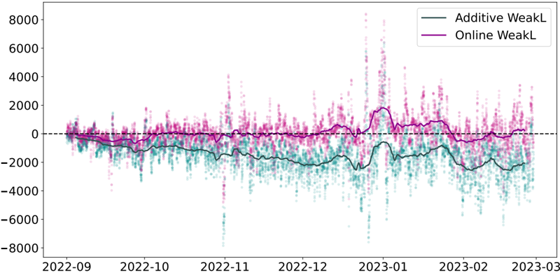
## Line Chart: WeakL Comparison
### Overview
The image presents a line chart comparing two time series, labeled "Additive WeakL" and "Online WeakL", over a period from approximately September 2022 to March 2023. The chart displays fluctuations in values, with the y-axis representing the magnitude of these fluctuations and the x-axis representing time. A horizontal dashed line at y=0 is present, likely serving as a baseline for comparison.
### Components/Axes
* **X-axis:** Represents time, spanning from approximately 2022-09 to 2023-03. Tick marks are present at roughly monthly intervals.
* **Y-axis:** Represents the value of "WeakL", ranging from approximately -8000 to 8000. Tick marks are present at 2000-unit intervals.
* **Legend:** Located in the top-right corner.
* "Additive WeakL" - represented by a solid teal line.
* "Online WeakL" - represented by a solid magenta line.
* **Baseline:** A horizontal dashed black line at y=0.
### Detailed Analysis
**Additive WeakL (Teal Line):**
The teal line exhibits significant fluctuations throughout the period. The trend is generally downward from September 2022 to around November 2022, then fluctuates around a negative value. From January 2023, the line shows a slight upward trend, but remains largely negative.
* Approximate values (with uncertainty of +/- 200):
* 2022-09: ~ -500
* 2022-10: ~ -1500
* 2022-11: ~ -2500
* 2022-12: ~ -3000
* 2023-01: ~ -3500
* 2023-02: ~ -2000
* 2023-03: ~ -1000
**Online WeakL (Magenta Line):**
The magenta line also shows substantial fluctuations, but generally remains closer to the zero baseline than the teal line. It exhibits a more erratic pattern, with frequent spikes both above and below the baseline.
* Approximate values (with uncertainty of +/- 200):
* 2022-09: ~ 500
* 2022-10: ~ 500
* 2022-11: ~ 1000
* 2022-12: ~ 2000
* 2023-01: ~ 4000
* 2023-02: ~ 1000
* 2023-03: ~ 0
### Key Observations
* The "Online WeakL" consistently shows higher positive values than the "Additive WeakL" for most of the observed period.
* Both time series exhibit high volatility, with frequent and significant fluctuations.
* The "Additive WeakL" spends a larger portion of the time below the zero baseline.
* There is a notable spike in "Online WeakL" around January 2023, reaching a peak value of approximately 4000.
* The "Additive WeakL" appears to be more stable in the final month (March 2023) compared to the "Online WeakL".
### Interpretation
The chart likely compares the performance or error metrics ("WeakL") of two different algorithms or approaches: an "Additive" method and an "Online" method. The "Online WeakL" generally performs better (higher values) than the "Additive WeakL", suggesting it produces more accurate or desirable results. However, the "Online WeakL" is also more volatile, indicating a greater degree of instability or sensitivity to input data. The spike in January 2023 for "Online WeakL" could represent an anomaly or a specific event that significantly impacted its performance. The baseline at y=0 suggests that positive values are desirable, and the goal is to maximize the "WeakL" metric. The difference in behavior between the two lines suggests that the "Additive" approach may be more robust but less accurate, while the "Online" approach may be more accurate but less stable. Further investigation would be needed to understand the underlying causes of these differences and the implications for practical applications.