## Line Chart: Effective Dimension vs. 2m+1
### Overview
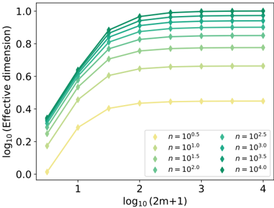
The image presents a line chart illustrating the relationship between the base-10 logarithm of the effective dimension (y-axis) and the base-10 logarithm of (2m+1) (x-axis). Multiple lines are plotted, each representing a different value of 'n', which appears to be a parameter influencing the effective dimension. The chart demonstrates how the effective dimension scales with (2m+1) for various 'n' values.
### Components/Axes
* **X-axis Title:** log₁₀(2m+1)
* **X-axis Scale:** Ranges from approximately 0 to 4.
* **Y-axis Title:** log₁₀(Effective dimension)
* **Y-axis Scale:** Ranges from approximately 0 to 1.
* **Legend:** Located in the bottom-right corner. Contains the following entries:
* Yellow: n = 10⁰.⁵
* Light Green: n = 10¹.⁰
* Green: n = 10².⁰
* Teal: n = 10².⁵
* Dark Teal: n = 10³.⁰
* Dark Green: n = 10³.⁵
* Darkest Green: n = 10⁴.⁰
### Detailed Analysis
The chart displays seven lines, each corresponding to a different 'n' value.
* **n = 10⁰.⁵ (Yellow):** This line starts at approximately 0.1 at x=0 and increases to approximately 0.45 at x=4. It exhibits a concave-down trend, leveling off towards the right side of the chart.
* **n = 10¹.⁰ (Light Green):** This line starts at approximately 0.3 at x=0 and increases to approximately 0.75 at x=4. It shows a similar concave-down trend as the yellow line, but is consistently higher.
* **n = 10².⁰ (Green):** This line starts at approximately 0.6 at x=0 and increases to approximately 0.85 at x=4. It also exhibits a concave-down trend, remaining above the light green line.
* **n = 10².⁵ (Teal):** This line starts at approximately 0.75 at x=0 and increases to approximately 0.95 at x=4. It shows a concave-down trend, consistently higher than the green line.
* **n = 10³.⁰ (Dark Teal):** This line starts at approximately 0.85 at x=0 and increases to approximately 0.98 at x=4. It exhibits a concave-down trend, remaining above the teal line.
* **n = 10³.⁵ (Dark Green):** This line starts at approximately 0.9 at x=0 and remains nearly constant at approximately 0.98 at x=4. It is almost flat, indicating minimal change in effective dimension with increasing (2m+1).
* **n = 10⁴.⁰ (Darkest Green):** This line starts at approximately 0.95 at x=0 and remains nearly constant at approximately 1.0 at x=4. It is the flattest line, indicating the effective dimension saturates at a value of 1.
All lines show an initial increase in effective dimension as (2m+1) increases. However, the rate of increase diminishes as (2m+1) becomes larger, with higher 'n' values reaching saturation more quickly.
### Key Observations
* The effective dimension increases with (2m+1) for all values of 'n'.
* Higher values of 'n' result in higher effective dimensions.
* The increase in effective dimension diminishes as (2m+1) increases, particularly for larger 'n' values.
* For n >= 10³.⁰, the effective dimension approaches 1.0 and plateaus.
### Interpretation
The chart suggests that the effective dimension of a system is influenced by the parameter 'n' and the size of the input space, represented by (2m+1). As the input space grows (increasing (2m+1)), the effective dimension initially increases, but eventually saturates. This saturation point is reached more quickly for larger values of 'n'.
This behavior could indicate that the system's complexity is limited by 'n', and beyond a certain point, increasing the input space does not significantly increase the system's ability to represent or process information. The saturation effect suggests a form of dimensionality reduction or a constraint on the system's capacity. The logarithmic scales used for both axes suggest that the relationship between effective dimension and (2m+1) is not linear, but rather follows a power law or a similar non-linear function. The chart is likely illustrating a theoretical concept in areas like machine learning, information theory, or statistical mechanics, where the effective dimension represents the number of independent variables needed to describe the system's behavior.