\n
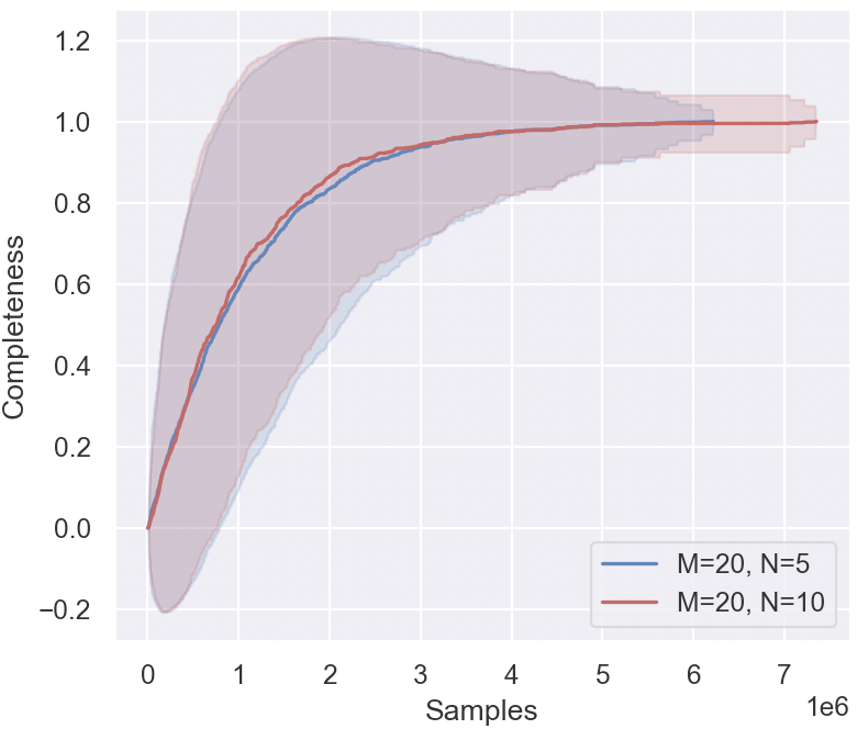
## Line Chart: Completeness vs. Samples
### Overview
The image presents a line chart illustrating the relationship between the number of samples and the completeness of a process or dataset. Two lines are plotted, each representing a different set of parameters (M=20, N=5 and M=20, N=10). Shaded regions around each line indicate the variability or confidence interval.
### Components/Axes
* **X-axis:** Labeled "Samples", ranging from 0 to approximately 7,000,000 (7e6).
* **Y-axis:** Labeled "Completeness", ranging from approximately -0.2 to 1.2.
* **Legend:** Located in the bottom-right corner.
* Blue Line: "M=20, N=5"
* Red Line: "M=20, N=10"
* **Shaded Regions:** Represent the variability around each line. The blue shaded region corresponds to M=20, N=5, and the red shaded region corresponds to M=20, N=10.
### Detailed Analysis
**Line 1: M=20, N=5 (Blue)**
The blue line starts at approximately -0.15 at 0 samples. It exhibits a steep upward slope initially, reaching a completeness of approximately 0.4 at 500,000 samples. The slope gradually decreases, and the line plateaus around a completeness of 0.95 between 4,000,000 and 7,000,000 samples. The shaded region around the blue line is wider at lower sample counts, indicating greater variability, and narrows as the sample count increases.
* 0 Samples: Completeness ≈ -0.15
* 500,000 Samples: Completeness ≈ 0.4
* 1,000,000 Samples: Completeness ≈ 0.65
* 2,000,000 Samples: Completeness ≈ 0.8
* 4,000,000 Samples: Completeness ≈ 0.93
* 7,000,000 Samples: Completeness ≈ 0.95
**Line 2: M=20, N=10 (Red)**
The red line also starts at approximately -0.15 at 0 samples. It initially rises more slowly than the blue line, reaching a completeness of approximately 0.3 at 500,000 samples. The slope then increases, becoming steeper than the blue line between 1,000,000 and 3,000,000 samples. The red line plateaus around a completeness of 1.0 between 3,000,000 and 7,000,000 samples. The shaded region around the red line is also wider at lower sample counts and narrows as the sample count increases.
* 0 Samples: Completeness ≈ -0.15
* 500,000 Samples: Completeness ≈ 0.3
* 1,000,000 Samples: Completeness ≈ 0.5
* 2,000,000 Samples: Completeness ≈ 0.75
* 3,000,000 Samples: Completeness ≈ 0.9
* 4,000,000 Samples: Completeness ≈ 0.98
* 7,000,000 Samples: Completeness ≈ 1.0
### Key Observations
* Both lines exhibit a similar initial behavior, starting with negative completeness values.
* The red line (M=20, N=10) generally achieves higher completeness values than the blue line (M=20, N=5) for a given number of samples.
* The variability (as indicated by the shaded regions) is higher at lower sample counts for both lines.
* Both lines appear to converge towards a completeness of approximately 1.0 as the number of samples increases.
### Interpretation
The chart demonstrates how the completeness of a process or dataset increases with the number of samples, under different parameter settings (M and N). The parameter N appears to have a significant impact on the rate of completeness. A higher value of N (N=10) leads to faster and more complete convergence. The negative completeness values at low sample counts suggest that the initial stages of the process may introduce some degree of incompleteness or error. The convergence towards 1.0 indicates that, given enough samples, the process can achieve a high level of completeness. The shaded regions represent the uncertainty or variance in the completeness, which decreases as the sample size increases, suggesting that the process becomes more stable and predictable with more data. This could represent a learning curve or the convergence of an algorithm. The parameters M and N likely control aspects of the process, with N being the more influential factor in achieving completeness.