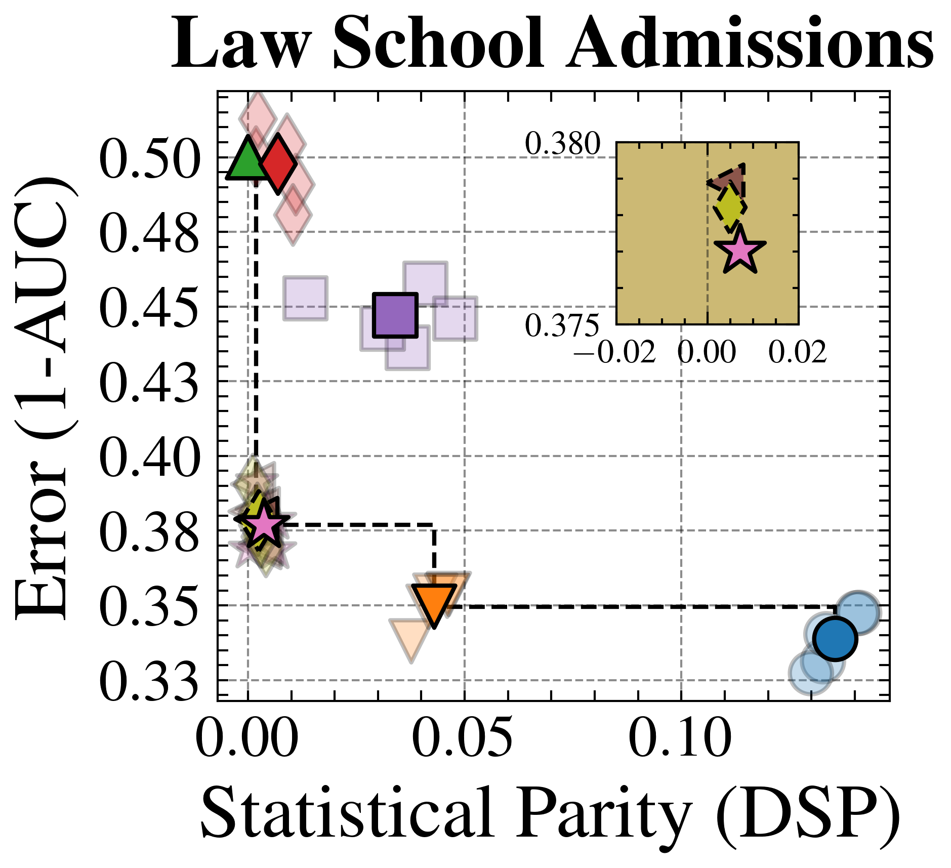
## Scatter Plot: Law School Admissions
### Overview
The image is a scatter plot titled "Law School Admissions". It visualizes the relationship between "Error (1-AUC)" on the y-axis and "Statistical Parity (DSP)" on the x-axis. The plot includes data points represented by different shapes and colors, and a smaller inset plot in the top-right corner provides a zoomed-in view of a cluster of points. A dashed line connects the leftmost data points to the rightmost data points.
### Components/Axes
* **Title:** Law School Admissions
* **X-axis:** Statistical Parity (DSP)
* Scale: 0.00, 0.05, 0.10
* **Y-axis:** Error (1-AUC)
* Scale: 0.33, 0.35, 0.38, 0.40, 0.43, 0.45, 0.48, 0.50
* **Data Points:** Represented by different shapes and colors (Diamonds, Squares, Triangles, Stars, Circles).
* **Inset Plot:** Located in the top-right corner, showing a zoomed-in view.
* X-axis Scale (Inset): -0.02, 0.00, 0.02
* Y-axis Markers (Inset): 0.375, 0.380
### Detailed Analysis or Content Details
**Main Plot Data Points:**
* **Diamonds (Red/Green):** Located at the top-left of the plot. The red diamond is at approximately (0.00, 0.49), and the green diamond is at approximately (0.00, 0.50).
* **Squares (Purple):** Located around (0.04, 0.45).
* **Triangles (Orange):** Located around (0.04, 0.36).
* **Stars (Pink):** Located around (0.00, 0.38).
* **Circles (Blue):** Located at the bottom-right of the plot, around (0.12, 0.34).
**Inset Plot Data Points:**
* The inset plot shows a zoomed-in view of data points clustered near the origin.
* Shapes include diamonds (brown/yellow) and a star (pink).
* The pink star in the inset plot is located at approximately (0.00, 0.377).
**Dashed Line:**
* A dashed line connects the leftmost data points (stars, diamonds) to the rightmost data points (circles).
* The line appears to indicate a general trend or boundary.
### Key Observations
* The plot shows a distribution of data points across different levels of "Statistical Parity" and "Error".
* There is a cluster of points with low "Statistical Parity" and varying "Error" values.
* The dashed line suggests a trade-off between "Statistical Parity" and "Error".
* The inset plot highlights the density of data points near the origin.
### Interpretation
The scatter plot visualizes the performance of different models or algorithms in the context of "Law School Admissions," balancing "Error" (potentially a measure of accuracy) and "Statistical Parity" (a measure of fairness or bias). The distribution of points suggests that some models achieve low error but at the cost of lower statistical parity, and vice versa. The dashed line may represent a Pareto frontier, indicating the best possible trade-offs between these two metrics. The inset plot emphasizes the behavior of models with very low statistical parity. The different shapes and colors likely represent different models or configurations, allowing for a comparison of their performance characteristics.