## Line Graphs: Age Group Trends and Ratios Over Time
### Overview
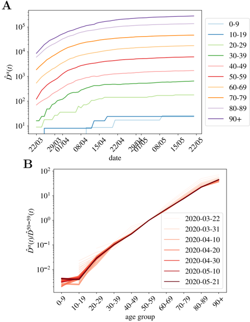
The image contains two line graphs (A and B) analyzing age-related trends in a metric denoted as **D̂a(t)**. Chart A tracks **D̂a(t)** values across age groups over time, while Chart B examines the ratio of **D̂a(t)** to **D̂50-59(t)** across age groups for specific dates.
---
### Components/Axes
#### Chart A
- **X-axis**: Labeled "date" with markers for **22/03**, **29/03**, **01/04**, **08/04**, **15/04**, **22/04**, **29/04**, **01/05**, **08/05**, **15/05**, **22/05** (March–May 2020).
- **Y-axis**: Labeled **D̂a(t)** on a logarithmic scale (10¹ to 10⁵).
- **Legend**: Positioned on the right, mapping age groups to colors:
- **0-9**: Blue
- **10-19**: Teal
- **20-29**: Light green
- **30-39**: Green
- **40-49**: Pink
- **50-59**: Red
- **60-69**: Orange
- **70-79**: Light orange
- **80-89**: Light purple
- **90+**: Purple
#### Chart B
- **X-axis**: Labeled "age group" with categories **0-9**, **10-19**, ..., **90+**.
- **Y-axis**: Labeled **D̂a(t)/D̂50-59(t)** on a logarithmic scale (10⁻² to 10¹).
- **Legend**: Positioned on the right, mapping dates to colors:
- **2020-03-22**: Light red
- **2020-03-31**: Red
- **2020-04-10**: Dark red
- **2020-04-20**: Maroon
- **2020-05-10**: Dark maroon
- **2020-05-21**: Black
---
### Detailed Analysis
#### Chart A
- **Trends**:
- All age groups show **increasing D̂a(t)** over time.
- **90+** (purple) consistently has the highest values, peaking near **10⁵** by **22/05**.
- **0-9** (blue) remains the lowest, plateauing near **10¹**.
- **50-59** (red) shows a sharp rise from ~10² to ~10⁴ between **22/03** and **22/05**.
- **Spatial Grounding**:
- Legend aligns with line colors (e.g., purple for **90+** matches the topmost line).
- Lines are plotted left-to-right chronologically.
#### Chart B
- **Trends**:
- Ratio **D̂a(t)/D̂50-59(t)** increases with age, peaking at **90+** (~10¹).
- **0-9** (light red) starts near **10⁻²** and rises slightly.
- Lines for all dates overlap closely, indicating minimal temporal variation.
- **Spatial Grounding**:
- Legend colors match line hues (e.g., dark maroon for **2020-05-10** aligns with the darkest line).
---
### Key Observations
1. **Age-Dependent Risk**: Older age groups (e.g., **90+**) exhibit significantly higher **D̂a(t)** values than younger groups, with a 10⁴-fold difference between **0-9** and **90+** by **22/05**.
2. **Consistency Over Time**: Ratios in Chart B remain stable across dates, suggesting the age-related trend is robust.
3. **Acceleration in Mid-Age Groups**: **50-59** (red) shows a steep upward curve in Chart A, indicating a critical inflection point.
---
### Interpretation
- **Public Health Implications**: The data suggests **D̂a(t)** (possibly disease prevalence or mortality risk) disproportionately affects older populations, with the **90+** group at highest risk.
- **Temporal Dynamics**: The sharp rise in **50-59** (Chart A) may reflect an emerging wave of cases or policy changes during this period.
- **Ratio Stability (Chart B)**: The consistency of age-related ratios across dates implies that relative risk profiles for age groups remained unchanged during the observed period, despite absolute values increasing.
No textual content or tables are present in the image. All data is derived from line trends and axis labels.