\n
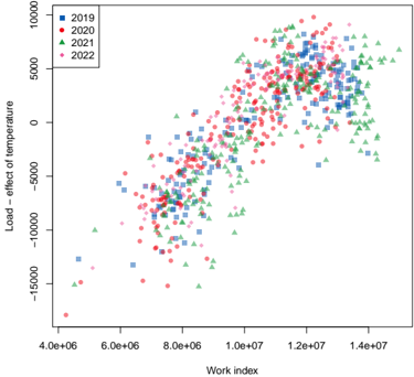
## Scatter Plot: Load vs. Work Index with Temperature Effect
### Overview
The image presents a scatter plot visualizing the relationship between "Work Index" and "Load – effect of temperature" for four different years: 2019, 2020, 2021, and 2022. Each year is represented by a distinct color and marker shape. The plot appears to show a positive correlation between Work Index and Load, with variations across the years.
### Components/Axes
* **X-axis:** "Work index" - Scale ranges approximately from 4.0e+06 to 1.4e+07.
* **Y-axis:** "Load – effect of temperature" - Scale ranges approximately from -15000 to 10000.
* **Legend:** Located in the top-left corner, identifying the years and their corresponding colors/markers:
* 2019: Blue squares
* 2020: Red circles
* 2021: Green triangles
* 2022: Pink diamonds
### Detailed Analysis
The data points are distributed across the plot, with each year exhibiting a distinct pattern.
* **2019 (Blue Squares):** The data points generally cluster in the lower-left quadrant, with a noticeable upward trend as the Work Index increases. The Load values range from approximately -10000 to 5000.
* **2020 (Red Circles):** The data points are more dispersed than those of 2019, spanning a wider range of Load values, from approximately -15000 to 7000. There's a general upward trend, but with more scatter.
* **2021 (Green Triangles):** The data points are concentrated in the upper-right quadrant, with Load values predominantly positive, ranging from approximately -5000 to 8000. The trend is strongly upward.
* **2022 (Pink Diamonds):** The data points are also concentrated in the upper-right quadrant, similar to 2021, but with a slightly wider spread. Load values range from approximately 0 to 9000.
**Approximate Data Points (sampled for illustration):**
| Year | Work Index (approx.) | Load – effect of temperature (approx.) |
|---|---|---|
| 2019 | 4.5e+06 | -8000 |
| 2019 | 6.0e+06 | -2000 |
| 2019 | 8.0e+06 | 2000 |
| 2019 | 1.2e+07 | 4000 |
| 2020 | 4.2e+06 | -14000 |
| 2020 | 6.5e+06 | -1000 |
| 2020 | 8.5e+06 | 3000 |
| 2020 | 1.3e+07 | 6000 |
| 2021 | 5.0e+06 | -2000 |
| 2021 | 7.0e+06 | 2000 |
| 2021 | 9.0e+06 | 5000 |
| 2021 | 1.4e+07 | 7000 |
| 2022 | 5.5e+06 | 1000 |
| 2022 | 7.5e+06 | 4000 |
| 2022 | 9.5e+06 | 6000 |
| 2022 | 1.4e+07 | 8000 |
### Key Observations
* The relationship between Work Index and Load appears to be generally positive for all years.
* The Load values tend to increase with the Work Index.
* 2021 and 2022 show a more pronounced positive correlation and higher Load values compared to 2019 and 2020.
* 2020 exhibits the most scatter in the data, suggesting greater variability in the Load for a given Work Index.
* 2019 has the lowest Load values overall.
### Interpretation
The plot suggests that as the "Work Index" increases, the "Load – effect of temperature" also tends to increase. This could indicate that higher work indices are associated with greater thermal effects. The differences between the years suggest that the relationship between Work Index and Load may be influenced by other factors that vary annually. The increasing Load values in 2021 and 2022 could be due to changes in environmental conditions, operational parameters, or other variables not explicitly shown in the plot. The wider scatter in 2020 might indicate a period of instability or greater variability in the system being measured. The data could be used to model the thermal load based on the work index, and to identify years with particularly high or low thermal effects. Further investigation would be needed to understand the underlying causes of these trends and variations.