## Bar Chart: CoC (Interweave)
### Overview
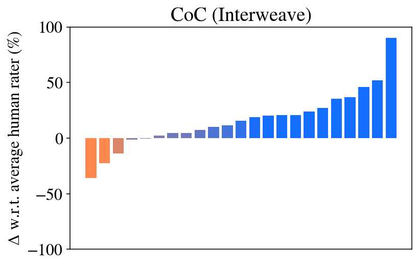
This is a vertical bar chart titled "CoC (Interweave)". It displays the performance of multiple items (likely models, methods, or test cases) relative to an average human rater. The chart shows a clear progression from negative to positive values, with bars colored in a gradient from orange to blue.
### Components/Axes
* **Title:** "CoC (Interweave)" (located at the top center).
* **Y-Axis:**
* **Label:** "Δ w.r.t. average human rater (%)". This indicates the metric is the percentage change or difference relative to the average human rater's score.
* **Scale:** Linear scale ranging from -100 to 100.
* **Major Ticks:** -100, -50, 0, 50, 100.
* **X-Axis:** No explicit labels or categories are provided for the individual bars. The bars are arranged in a sequence from left to right.
* **Data Series:** A single series of approximately 20 vertical bars.
* **Color Legend:** No separate legend is present. The bar colors themselves form a gradient:
* **Orange:** Used for bars with negative values (below the human rater average).
* **Blue:** Used for bars with positive values (above the human rater average).
* The color transitions smoothly from orange through neutral tones to blue as the values increase.
### Detailed Analysis
The chart presents a sorted sequence of values. Reading from left to right:
1. **Bar 1 (Far Left):** Orange. Value ≈ -35%.
2. **Bar 2:** Orange. Value ≈ -20%.
3. **Bar 3:** Light Orange/Brown. Value ≈ -10%.
4. **Bar 4:** Very light gray/blue. Value ≈ -1% (slightly below zero).
5. **Bar 5:** Light blue. Value ≈ +1% (slightly above zero).
6. **Bar 6:** Light blue. Value ≈ +3%.
7. **Bar 7:** Light blue. Value ≈ +5%.
8. **Bar 8:** Blue. Value ≈ +8%.
9. **Bar 9:** Blue. Value ≈ +10%.
10. **Bar 10:** Blue. Value ≈ +12%.
11. **Bar 11:** Blue. Value ≈ +15%.
12. **Bar 12:** Blue. Value ≈ +18%.
13. **Bar 13:** Blue. Value ≈ +20%.
14. **Bar 14:** Blue. Value ≈ +20% (appears equal to Bar 13).
15. **Bar 15:** Blue. Value ≈ +22%.
16. **Bar 16:** Blue. Value ≈ +25%.
17. **Bar 17:** Blue. Value ≈ +30%.
18. **Bar 18:** Blue. Value ≈ +35%.
19. **Bar 19:** Blue. Value ≈ +45%.
20. **Bar 20:** Blue. Value ≈ +50%.
21. **Bar 21 (Far Right):** Blue. Value ≈ +90%.
**Trend Verification:** The data series shows a consistent, monotonic upward trend from left to right. The slope is gentle in the middle section and becomes very steep for the final few bars on the right.
### Key Observations
1. **Clear Performance Gradient:** The items are sorted by performance, showing a continuous spectrum from significantly below average (-35%) to dramatically above average (+90%).
2. **Color-Value Correlation:** The color gradient is perfectly synchronized with the value, providing an immediate visual cue for performance relative to the benchmark (human rater).
3. **Asymmetric Distribution:** The majority of items (approximately 18 out of 21) perform at or above the human rater average (value ≥ 0). Only the first three to four items are below average.
4. **High-End Outlier:** The rightmost bar is a significant outlier, showing a performance gain (+90%) nearly double that of the next highest bar (+50%).
5. **Missing Context:** The lack of labels on the x-axis means the specific identities of the items being compared are unknown from the chart alone.
### Interpretation
This chart, likely from a research paper or technical report on AI/ML evaluation ("CoC" may stand for "Chain-of-Caption" or a similar metric), demonstrates the results of an "Interweave" method or dataset. The data suggests that the "Interweave" approach enables most tested systems to meet or exceed human-level performance on the measured task.
The **Peircean investigative reading** reveals:
* **Index:** The sorted bars are an index of relative performance.
* **Symbol:** The "Δ w.r.t. average human rater (%)" symbolizes a standardized evaluation framework.
* **Icon:** The color gradient iconically represents the transition from "worse than human" (warm, warning colors) to "better than human" (cool, positive colors).
The most critical insight is the **effectiveness ceiling being broken**. The final bar's extreme value indicates that at least one configuration under the "Interweave" paradigm achieves a transformative improvement, suggesting a potential breakthrough or a highly optimized case. The chart's primary purpose is to visually argue that the presented method generally elevates performance above the human baseline and can, in best-case scenarios, vastly surpass it.