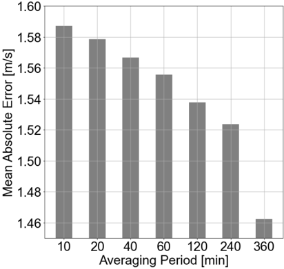
## Bar Chart: Mean Absolute Error vs. Averaging Period
### Overview
The chart displays a bar graph comparing the **Mean Absolute Error (MAE)** in meters per second (m/s) across different **Averaging Periods** measured in minutes. The y-axis represents MAE values ranging from 1.46 to 1.60 m/s, while the x-axis lists averaging periods of 10, 20, 40, 60, 120, 240, and 360 minutes. All bars are gray, with no additional legends or color coding.
### Components/Axes
- **X-axis (Averaging Period [min])**: Categories are 10, 20, 40, 60, 120, 240, and 360 minutes. Labels are centered below each bar.
- **Y-axis (Mean Absolute Error [m/s])**: Scale ranges from 1.46 to 1.60 m/s, with gridlines at 0.02 m/s intervals.
- **Legend**: No explicit legend is visible, but all bars are uniformly gray, suggesting a single data series.
### Detailed Analysis
- **10 minutes**: Bar height corresponds to ~1.58 m/s (tallest bar).
- **20 minutes**: ~1.58 m/s (slightly shorter than 10 minutes).
- **40 minutes**: ~1.56 m/s (gradual decline).
- **60 minutes**: ~1.55 m/s (continued decrease).
- **120 minutes**: ~1.54 m/s (moderate drop).
- **240 minutes**: ~1.52 m/s (further reduction).
- **360 minutes**: ~1.46 m/s (significant outlier, much lower than preceding values).
### Key Observations
1. **General Trend**: MAE decreases as the averaging period increases, suggesting longer periods reduce error.
2. **Outlier**: The 360-minute bar deviates sharply from the trend, showing a much lower error (~1.46 m/s) compared to the gradual decline observed in shorter periods.
3. **Consistency**: The first six bars follow a nearly linear decline, while the last bar breaks this pattern.
### Interpretation
The data suggests that increasing the averaging period generally improves accuracy (lower MAE), likely due to noise reduction in the data. However, the 360-minute period’s drastic drop may indicate:
- A threshold effect where errors stabilize or are minimized beyond a certain period.
- Potential data anomalies (e.g., sparse or uniform data at 360 minutes).
- Methodological changes in error calculation for longer periods.
The uniformity of the first six bars implies a predictable relationship between averaging time and error, while the 360-minute outlier warrants further investigation to determine if it reflects a genuine trend or an outlier in the dataset.