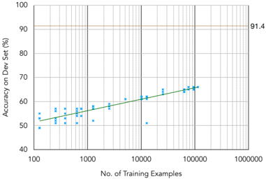
## Line Graph: Accuracy on Dev Set vs. Number of Training Examples
### Overview
The image is a line graph depicting the relationship between the number of training examples and the accuracy of a model on a development set. The x-axis represents the number of training examples (ranging from 100 to 1,000,000), while the y-axis represents accuracy as a percentage (from 40% to 100%). A green trend line and blue data points illustrate the model's performance, with a red horizontal line marking a target accuracy of 91.4%.
### Components/Axes
- **X-axis (Horizontal)**: "No. of Training Examples" (logarithmic scale: 100, 1,000, 10,000, 100,000, 1,000,000).
- **Y-axis (Vertical)**: "Accuracy on Dev Set (%)" (linear scale: 40% to 100%).
- **Legend**:
- **Green line**: "Training Accuracy Trend" (solid line).
- **Red line**: "Target Accuracy (91.4%)" (horizontal line at 91.4%).
- **Data Points**: Blue "x" markers representing individual accuracy measurements at specific training example counts.
### Detailed Analysis
- **Green Trend Line**:
- Starts near **50%** at 100 training examples.
- Increases gradually, reaching **~60%** at 10,000 examples.
- Plateaus near **~65%** at 100,000 examples.
- The line exhibits a logarithmic growth pattern, with diminishing returns as the number of examples increases.
- **Blue Data Points**:
- Scattered around the green trend line, with minor deviations (e.g., some points slightly below or above the line).
- No significant outliers observed.
- **Red Target Line**:
- Horizontal line at **91.4%**, consistently above the green trend line across all training example counts.
### Key Observations
1. **Accuracy Growth**: The model's accuracy improves with more training data, but the rate of improvement slows significantly after 10,000 examples.
2. **Target Gap**: The model's accuracy (green line) remains **~26% below the target (91.4%)** even at 100,000 examples.
3. **Logarithmic Scaling**: The x-axis uses a logarithmic scale, emphasizing the exponential growth in training data required for incremental accuracy gains.
### Interpretation
The graph demonstrates that increasing the number of training examples enhances model performance, but the improvement is not linear. The green trend line suggests diminishing returns, indicating that the model may be approaching a performance ceiling with the current architecture or data quality. The red target line (91.4%) highlights a critical gap, implying that either:
- **More data** is needed to close the gap, or
- **Model improvements** (e.g., architecture changes, hyperparameter tuning) are required to achieve the target accuracy.
The logarithmic trend underscores the challenge of scaling machine learning models, where additional data yields smaller performance gains over time. This pattern is common in real-world scenarios, where data scarcity or model limitations constrain performance.