\n
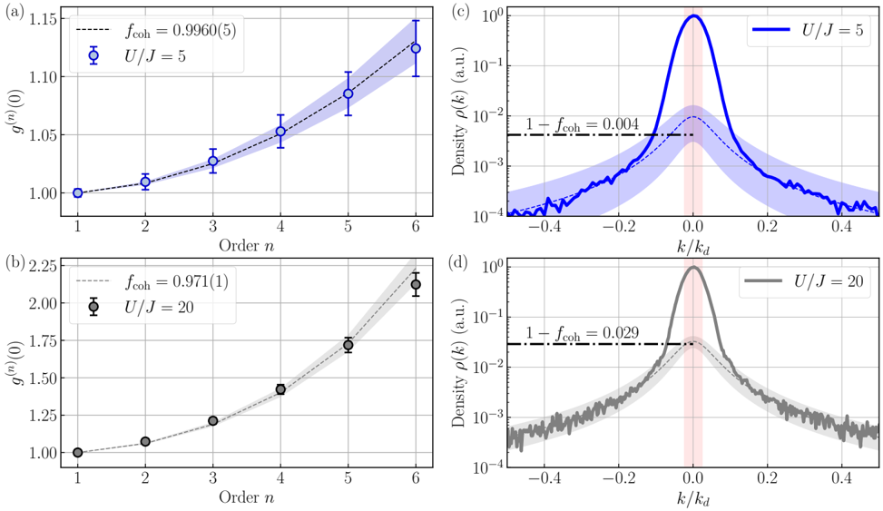
## Charts: Correlation Function and Density Distribution
### Overview
The image presents four charts: (a) and (b) depict correlation functions, while (c) and (d) show density distributions. Charts (a) and (c) correspond to U/J = 5, and charts (b) and (d) correspond to U/J = 20. The correlation functions show the average value of a quantity (denoted as ⟨n(r)⟩) as a function of order 'n'. The density distributions show the probability density function ρ(k) as a function of k/kd.
### Components/Axes
* **Charts (a) & (b):**
* X-axis: Order n (ranging from approximately 1 to 6).
* Y-axis: ⟨n(r)⟩ (ranging from approximately 1.0 to 2.25).
* Data points: Represented by circles with error bars.
* Shaded region: Represents the uncertainty around the fitted curve.
* Text: "fcoh = 0.9960(5)" for (a) and "fcoh = 0.971(1)" for (b).
* Label: "U/J = 5" for (a) and "U/J = 20" for (b).
* **Charts (c) & (d):**
* X-axis: k/kd (ranging from approximately -0.4 to 0.4, on a logarithmic scale).
* Y-axis: Density ρ(k) (a.u.) (ranging from approximately 10^-4 to 10^0, on a logarithmic scale).
* Lines: Represent the density distribution.
* Shaded region: Represents the uncertainty or variation in the density distribution.
* Text: "1 + fcoh = 0.004" for (c) and "1 + fcoh = 0.029" for (d).
* Label: "U/J = 5" for (c) and "U/J = 20" for (d).
* Red shaded region: Highlighted area around k/kd = 0.
* **Legend (top-right):**
* U/J = 5 (Blue line)
* U/J = 20 (Black line)
### Detailed Analysis or Content Details
* **Chart (a):** The blue line representing U/J = 5 shows an upward trend.
* n = 1: ⟨n(r)⟩ ≈ 1.00, error bar ≈ ± 0.02
* n = 2: ⟨n(r)⟩ ≈ 1.04, error bar ≈ ± 0.02
* n = 3: ⟨n(r)⟩ ≈ 1.08, error bar ≈ ± 0.02
* n = 4: ⟨n(r)⟩ ≈ 1.12, error bar ≈ ± 0.03
* n = 5: ⟨n(r)⟩ ≈ 1.16, error bar ≈ ± 0.03
* n = 6: ⟨n(r)⟩ ≈ 1.20, error bar ≈ ± 0.04
* **Chart (b):** The black line representing U/J = 20 shows a steeper upward trend.
* n = 1: ⟨n(r)⟩ ≈ 1.00, error bar ≈ ± 0.03
* n = 2: ⟨n(r)⟩ ≈ 1.20, error bar ≈ ± 0.04
* n = 3: ⟨n(r)⟩ ≈ 1.40, error bar ≈ ± 0.05
* n = 4: ⟨n(r)⟩ ≈ 1.60, error bar ≈ ± 0.06
* n = 5: ⟨n(r)⟩ ≈ 1.80, error bar ≈ ± 0.07
* n = 6: ⟨n(r)⟩ ≈ 2.00, error bar ≈ ± 0.08
* **Chart (c):** The blue line representing U/J = 5 shows a peak around k/kd = 0, with a relatively narrow distribution.
* Peak density ≈ 1.0
* Density at k/kd = ±0.2 ≈ 0.1
* Density at k/kd = ±0.4 ≈ 0.01
* **Chart (d):** The black line representing U/J = 20 shows a broader peak around k/kd = 0, with a wider distribution.
* Peak density ≈ 1.0
* Density at k/kd = ±0.2 ≈ 0.2
* Density at k/kd = ±0.4 ≈ 0.05
### Key Observations
* The correlation function ⟨n(r)⟩ increases with order 'n' for both U/J values, indicating a positive correlation.
* The rate of increase in ⟨n(r)⟩ is significantly higher for U/J = 20 (Chart b) compared to U/J = 5 (Chart a).
* The density distribution for U/J = 5 (Chart c) is more sharply peaked around k/kd = 0, suggesting a more localized distribution.
* The density distribution for U/J = 20 (Chart d) is broader, indicating a more delocalized distribution.
* The value of fcoh is higher for U/J = 5 (0.9960(5)) than for U/J = 20 (0.971(1)).
### Interpretation
These charts likely represent the behavior of a system (possibly a quantum system) with different interaction strengths (U/J). The correlation function ⟨n(r)⟩ measures the spatial correlation of a quantity 'n' at different distances (represented by 'n'). The density distribution ρ(k) represents the distribution of the system in momentum space.
The higher U/J value (20) leads to a faster increase in the correlation function, suggesting stronger correlations at larger distances. This could indicate a tendency towards ordering or localization. The broader density distribution for U/J = 20 supports this interpretation, as it implies that the system's momentum is more spread out, consistent with a more delocalized state.
The fcoh parameter likely represents a coherence factor. The higher value for U/J = 5 suggests a higher degree of coherence in the system at that interaction strength. The red shaded region around k/kd = 0 in both density distribution charts may highlight a specific region of interest, potentially related to the system's ground state or a dominant scattering process. The logarithmic scale on the y-axis of the density distribution charts emphasizes the relative probabilities of different momentum values.