TECHNICAL ASSET FINGERPRINT
c6d39acf484fbc81ff3226d4
Click to view fullscreen
Press ESC or click to close
FOUND IN PAPERS
EXPERT: healer-alpha-free VERSION 1
RUNTIME: free/openrouter/healer-alpha
INTEL_VERIFIED
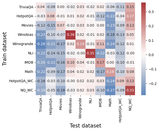
## Heatmap: Cross-Dataset Performance Comparison
### Overview
The image is a heatmap visualizing numerical performance scores (likely correlation coefficients, transfer learning gains, or similar metrics) between various training datasets (y-axis) and test datasets (x-axis). The values range from approximately -0.28 to +0.36, with a color scale from blue (negative) to red (positive). The chart compares 10 distinct datasets on both axes.
### Components/Axes
* **Y-Axis (Vertical):** Labeled "Train dataset". Contains 10 categorical labels, from top to bottom:
1. TriviaQA
2. HotpotQA
3. Movies
4. Winobias
5. Winogrande
6. NLI
7. IMDB
8. Math
9. HotpotQA_WC
10. NQ_WC
* **X-Axis (Horizontal):** Labeled "Test dataset". Contains the same 10 categorical labels, from left to right:
1. TriviaQA
2. HotpotQA
3. Movies
4. Winobias
5. Winogrande
6. NLI
7. IMDB
8. Math
9. HotpotQA_WC
10. NQ_WC
* **Legend/Color Bar:** Positioned on the right side of the chart. It is a vertical gradient bar mapping color to numerical value.
* **Scale:** Linear.
* **Range:** Approximately -0.2 (dark blue) to +0.3 (dark red).
* **Key Markers:** -0.2, -0.1, 0.0, 0.1, 0.2, 0.3.
* **Interpretation:** Blue shades indicate negative values, white/light shades indicate values near zero, and red shades indicate positive values.
### Detailed Analysis
The heatmap is a 10x10 grid. Each cell contains a numerical value and is colored according to the legend. Below is the reconstructed data table, with Train dataset as rows and Test dataset as columns.
| Train \ Test | TriviaQA | HotpotQA | Movies | Winobias | Winogrande | NLI | IMDB | Math | HotpotQA_WC | NQ_WC |
| :--- | :--- | :--- | :--- | :--- | :--- | :--- | :--- | :--- | :--- | :--- |
| **TriviaQA** | 0.04 | -0.08 | 0.00 | -0.02 | 0.03 | -0.02 | 0.02 | -0.06 | -0.11 | 0.15 |
| **HotpotQA** | -0.03 | 0.08 | -0.01 | 0.01 | 0.02 | -0.01 | -0.12 | -0.22 | -0.04 | 0.17 |
| **Movies** | -0.12 | -0.15 | 0.07 | -0.02 | 0.03 | 0.00 | 0.00 | -0.23 | -0.09 | 0.13 |
| **Winobias** | -0.23 | -0.10 | -0.07 | **0.36** | 0.02 | -0.01 | 0.02 | -0.18 | -0.13 | 0.05 |
| **Winogrande** | -0.28 | -0.21 | -0.17 | 0.02 | **0.19** | -0.01 | 0.11 | -0.24 | -0.12 | 0.01 |
| **NLI** | -0.22 | -0.14 | -0.15 | -0.02 | 0.00 | **0.35** | -0.22 | -0.03 | -0.12 | -0.00 |
| **IMDB** | -0.20 | -0.22 | -0.16 | 0.10 | 0.04 | -0.01 | **0.17** | 0.00 | -0.10 | -0.01 |
| **Math** | -0.22 | -0.09 | -0.17 | 0.04 | 0.02 | 0.02 | -0.17 | **0.18** | -0.10 | 0.08 |
| **HotpotQA_WC** | -0.16 | -0.03 | -0.10 | -0.00 | 0.02 | 0.02 | 0.03 | -0.24 | **0.09** | 0.13 |
| **NQ_WC** | -0.19 | -0.05 | -0.18 | -0.03 | 0.02 | 0.03 | -0.10 | -0.27 | -0.09 | **0.33** |
**Trend Verification by Row (Train Dataset):**
* **TriviaQA:** Mostly neutral to slightly negative values, with a positive spike (0.15) on NQ_WC.
* **HotpotQA:** Mixed, with a notable negative value on Math (-0.22) and a positive value on NQ_WC (0.17).
* **Movies:** Generally negative or near-zero, except for its own test (0.07) and NQ_WC (0.13).
* **Winobias:** Strong positive on its own test (0.36, the highest value in the chart), otherwise mostly negative.
* **Winogrande:** Strong negative values across most tests, except for a positive on its own test (0.19) and a mild positive on IMDB (0.11).
* **NLI:** Strong positive on its own test (0.35), otherwise strongly negative, especially on IMDB (-0.22).
* **IMDB:** Negative across most, with positives on Winobias (0.10) and its own test (0.17).
* **Math:** Mostly negative, with a positive on its own test (0.18) and a mild positive on NQ_WC (0.08).
* **HotpotQA_WC:** Mostly negative, with positives on its own test (0.09) and NQ_WC (0.13).
* **NQ_WC:** Strong positive on its own test (0.33), otherwise mostly negative, with a strong negative on Math (-0.27).
### Key Observations
1. **Diagonal Dominance:** The highest values for each row almost always occur on the diagonal (where Train and Test datasets are the same). This suggests models perform best when tested on the same domain they were trained on.
2. **Highest Positive Values:** The strongest positive scores are **Winobias→Winobias (0.36)**, **NLI→NLI (0.35)**, and **NQ_WC→NQ_WC (0.33)**.
3. **Strongest Negative Values:** The most negative scores are **Winogrande→TriviaQA (-0.28)**, **NQ_WC→Math (-0.27)**, and **Winogrande→Math (-0.24)**.
4. **NQ_WC as a Test Set:** The NQ_WC column (far right) shows a consistent pattern of positive values for almost all training sets, suggesting it may be an "easier" or more generalizable test benchmark.
5. **Math as a Test Set:** The Math column shows consistently negative values for all training sets except its own, indicating it is a difficult, specialized domain that does not transfer well from other datasets.
### Interpretation
This heatmap likely illustrates **transfer learning performance** or **cross-domain generalization** between different natural language processing (NLP) and reasoning datasets. The data suggests:
* **Strong Domain Specificity:** The prominent diagonal indicates that knowledge or skills learned from a specific dataset (e.g., Winobias for bias detection, NLI for natural language inference) do not transfer effectively to other domains. This is a common challenge in AI, highlighting the lack of robust, generalizable understanding.
* **Asymmetric Relationships:** The transfer is not symmetric. For example, training on Winobias and testing on Winogrande yields 0.02, but training on Winogrande and testing on Winobias yields 0.02 as well in this case, but other pairs show more asymmetry. This implies the datasets capture different, sometimes non-overlapping, skills.
* **Nature of Benchmarks:** The consistent positivity of the NQ_WC test column might indicate it is a broader, more factual recall-based benchmark that benefits from many types of training data. Conversely, the consistent negativity of the Math test column underscores its unique, formal reasoning requirements that are not addressed by general language datasets.
* **Outliers and Anomalies:** The strong negative values (e.g., -0.28) are as informative as the positives. They suggest that training on certain datasets (like Winogrande) might actively *hurt* performance on others (like TriviaQA), possibly due to conflicting objectives or overfitting to specific patterns that are misleading in a new context.
In essence, the chart maps the "knowledge landscape" of these AI benchmarks, showing islands of specialized competence (the diagonal) surrounded by seas of negative or neutral transfer, with a few bridges (like NQ_WC) that connect to multiple training sources.
DECODING INTELLIGENCE...