\n
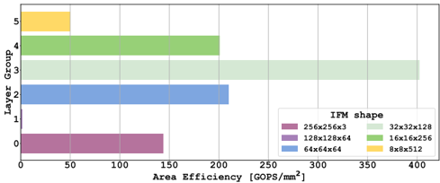
## Bar Chart: Area Efficiency vs. Layer Group
### Overview
This is a horizontal bar chart illustrating the relationship between Area Efficiency (measured in GOPS/mm²) and Layer Group, categorized by IFM (Input Feature Map) shape. The chart displays the area efficiency for six different layer groups, each represented by a distinct color corresponding to a specific IFM shape.
### Components/Axes
* **X-axis:** Area Efficiency [GOPS/mm²], ranging from 0 to 400, with tick marks at 50, 100, 150, 200, 250, 300, 350, and 400.
* **Y-axis:** Layer Group, ranging from 0 to 5, with tick marks at each integer value.
* **Legend:** Located in the top-right corner, detailing the IFM shape associated with each color:
* Magenta: 256x256x3
* Purple: 128x128x64
* Blue: 64x64x64
* Light Green: 32x32x128
* Green: 16x16x256
* Yellow: 8x8x512
### Detailed Analysis
The chart consists of six horizontal bars, each representing a layer group. The length of each bar corresponds to its area efficiency.
* **Layer Group 0 (Magenta):** The bar extends to approximately 120 GOPS/mm².
* **Layer Group 1 (Purple):** The bar extends to approximately 190 GOPS/mm².
* **Layer Group 2 (Blue):** The bar extends to approximately 210 GOPS/mm².
* **Layer Group 3 (Light Green):** The bar extends to approximately 320 GOPS/mm².
* **Layer Group 4 (Green):** The bar extends to approximately 380 GOPS/mm².
* **Layer Group 5 (Yellow):** The bar extends to approximately 60 GOPS/mm².
The bars are arranged vertically, with Layer Group 0 at the bottom and Layer Group 5 at the top.
### Key Observations
* Layer Group 4 exhibits the highest area efficiency, at approximately 380 GOPS/mm².
* Layer Group 5 exhibits the lowest area efficiency, at approximately 60 GOPS/mm².
* Area efficiency generally increases with Layer Group, peaking at Layer Group 4, then decreasing at Layer Group 5.
* The IFM shape 16x16x256 (Green) corresponds to the highest area efficiency.
* The IFM shape 8x8x512 (Yellow) corresponds to the lowest area efficiency.
### Interpretation
The data suggests a correlation between Layer Group, IFM shape, and Area Efficiency. The increasing trend in area efficiency from Layer Group 0 to 4 indicates that certain layer configurations are more efficient in terms of GOPS per square millimeter. The significant drop in area efficiency at Layer Group 5 suggests that the chosen IFM shape (8x8x512) for that layer is less optimal.
The relationship between IFM shape and area efficiency is also apparent. The larger IFM shapes (256x256x3, 128x128x64) generally result in lower area efficiencies compared to smaller IFM shapes (16x16x256, 32x32x128). This could be due to increased computational overhead or memory access costs associated with larger feature maps.
The chart provides valuable insights for optimizing neural network architectures by identifying layer configurations and IFM shapes that maximize area efficiency. The outlier at Layer Group 5 warrants further investigation to understand the reasons for its poor performance.