## Line Chart: Accuracy vs. Thinking Compute
### Overview
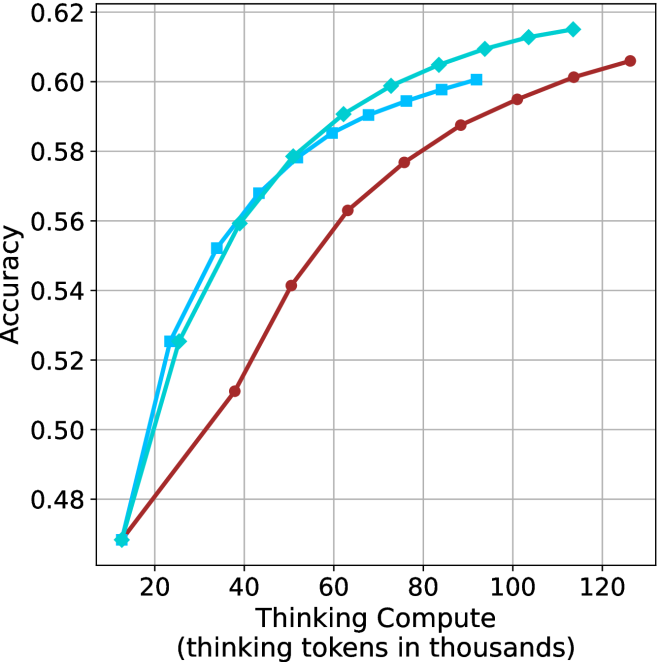
The image is a line chart plotting "Accuracy" against "Thinking Compute (thinking tokens in thousands)." It displays three distinct data series, each represented by a line with unique color and marker style, showing how accuracy changes as the computational resources (thinking tokens) increase. The chart demonstrates a positive correlation between compute and accuracy for all series, with diminishing returns at higher compute levels.
### Components/Axes
* **X-Axis (Horizontal):**
* **Title:** "Thinking Compute (thinking tokens in thousands)"
* **Scale:** Linear scale from 20 to 120, with major tick marks at intervals of 20 (20, 40, 60, 80, 100, 120).
* **Y-Axis (Vertical):**
* **Title:** "Accuracy"
* **Scale:** Linear scale from 0.48 to 0.62, with major tick marks at intervals of 0.02 (0.48, 0.50, 0.52, 0.54, 0.56, 0.58, 0.60, 0.62).
* **Data Series (Legend inferred from visual attributes):**
* **Series 1:** Cyan line with diamond-shaped markers.
* **Series 2:** Cyan line with square-shaped markers.
* **Series 3:** Red (or dark brown) line with circular markers.
* **Grid:** A light gray grid is present, with vertical lines at each x-axis tick and horizontal lines at each y-axis tick.
### Detailed Analysis
**Trend Verification & Data Points (Approximate):**
All three lines show a logarithmic-like growth curve: a steep initial increase in accuracy that gradually flattens as compute increases.
1. **Cyan Line with Diamonds (Top-most line at high compute):**
* **Trend:** Steepest initial slope, consistently the highest or tied for highest accuracy across the range.
* **Approximate Points:**
* (20, 0.47)
* (30, 0.525)
* (40, 0.56)
* (50, 0.578)
* (60, 0.59)
* (70, 0.599)
* (80, 0.605)
* (90, 0.61)
* (100, 0.613)
* (110, 0.615)
2. **Cyan Line with Squares (Middle line at high compute):**
* **Trend:** Follows a very similar trajectory to the diamond line but is consistently slightly lower after the initial point.
* **Approximate Points:**
* (20, 0.47) *[Starts at the same point as the diamond line]*
* (30, 0.52)
* (40, 0.555)
* (50, 0.575)
* (60, 0.585)
* (70, 0.59)
* (80, 0.595)
* (90, 0.60)
3. **Red Line with Circles (Bottom line):**
* **Trend:** Has the shallowest initial slope. It starts at the same accuracy as the others but grows more slowly, remaining below both cyan lines for the entire plotted range after the starting point.
* **Approximate Points:**
* (20, 0.47)
* (40, 0.51)
* (50, 0.54)
* (60, 0.562)
* (70, 0.577)
* (80, 0.588)
* (90, 0.595)
* (100, 0.601)
* (110, 0.606)
### Key Observations
1. **Common Origin:** All three series begin at approximately the same accuracy (~0.47) at the lowest compute point (20k tokens).
2. **Performance Hierarchy:** A clear performance hierarchy is established early (by 30k tokens) and maintained: Diamond ≥ Square > Circle. The gap between the cyan lines and the red line widens significantly between 40k and 80k tokens.
3. **Diminishing Returns:** All curves show clear diminishing returns. The gain in accuracy per additional 10k tokens decreases substantially after ~60k-80k tokens.
4. **Convergence at High Compute:** The slopes of all lines flatten considerably at the high end (100k-120k tokens), suggesting a potential ceiling effect for accuracy within this experimental setup.
5. **Cyan Line Proximity:** The two cyan lines (diamond and square) are very close in performance, with the diamond-marked line maintaining a slight but consistent advantage.
### Interpretation
This chart likely compares the efficiency of different AI model architectures, training methods, or reasoning strategies ("thinking" processes). The "thinking tokens" represent the computational budget allocated to internal reasoning before producing an output.
* **What the data suggests:** The two methods represented by the cyan lines are significantly more **compute-efficient** than the method represented by the red line. They achieve higher accuracy at every level of compute beyond the initial point. The diamond method appears to be the most efficient overall.
* **Relationship between elements:** The direct relationship shown is that increased reasoning compute leads to higher accuracy, but the **rate of improvement** is critically dependent on the underlying method. The chart argues that not all "thinking" is equal; some approaches yield better accuracy per token spent.
* **Notable implications:** The steep initial rise indicates that even a modest investment in thinking compute (from 20k to 40k tokens) yields large accuracy gains for all methods. However, to reach the highest accuracy levels (>0.60), the more efficient (cyan) methods require substantially less compute (~80k-90k tokens) than the less efficient (red) method, which needs over 100k tokens to approach similar performance. This has direct implications for cost and latency in deploying such AI systems. The plateau suggests that simply throwing more compute at the problem may not be a viable path to much higher accuracy without algorithmic improvements.