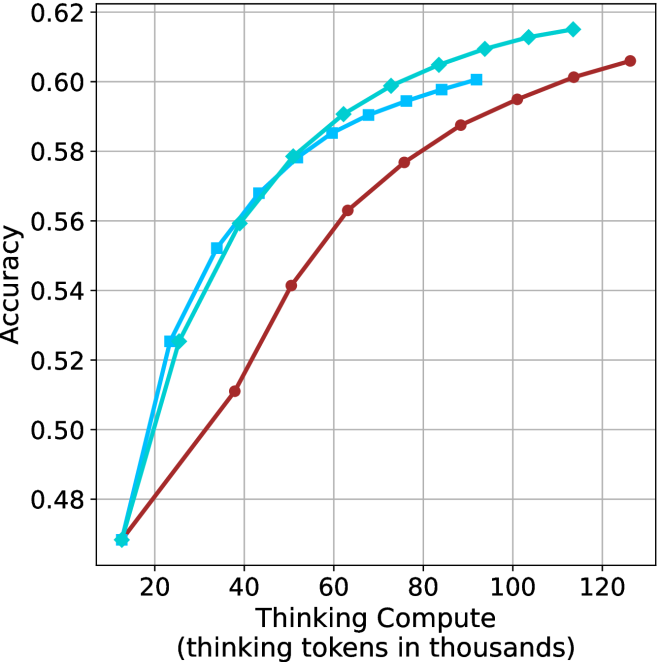
## Line Chart: Accuracy vs. Thinking Compute
### Overview
The image is a line chart comparing the accuracy of different models as a function of "Thinking Compute," measured in thousands of thinking tokens. There are three data series plotted, each represented by a different colored line with distinct markers. The chart shows how accuracy increases with increasing compute for each model.
### Components/Axes
* **X-axis:** "Thinking Compute (thinking tokens in thousands)". The scale ranges from 20 to 120, with tick marks at intervals of 20.
* **Y-axis:** "Accuracy". The scale ranges from 0.48 to 0.62, with tick marks at intervals of 0.02.
* **Data Series:**
* **Light Blue with Diamond Markers:** This line represents one model's performance.
* **Cyan with Square Markers:** This line represents another model's performance.
* **Brown with Circle Markers:** This line represents a third model's performance.
### Detailed Analysis
* **Light Blue (Diamond Markers):**
* Trend: The line slopes upward, indicating increasing accuracy with increasing compute. The rate of increase slows down as compute increases.
* Data Points:
* (20, 0.47)
* (40, 0.525)
* (60, 0.575)
* (80, 0.59)
* (100, 0.61)
* (120, 0.615)
* **Cyan (Square Markers):**
* Trend: The line slopes upward, indicating increasing accuracy with increasing compute. The rate of increase slows down as compute increases.
* Data Points:
* (20, 0.525)
* (40, 0.56)
* (60, 0.585)
* (80, 0.595)
* (100, 0.60)
* **Brown (Circle Markers):**
* Trend: The line slopes upward, indicating increasing accuracy with increasing compute. The rate of increase slows down as compute increases.
* Data Points:
* (20, 0.47)
* (40, 0.51)
* (60, 0.56)
* (80, 0.575)
* (100, 0.59)
* (120, 0.605)
### Key Observations
* All three models show improved accuracy with increased thinking compute.
* The light blue line (diamond markers) and cyan line (square markers) generally outperform the brown line (circle markers) across the range of thinking compute values.
* The rate of accuracy increase diminishes for all models as thinking compute increases, suggesting diminishing returns.
### Interpretation
The chart demonstrates the relationship between the amount of computational resources ("Thinking Compute") allocated to a model and its resulting accuracy. The data suggests that increasing compute generally leads to higher accuracy, but the extent of improvement decreases as compute increases. The different lines likely represent different model architectures or training methodologies, with some being more efficient in utilizing compute to achieve higher accuracy than others. The flattening of the curves at higher compute values indicates a potential saturation point, where further increases in compute yield minimal gains in accuracy. This information is valuable for optimizing model design and resource allocation, suggesting that there is a point of diminishing returns for increasing "Thinking Compute".