## Line Chart: Accuracy vs. Thinking Compute
### Overview
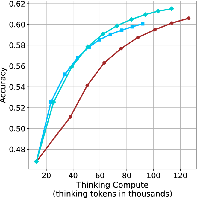
This image is a line chart illustrating the relationship between "Thinking Compute" (measured in thousands of thinking tokens) and "Accuracy." The chart displays three distinct data series, each showing a positive correlation where increased thinking compute leads to higher accuracy, albeit with diminishing returns.
### Components/Axes
* **Y-Axis (Vertical):** Labeled "Accuracy." The scale ranges from 0.48 to 0.62, with major grid lines at intervals of 0.02.
* **X-Axis (Horizontal):** Labeled "Thinking Compute (thinking tokens in thousands)." The scale ranges from 20 to 120, with major grid lines at intervals of 20. Data points begin at approximately 12.
* **Data Series (Legend absent, identified by marker/color):**
* **Series A (Dark Red Line with Circle Markers):** The lowest-performing series across the compute range.
* **Series B (Cyan Line with Diamond Markers):** The highest-performing series across the compute range.
* **Series C (Cyan Line with Square Markers):** An intermediate series, performing better than the red line but lower than the diamond line.
### Detailed Analysis
The chart displays a concave trend for all three series, indicating that while accuracy improves with more thinking tokens, the marginal gain decreases as compute increases.
**Trend Verification:**
* **Dark Red (Circles):** Slopes upward steadily from the start. It maintains the lowest accuracy relative to the other two series throughout the entire range.
* **Cyan (Diamonds):** Slopes upward, starting at the same point as the red line, but diverges quickly to become the highest-performing series.
* **Cyan (Squares):** Slopes upward, starting slightly later than the other two series (around 22k tokens), and tracks closely below the diamond series.
**Approximate Data Points (X, Y):**
| Thinking Compute (k) | Red (Circles) | Cyan (Squares) | Cyan (Diamonds) |
| :--- | :--- | :--- | :--- |
| ~12 | ~0.47 | N/A | ~0.47 |
| ~22 | ~0.49 | ~0.525 | ~0.525 |
| ~38 | ~0.51 | ~0.55 | ~0.56 |
| ~50 | ~0.54 | ~0.578 | ~0.58 |
| ~62 | ~0.56 | ~0.585 | ~0.59 |
| ~75 | ~0.575 | ~0.59 | ~0.60 |
| ~88 | ~0.585 | ~0.598 | ~0.605 |
| ~100 | ~0.595 | N/A | ~0.61 |
| ~112 | ~0.60 | N/A | ~0.615 |
| ~125 | ~0.605 | N/A | N/A |
### Key Observations
* **Performance Gap:** There is a clear performance gap between the Dark Red series and the Cyan series. The Cyan series (both shapes) reaches higher accuracy levels with significantly less compute than the Red series.
* **Diminishing Returns:** The slope of all lines is steepest between 10k and 40k tokens. Beyond 60k tokens, the curves flatten significantly, suggesting that adding more thinking tokens yields smaller incremental improvements in accuracy.
* **Convergence:** The two Cyan lines (Squares and Diamonds) start at a similar point (~22k tokens, ~0.525 accuracy) and follow a similar trajectory, though the Diamond series maintains a slight lead.
### Interpretation
This chart likely represents the performance scaling of an AI model (or models) that utilizes "Chain of Thought" or "Thinking" processes.
* **Scaling Laws:** The data demonstrates that "thinking" is a scalable resource. By allocating more tokens to the reasoning process, the model achieves higher accuracy.
* **Efficiency:** The distinct separation between the Red line and the Cyan lines suggests that the Cyan series represents a more efficient or capable model architecture (or a different version of the same model) that achieves higher accuracy for the same amount of compute.
* **Optimization Threshold:** The flattening of the curves suggests an "optimal" compute range. Beyond ~80k-100k tokens, the cost of additional compute (latency/resources) may outweigh the marginal gains in accuracy, indicating a point of diminishing returns for practical applications.