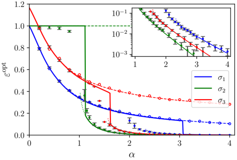
## Line Chart: Epsilon Optimal vs. Alpha
### Overview
The image contains a line chart showing the relationship between epsilon optimal (εopt) and alpha (α) for three different sigma values (σ1, σ2, σ3). The main chart displays a linear y-axis, while an inset chart in the top-right corner shows the same data with a logarithmic y-axis. The chart includes data points with error bars and fitted curves for each sigma value.
### Components/Axes
* **Main Chart:**
* **X-axis:** α (alpha), ranging from 0 to 4.
* **Y-axis:** εopt (epsilon optimal), ranging from 0.0 to 1.2.
* **Legend (bottom-right):**
* Blue line: σ1
* Green line: σ2
* Red line: σ3
* **Inset Chart (top-right):**
* **X-axis:** α (alpha), ranging from 1 to 4.
* **Y-axis:** Logarithmic scale, ranging from 10^-3 to 10^-1.
### Detailed Analysis
**Main Chart:**
* **σ1 (Blue):** The blue line starts at approximately 1.0 at α = 0 and decreases rapidly until α ≈ 1.0. It then continues to decrease at a slower rate, reaching approximately 0.3 at α = 1.5, and then drops to approximately 0.1 at α = 3.0, remaining relatively constant thereafter.
* α = 0: εopt ≈ 1.0
* α = 1.0: εopt ≈ 0.3
* α = 1.5: εopt ≈ 0.2
* α = 3.0: εopt ≈ 0.1
* α = 4.0: εopt ≈ 0.1
* **σ2 (Green):** The green line remains constant at approximately 1.0 from α = 0 to α ≈ 1.0. It then drops sharply to approximately 0.1 at α = 1.2, and continues to decrease to approximately 0.0 at α = 1.5, remaining relatively constant thereafter.
* α = 0 to 1.0: εopt ≈ 1.0
* α = 1.2: εopt ≈ 0.1
* α = 1.5: εopt ≈ 0.0
* α = 4.0: εopt ≈ 0.0
* **σ3 (Red):** The red line starts at approximately 1.2 at α = 0 and decreases rapidly until α ≈ 1.5. It then continues to decrease at a slower rate, reaching approximately 0.4 at α = 2.0, and then drops to approximately 0.1 at α = 3.0, remaining relatively constant thereafter.
* α = 0: εopt ≈ 1.2
* α = 1.5: εopt ≈ 0.4
* α = 2.0: εopt ≈ 0.3
* α = 3.0: εopt ≈ 0.1
* α = 4.0: εopt ≈ 0.1
**Inset Chart:**
* **σ1 (Blue):** The blue line decreases from approximately 0.05 at α = 1.0 to approximately 0.001 at α = 4.0.
* **σ2 (Green):** The green line decreases from approximately 0.08 at α = 1.0 to approximately 0.001 at α = 4.0.
* **σ3 (Red):** The red line decreases from approximately 0.1 at α = 1.0 to approximately 0.002 at α = 4.0.
### Key Observations
* All three sigma values show a decrease in εopt as α increases.
* σ2 exhibits a sharp drop in εopt at α ≈ 1.0, while σ1 and σ3 show a more gradual decrease.
* The inset chart provides a clearer view of the behavior of εopt at lower values, showing an exponential decay for all three sigma values.
* The data points have error bars, indicating the uncertainty in the measurements.
### Interpretation
The chart illustrates the relationship between epsilon optimal (εopt) and alpha (α) for different sigma values. The data suggests that as alpha increases, epsilon optimal decreases for all three sigma values. The sharp drop in εopt for σ2 indicates a critical point or threshold behavior, while the more gradual decrease for σ1 and σ3 suggests a more continuous relationship. The inset chart, with its logarithmic y-axis, highlights the exponential decay of εopt as alpha increases, particularly at lower values of εopt. The error bars on the data points indicate the variability or uncertainty in the measurements, which should be considered when interpreting the results. The different sigma values likely represent different experimental conditions or parameters, and the chart allows for a comparison of their effects on the relationship between epsilon optimal and alpha.